Part 2 : Arles in Black


Arles in Black 

Looking back at my notes I realise I actually forgot another of my aims  for the weekend – an unvoiced one at the time which was “To experience creative anarchy”, and that’s what happened as Space, Place, Imagery and Heat combined! What particularly struck me at the time, and has stayed with me, was presentation – how the work was put together conveyed and in what type of space. Of course, whilst reflecting on the impressions since then I’ve also been doing some further research. Don’t know how this will turn out – let’s see. I won’t be writing about all the photographers I saw, just ones that struck me the most at the time. I’m sure I’ll rediscover the others as I continue my journey with the OCA.

Guy Bourdin 

The Darkroom

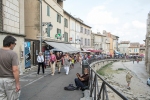
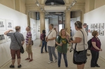
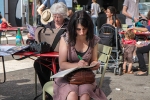
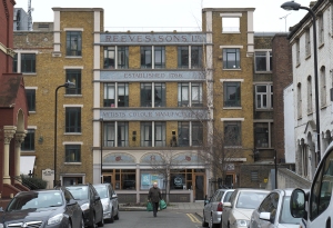
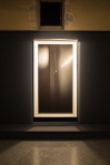
Our first Exhibition viewing – in a beautiful building,  Espace Van Gogh  but within a created, dark space

_R010148 lr


Bourdin was a fashion photographer between 1955 and 1990.  The Arles Catalogue (p.63) describes him as “an autodidact, whose life was devoted to a wide spectrum of artistic research: painting, photography, filming and writing”.  I like that word, “autodidact”. – self-directed, learning through a contemplative and absorbed process.

This Exhibition (as other previous Exhibitions) was curated by Shelly Verthime who must know his work so well.  100 manila envelopes, each containing a single negative, with a contact print attached to the front with sticky tape were found by her in 2011 when she was working with Bourdin’s archive. Shelly Verthime has written three books about Bourdin. I know she is London-based but can’t find out who she is, just the occasional comment on the web that  refers to her as a Cultural historian, Bourdin’s biographer, art maven. Here Shelly Verthime talks about Bourdin’s use of mirrors in his images

There is magic in the mirror as much as there is magic in Guy Bourdin’s work. With both, the more you look the more you discover. The mirror tells you the truth. (2011 in Dazed Digital website)

According to Linkedin she has an MA from the Royal College of Art.  Trying to find out who she was and how, she became involved in the Archives became what I realised was a ‘search for Shelly Verthime” rather than for Guy Bourdin. In fact there was little I can find so I think she must be quite self-effacing. I became curious about her choices of image and presentation from Bourdin’s archive and the fact that, actually, we are seeing him through her eyes as she looks through the mirror.

What I thought as I looked through his fashion images was of how often I might have seen them in magazines in the past and just flicked over the pages so quickly not taking in how he was portraying these beautiful women and his use of layers, sun and shadows. There was much about frames here. The compositional frame and also the image frame.  Why were very ornate frames used on some black and white images and not on others? Were these frames ‘old’ or newly created? What did each frame achieve? The ornateness of the frame stopped my eye.  I wanted to get rid of the frame to get closer to the image but the frame got in my way. These images were of ‘ordinary’ people including children, and we discussed the intention of the frame. Was it to make these ordinary people special; just as special as elegant and glamorous models or famous people. The polaroids were in the exact centre of a white mount within a white block frame. What if they  were swapped with those other frames. How might they look then.

Hiroshi Sugimoto

Revolution

New work in black and white resulting from an out-of-body experience whilst gazing at the horizon and his sense of the earth being a watery globe.

_R010158 lr


Again the room was dark with the large (2.70m) prints, arrayed around the walls, “that immediately immerse visitors into meditation”  (Catalogue contents page). Actually I was immersed into craning my neck to see the images the right way up and wondering why he chose to up-end them. I think the prints were aluminium; certainly the spotlights reflected off them.

Couleurs de l’ombre

The result of Hermès Editeur – editions of works of art on silk,  otherwise known as scarves – a project dating back to 1937 and involving collaborations with contemporary artists, the first edition being Josef Albers.  Available Sugimoto scarves are retailing at €7,000 according to the Hermes site.  I love silk but this is a lot of money!

This series emanated from Colours of Shadow – polaroids by Sugimoto taken at 5.30am every day from late 2009 to the beginning of 2010 through a fascinating process whereby sunlight striking though a prism refracted into colours, which were then projected onto his mirror and reflected into a dim observation chamber where he reduced it to Polaroid colours.  (p. 26 Catalogue).  In the project with Hermes  20 polaroids were transposed onto silk, in editions of 7 giving a total of 140 scarves each measuring 140cm x 140cm.

The Exhibition was in the Eglise Saint-Blaise which was founded in the 6th Century and abandoned and sold as a national property during the Revolution. Presumably it’s no longer used for religious purposes.


The scarves hanging like pennants on the old stone walls – a gangway for the viewer to walk along (instead of a model wearing one of the scarves);  small polaroids contained in glass ; the prism on a plinth where the altar might have been, with the backdrop of  “The Last Supper” (from an edition of 5) a print that was damaged in Hurricane Sandy.

To me this Exhibition was about worship – of money and the cost of beautiful objects. It was about patronage of the arts by wealthy benefactors. The pennants of scarves reminded me of the flags hanging from the walls of Churches and Cathedrals. Was this about the glory of Hermes; the glory of Sugimoto’s art? Has Sugimoto given in to the blandishments of wealth and commerce?

Eric Kessels 

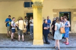
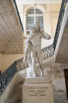
Eric Kessels is an artist, collector of vernacular photography and co-founder and creative director of KesselsKramer, an independent international communications agency.  He had two Exhibitions at Arles in the Palais de l’Archeveche another lovely building with an impressive entrance

_R010168 lr

Up the stairs we went into rooms full of photographs
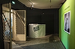
24 Hours of Photos

Taking a physical look at 24 hours of digital images uploaded to  Flickr. A windowless room flooded with them creeping up the walls.  We could look from below and from a platform above.

_R010174 lr

Actually I could see the installation base underneath so there weren’t as many as there seemed, but still – it was a graphic representation of the way in which we’re deluges with digital images day after day – and contribute.  It’s just occurred to me as well that maybe some of my images might be there. What day, month, year?
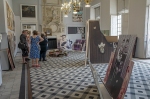
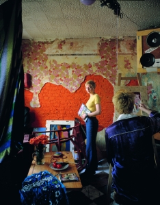
The Family Album

Several rooms – spacious high-ceilinged with beautiful windows and fireplaces. Photographs – single and in albums – large and small, some stained and creased. In heaps, displayed on the wall in various sizes, printed on rugs on the floors


All those people and discarded memories.  It reminded me of clearing my parents’ house after they both died; having to decide what to keep and what to throw away. Think of all those millions of people who go through the same process. I just wonder if any of them were there in those rooms in Arles and recognised a relative.

There is a quote by Kesslers in the catalogue (p. 346)

A long and dedicated search through photo albums will occasionally reveal something less than perfection, something other than an entry in the competition to appear normal. And in these cracks, beauty may be found.

I think he created such poignant beauty there in Arles. I sense a tenderness in the way he put all those images together and considered them worthy of display.

Some Conclusions

Here has been just a snapshot of images seen and places visited in the old City of Arles with its beautiful, old buildings.  Thinking about it now I realise that I was more affected by Exhibitions in those buildings than the ones in the Ateliers.  The environment does make a difference (at least to me) so does this mean I’m more concerned with style than content – something I need to think about.  As a postscript to that,  I had wanted to see Bibi  the Exhibition of photographs by Jacques Henri Lartigue. The Exhibition had been in Eglise des Trinitaires but had closed by the time we arrived. However I did have an opportunity to see it on a visit recently with John  to the Photographers Gallery . It  was a busy day for the Gallery, with a group of young people on a guided tour with one of the Exhibition staff. The Photographers Gallery is plain, modern, the talk was loud and distracting.  I looked at the images and thought, “Family photos with a flair. Wealthy people in wealthy places. Interesting as a historical record on dress and lifestyle etc.”. I talked with John about it and he said the photographs looked very different here in a plainer environment than they did for him in that Church in Arles.

The Bibi photographs reminded me of visiting Polesden Lacey in Surrey – home of Mrs Greville an Edwardian hostess and friendly with Edward VII and his coterie.  Earlier than Lartigue but still that rich lifestyle and many photographs from that era scattered around the luxurious rooms. Sounds like Kessler’s Exhibition a little maybe, although his images were of ordinary people doing ordinary things. No less interesting for that!

I think my Arles experience will stay with me for quite a while. I learned more about the difference that presentation and the environment can make to a viewing experience.  Another aspect for me is that I felt much more connected with those photographs from Kessler’s, the Family Album than I did with that Flickr River and its torrents.

References

Les Recontres Arles Photography (2013), Arles in Black, Actes Sud 2013

http://www.dazeddigital.com/artsandculture/article/5378/1/guy-bourdin-ses-films [accessed 24.10.13]

http://www.rencontres-arles.com/A11/C.aspx?VP3=CMS3&VF=ARL_1024_VForm&FRM=Frame%3aARL_1131&LANG=English

http://www.telegraph.co.uk/culture/photography/10149023/Les-Rencontres-Arles-Photographie-2013-The-unseen-work-of-Guy-Bourdin.html

http://en.wikipedia.org/wiki/Guy_Bourdin

OCA Visit to Arles Photography Festival September 2013 : Part 1

1: Beginning


Golden stone soaking heat

Cobbled street hard on feet.

Baking sun sears my eyes and stamps its image on my brain.

Arles.

Ancient city.

Crowds throng to see and hear the ritual bulls and pounding horses hooves,

Whilst I retreat to corrugated ruins of sheds where once the workmen toiled their keep.

They house a different breed.

Rows on row of captive  moments seek my gaze

And jostle a kaleidoscope for me

We left London at 10.25am and arrived at Arles station at 7.22pm. “Let’s walk”, said Gareth, “It’s only over there”, pointing towards the next bridge. My suitcase rumbled along the cobbles like a miniature cart and there were Rob and Amano sitting in the hotel -waiting to welcome us. We’d arrived! At last! An animated meal and night’s sleep later, we all met together the next morning. “What do you want to get from the weekend?” was the question.

What I wanted was to gain the sense (again) of being part of a wider community (an international one at that). The opportunity to renew, reinforce and form new relationships. To see photographs in more unusual settings and in different forms of presentation.  I wanted to think about how the presentation affected my viewing – how did it draw me through the frame. I wanted to be surprised, enthralled.

This is just a taste of Arles

and also to show how engaged we were in this medium of photography – gazing; thinking; resting; talking and reflecting.

It was hot and I was exhausted at times, but the need to engage and be involved kept me going. The company was wonderful.

I won’t be itemizing everything I saw but picking up on particular aspects, themes that struck me. Onwards to Sugimoto, family photographs; looking at some representations of childhood, and realizing how much the Bechers have indirectly influenced me as they’ve passed down their way of looking at things through other photographers.

12th September 2013

Talk by Tom Hunter: OCA Study Visit 2nd March 2013

Tom Hunter : The Way Home

_DSF0399 lr

As preparation for the talk I read an interview in Photomonitor by Katy Barron .  Photomonitor is an on-line magazine that includes our own OCA tutors Jesse and Sharon Boothroyd amongst its contributors. Sharon was also our accompanying tutor and had organised the visit.

_DSF0407 lr

I had already seen Tom’s work in “Seduced by Art” at the National Gallery and, of course looked at his website

Two aspects struck me in particular from the Photomonitor interview concerning his attitude towards photography. The first concerns his latest pinhole work and how the lens “slowly absorbs the scene rather than grabbing or taking it” giving him time to talk with people.  The second was about people’s attitudes towards Old Masters – “Rather like going to church where you have to bow to these great masters”, and how one can forget the context of a painting so that the subject matter becomes lost in the technical detail of the painting (I hope I’ve understood that right).

Tom has a casually relaxed style; is easy to listen to; engaging and obviously passionate about his work and the area where he lives. Basically, his talk covered the areas that have already been outlined in one of the essays on his website  the difference, of course, is that listening to him speak made his journey come alive; not to mention the images he showed and explained to us. I can certainly understand how he succeeds so well in getting his subjects to co-operate with him.

He has spent a long time looking at his surroundings; exploring his own neighbourhood and using different ways to portray situations. What came through overall in his talk was certainly the way in which universal themes and situations have continued in their different forms and how they can be portrayed, in what I think of as a painterly manner, whilst using ‘ordinary’ people and their lives as a context, through the photographic medium . What’s interesting to me is that this can now be seen as experimental/conceptual rather than ‘copying/mimicking’ as it might have seemed earlier in the history of photography. It seems to me that, on the whole, anything goes in photography so long as you can justify it comprehensively and articulately using the appropriate method of communication.

The other aspect that struck me was that continual search as a photographer for new ways of looking at things and yet retaining some beliefs/attitudes/passions as a core. A humanitarian ethos of respect for others and believing in the importance of engaging his subjects in his work.  Being welded to Hackney and its people and wanting to show that ordinary people have their own unique stories which are worth the telling.  There is also his use of an artistic approach to raise contentious issues and engage in a fight with local authorities.  This is an interesting aspect particularly at the moment having discussed Martha Rosler’s views on documentary in the recent OCA Thames Valley group session.  John  made a comment on my previous post here  concerning the question of whether documentary should appear on a gallery wall and Allan Sekula’s statement that

Documentary is thought to be art when it transcends its reference to the world, when the work can be regarded first and foremost, as an act of self-expression on the part of the artist” (A. Sekula,  1984, p.58)

How does that fit with Tom Hunter’s work?  To me his work is art as well as documentary.  He points to the universality of contemporary stories; bases them in his own neighbourhood and has found his own creative voice. His work appears on gallery walls and in museums. At the same time his images have achieved positive change.

His Degree Show in 1994 was The Ghetto. He and others were trying to save their squatted street in Hackney from demolition and themselves from eviction.  He produced a 3D model of the street (in his words to us his neighbourhood became an art sculpture). He had begun using a medium format camera and produced transparencies whose effect resembled being transported into a cathedral with it stained glass windows. These transparencies were placed in the model. His tutors encouraged him to look at Dutch painting and he discovered Vermeer and his use of light and the painting of ordinary people.  After travelling around Europe for a couple of years he went back to his squatting neighbourhood. Possession orders were again being issued, and he returned to Vermeer in his quest to raise the status of the fight with the Local Authorities.

One of his neighbours who had received an eviction order became Woman Reading a Possession Order from Hunter’s series Persons Unknown

filipa002

Woman Reading a Possession Order (1997) (c) Tom Hunter

Reproduced with his permission

the starting point was Vermeer’s A Girl Reading a Letter at an Open Window .  

Another example from the same series is the Art of Squatting .

the-art-of-squatting-1997-tom-hunter-email

                                                                                                                                   The Art of Squatting (1997) (c) Tom Hunter

Reproduced with his permission

The Art of Painting (1665-67)  was known as Vermeer’s favourite piece.  Vermeer’s painting has cloth/tapestry on the wall – probably a map of the Netherlands.  Hunter’s reworking has torn wallpaper that, to me,  looks the same shape as the map. Subsequently he has taken influences from other artists and lives of artists such as Millais  and the author Thomas Hardy. Hardy based all his stories on true stories and Tom Hunter started to collect people’s stories from the Hackney Gazette.   He noticed that the same stories repeated themselves over and over again and re-enacted some of them in his series Living in Hell and other Stories

This works for me as an artist in contextualizing my work, giving it multiple layers and asking classical and contemporary viewers alike to question art’s relationship to society (2012, p. 7)

He has wanted both to document life around him; raise issues and represent the beauty and dignity of ordinary people and his surroundings. One of the questions raised during the talk was whether he thought his views had become compromised by moving from documentary to a more elitist area, being shown in the National Gallery or Saatchi Gallery for instance. Tom Hunter’s response was that he had wanted to involve the whole society in a debate about ways of living and being shown in these environments gave him the opportunity to put his points of view to a wider audience. Making scenes look beautiful (as he does) will bring people in from all sorts of backgrounds. In terms of ‘realism’ he described how photojournalists may also compose and stage their images; instructing people to “Move here. Move there”.

I wrote above about Tom Hunter’s easy and relaxed way of talking to us. His view is that you have to prove to people that you’re honest and straightforward and won’t be “taking the piss”. He said there is an art in the way you talk to people. If they say, “No”, then that’s an opportunity to explain and engage them. I think that’s a good rule to follow.  I also hope that he doesn’t lose this as he becomes more famous. I don’t think he will somehow.

References

Hunter, T (2012) Tom Hunter : The Way Home, Hatje Cantz Verlag, Germany

Sekula, A Photography against the grain: essays and photo works, 1973-1983, Press of the Nova Scotia College of Art and Design, Halifax, 1984.

http://skd-online-collection.skd.museum/en/contents/showSearch?id=415429

http://www.khm.at/en/visit/exhibitions/past-exhibitions/2010/vermeer-the-art-of-painting/

http://www.franshalsmuseum.nl/en/collection/search-collection/the-art-of-squatting-1537/

Latest Features

http://www.tomhunter.org

http://www.tomhunter.org/the-way-home-book-introduction-essay-by-tom-hunter/

http://www.tomhunter.org/persons-unknown/

http://www.photomonitor.co.uk/2013/02/the-way-home

OCA Study Visit : 7. William Klein + Daido Moriyama at Tate Modern, 12th January 2013

OCA Study Visit :7. William Klein +Daido Moriyama at Tate Modern – January 2013

I’m catching up on Study Visits but so slowly!

What happened with this particular one was that I felt I needed to have more understanding of the links between these two photographers and why they are considered so important. This entailed me in quite a lot of reading and research and, as usual, I went along some highways and byways.  What I’m aiming to do here is to summarise my understanding of the beginnings of both photographers and then concentrate upon their impact upon me. I clearly see how creative and talented each of them is but didn’t feel attracted towards their work as I viewed it in the Exhibition. My immediate reaction was that this type of work ‘isn’t me” and I’ve slowly worked out  “Why?”

Reading Jack Kerouac’s “On the Road” and Robert Frank’s “The Americans” gave me a greater understanding of some artistic perceptions of 1950s America and a movement towards spontanaeity of expression that showed itself as ‘stream of consciousness’/diaristic . In photography this was rough, raw, informal,  and grainy , tending to capture the ‘indecisive’ rather than ‘decisive’ moment. Art was flavoured with some rebellion against ‘consumer America’; irony; a move towards existentialism and the life is for now attitude of the Beat Generation.

William Klein was born in New York in 1928  but has spent much of his adult life in Paris, whereas Frank was born in Switzlerand but settled in the United States. Whereas Frank put the searchlight of his lens over ‘America’,  William Klein’s “New York” (full title “Life is Good and Good for You in New York: Trance witness Revels”) portrayed his view of one City.  He had worked in Paris for 8 years and moved from abstract painting to abstract photography. He returned to New York with fresh eyes.  He has said that he thought he could use what he learned in painting in photography.

The kinetic quality of New York, the kids, dirt, madness – I tried to find a photographic style that would come close to is. So I would be grainy and contrasted and black. I’d crop, blur, play with negatives. I didn’t see clean technique being right for New York.

                                               (p. 12, Howarth & McLaren, (Ed) 2010)

I think I’m right in stating that Klein’s view in “New York” is less pessimistic than that of Frank and yet more aggressive and ‘in your face’.  He comes through as delighting in the energy of the City, wanting to be in the thick of it,  and certainly seems to me more of a ‘participant observer,’ whereas Frank strikes me as an ‘observer’. How far this is a matter of personality, upbringing and lifestyle is probably  complex and hard to unravel.  Similarly to Frank’s book, no American publisher was interested in Klein’s work. In the Tate video (c. 5.46 in on William Klein in Pictures) he says the New York editors believed the photos were the least publishable at the time being ‘too funky, grungy” and showing New York like a slum. His argument back was what did they know living on 5th Avenue as they did.  The book appeared in Paris published by a very traditional publishing house.

Daido Moriyama was born in Osaka in 1939. How does he come into this equation and what links him with Klein? A review by Marco Bohr in Photomonitor reminds us that Klein initially practised as a painter and started taking photographs as a way to experiment with optical and visual perception , whereas Moriyama, “ turned to photography to deconstruct his perception of the urban landscape”.  They both used photography, “as a method of visual interrogation, abstraction and deconstruction” both experimented with a wide range of techniques, not to mention photobooks.

Moriyama discovered Klein’s “New York’ Photobook whilst working as an assistant to Photographer Takeji Iwamiya. The Exhibition booklet refers to this as a crucial influence upon him as was Klein’s Photobook “Tokyo” photographed in 1961 and printed in 1964 – this functioned as a guide book to Japanese photographers in the mid to late 1960s including the then aspiring photographer Moriyama. Moriyama had  moved to Tokyo in 1961, working for photographer Eikoh Hosae before turning freelance in 1964. Moriyama read Kerouac’s “On the Road” in the late 1960s and, in response began to photograph highways out of Tokyo, “shifting focus from cities and towns to the roads that connect them. The resulting book “Hunter” was dedicated to Kerouac.  Moriyama photographed New York and produced his Photobook “ANOTHER COUNTRY IN NEW YORK in 1971.

The Exhibition

The Exhibition was divided into two – each half being further divided into ‘rooms’ (7 for Klein and 6 for Moriyama) and was organised in such a way that you began with Klein’s work first, whilst being able to see snatches of Moriyama’s work through the partitions in the centre room (and vice versa). Bohr writes that this presentation “appears to promote the classic paradigm of a Japanese avant-garde apparently borrowing from the epicenters of cultural productions, New York and Paris” and that places much emphasis on individuals. ”either being inspired or inspiring others”. He points out that both photographers produced works, “in a very specific political, social and ideological environment that not only accepted their photographs, but also, that actively promoted them”.  I’m sure I’m stereotyping here but it does seem to me that modern Japan, particularly its large city youth, does seem to be undergoing the type of changes prevalent in the New York of the 1950s – that clash between old values and the brash new world where an outgoing hip generation both questions and adapts everything for itself whilst artists, including photographers, observe, record and draw attention.

We were a large group of students and so we worked through on our own, falling into pairs and groups as we came together at times, often with one of the tutors, to discuss views.

I’ll now record brief impressions:

William Klein

We began with his film “Broadway by Light” (1958) a portrait of New York through its gaudy neon signage. In some respects I thought it was of its time in terms of the quality of the film and colour.  I remember travelling down Broadway, in a taxi in 2004, and feeling almost overwhelmed by the litter and sense of speediness with traffic rushing and horns blaring whilst skateboards weaved their dangerous path between them all. Thinking about it, as there must have been less traffic then (?) Klein chose well in using the signage to signal the pace.

As I continued, and absorbed the wide-angle views I began to think about the differences between Klein and Henri Cartier-Bresson – the one wanting to be seen and the other ‘unobtrusively’ capturing the decisive moment. Images were twice as large as life and lens distortion was obvious.  I was caught by a photograph in Grand Central station where the only stillness came from an old woman, wearing a headscarf – just sitting – a punctum for me amongst the throng.

In Room 3 and 1960s Tokyo – carefully sequenced photobooks yet capturing the haste and bustle of the street. Splodgy, early film; in your face (reminded me of Joel Meyerowitz, b. 1938 but colour is his medium),  grainy b+w.

Room 4 and back to Klein’s beginnings as a painter; his early wooden panels and use of typography, where  I recognized the influence of the Bauhaus movement.

Klein came over to me as a large intellect, and extrovert presence with a great zest for life, and continuously experimenting with all types of artistic expression. From the video of him wandering the streets and engaging with people I could see that, despite his age, he still retains this psychic energy.  Watching the video I found him engaging and easy to listen to. He talks about the way in which his contact sheets bring back all the memories of when he took them and his fascination with faces.  To be honest I found it quite overwhelming and was questioning myself continuously around this. Is it to do with the different ways we see?  I’m naturally long-sighted and tend to draw back to see something clearly.  If something is too close I get a feeling of slight claustrophobia.  Similarly, I don’t like it if someone shoves a camera in my face and feel very reluctant to do the same to other people; and yet I do engage with people.  I actually did some web searches to see if there is any evidence that long-sighted people tend to be more introverted and vice versa but couldn’t find any conclusive proof

Daido Moriyama

I felt a similar sense of motion as with Klein but it was different in the sense of  his photography being even more grainy and amorphous. There is a quote at the beginning of the Exhibition Guide:

For me photography is not about an attempt to create a two-dimensional work of art, but by taking photo after photo, I come closer to truth and reality at the very intersection of the fragmentary nature of the world and my own personal sense of time.

To achieve this Moriyama moved away from accepted conventions in Japanese post Second World War photography. He photographed things on the move,  shooting without looking in the viewfinder; working often at night, in poor light, and using slow shutter speeds and deliberate camera shake. This is an aesthetic in Japanese known as are, bure, boke: blurry, grainy, unfocussed. (G. Bauret, 2012, in R. Delpire, 2010).

I’d stopped to have various brief discussions with some of the other students as I was walking around and, at one point, Keith and I got to talking about language and culture and how much that affects both the photographer and the viewer’s perception of the work.   We may share some cultural attitudes and nuances with European and American artists but how possible is this with a country like Japan?

There is much about Moriyama’s  fascination with the Shinjuku district in Tokyo which began in 1965 and continues. He talks about this in the Tate video Daido Moriyama in Pictures and how he sees it as a “stadium of people’s desires (2.02 in). Moriyama takes us to a room above a bar, saying “I think of this place as my room in Shinjuku. We see him at night prowling the streets.  I say ‘prowling’ because that’s the way I see it.   For me,  Klein’s wandering produces “This is how I’m seeing the World” and I still get a sense of his retaining some distance and recognition of himself as a separate individual. However, through the grain and almost seeping of black into white, I imagine Moriyama as edging towards that boundary between ‘me’ and ‘not-me’ that can lead to loss of self. I wondered if he is looking for a grounded sense of self as he walks those streets. I was caught by something he said in the video which connects with this for me.

Japanese people often talk of home as a place where you are born, grow up and everyone is there but I don’t have such a home. I’ve been moving a lot since I was a child.  I am creating my own home by connecting pieces of images from my imagination and things I saw as a child (3.15 in ibid).

What he said very much reminded me of how Elif Shafak, the Turkish author likened her imagination to being her only suitcase when she was travelling around with her mother (see here).  In fact it was listening to her that made me think about the whole issue of language and culture in relation to understanding Art and encouraged me to explore this further.

One further aspect is the Black Dog, the image that is almost Moriyama’s signature and, to me, very much conveys that sense of prowling in the dark. He describes how the dog was ‘just there’ as he stepped out of his hotel to do a photo shoot, “and this dog instantly became a part of me” (c. 4.48 in). I can almost feel his attraction towards it as I look at the image. It also reminded me of how William Churchill referred to his depressive periods as “The Black Dog”. I certainly wouldn’t want to say that I think Moriyama generally suffers the same, although I know that when he was young he did go through a period where he felt the world was fragmenting and questioned why he took photographs (cf his series Farewell to Photography).

Maybe, though, the style of Moriyama’s images; lack of clear form and blurring of darkness into light does give me an impression of what it might feel like to be drawn towards the darker side of life; the slide into depression. I’m probably allowing my imagination too much rein here but thinking along those lines does help me to understand my own reaction to his photography.

Further thoughts

When I have a strong negative reaction towards a particular photographer’s work then I really do need to analyse “Why”. I read about their life/background and try to look at it all from their point of view and then translate that into photography. In fact I’m sure I work harder than I do when I feel drawn towards a photographer.

William Klein said something that very much struck home for me. He said that when he was photographing children in New York he was also photographing his memories.  I generally try to avoid photographing children because of all the issues involved but I did post one on the blog recently here – a much softer and more innocent feel to it than Klein’s boy with toy gun . Thinking about this again in terms of Klein’s remark, I realised that I was one of those children and remembered the make believe games we played; my gang of boys, and how I loved climbing trees and always had dirty knees. The streets and local parks were my playground with none of this middle-class way of inviting friends home for tea!  Thanks for reminding me William.

6th June 2013

References

Delpire, R (Ed),(2012) Photofiled: Daido Moriyama, Thames & Hudson, London

Howarth, S and McLaren, S (ed) (2010) Street Photography Now ,Thames &    Hudson Ltd, London

Klein, W, (2012) William Klein: ABC, Tate Publishing, London

http://masters-of-photography.com/K/klein/klein_boy_pointing_gun.html

http://www.hcs.harvard.edu/~hpj/badger.htm

http://www.photomonitor.co.uk/2012/11/klein-moriyama/ [accessed 13.5.2013)

http://www.tate.org.uk/whats-on/tate-modern/exhibition/william-klein-daido-moriyama [Accessed 6.6.2013]

6. Seduced By Art : Exhibition at the National Gallery, December 2012

Seduced By Art : the National Gallery  7th December 2012

OCA Study Visit

This was advertised as the Gallery’s first major exhibition of photography. It’s promise was that we would view Old Master painting through a new lens, with paintings and early and contemporary photographs (almost 90) being presented together according to traditional genres, “highlighting the universality of the themes and influences across all the works, both past and present. So this is an Exhibition that celebrated similarity rather than difference. What was interesting as well was the ‘hierarchy’ of genres in art, as per the list of the French Royal Academy – history pictures and tableaux; portraiture; figure studies; still life and landscape. It was suggested by OCA that we read/look at two internet sites beforehand regarding Jeff Wall’s work The Destroyed Room here  and Tom Hunter’s work  Death of Colotti  here

Brian Sewell’s review in the London Evening Standard 1/11/2012 was not complimentary. “Foolishly, they have given it the title ‘Seduced by Art’, using the term in its loose romantic sense – as might a chick-lit writer – rather than as debauched, corrupted, raped; but in the corruption here at work it is the photographer who is the rapist,”.  His view on the specially commissioned new photographs for the exhibition is  that this surely indicated there must have been “too little evidence to lend importance to the link”.  I could go on but it’s clear that Sewell does not like photography (unless he’s writing with his cynical tongue in cheek) and he even heaps calumny on the catalogue stating that it’s, “the nastiest example of book design every issued buy Yale University Press.

In fact I’d already ordered the catalogue in advance and was quite impressed by it, thinking that I hardly needed to go the Exhibition because it was so well-covered!

In terms of the Exhibition itself the question of curatorial selection also comes into play of course – selecting only photographs that are similar in some way to paintings. The Introduction to the Catalogue states, “Among a multitude of photographers, Seduced by Art focuses on artists who pay attention to historical picture making, whether painted or photographed and this is developed into a comparison between Historicism that validates new art “in the conventional terms of the old” and its antithesis Modernism “whose ethos was a break with precedent and whose motivation was a search for new modes of expression”  (ibid 28)

I recently read an article in Source (Issue 73, 2012) by Eugenie Shinkle, who states that “The basic problem with Seduced by Art is its failure to distinguish imitation from inspiration” (Source, 2012: 58). One example given of this is Wall’s Destroyed Room and I do think a conceptual gap has occurred. There is a qualitative difference between validating new art ‘in the conventional terms of the old’ (which smacks of looking for imitation) and celebrating that leap of vision which recognizes underlying concepts and concerns and then, by creative alchemy, translates that into something entirely different and contemporary.  To me that does constitute both “a break with precedent” and a new expressive mode. There is a synthesis between Historicism and Modernism rather than a distinct separation.  As I walked around the Exhibition I became more and more interested in the way that the photographers were achieving this and so I returned home with a list or photographers to research further.

Before I discuss these I must mention as well the excellent talk given to us beforehand by Aliki Braine who put the Exhibition into context. She is herself a conceptual artist with MA’s in Fine Art and the History of Art and uses photography in her work. See here and here.

History Pictures and Tableaux

Jeff Wall The Destroyed Room (1978)

In addition to following OCA’s suggestion of looking at his work on the MOMA site, I also looked at two YouTube videos – both of which illuminate Jeff Wall’s artistic credentials; the depth of his academic knowledge, extent of research and his creative inspirations and influences.

Wall had a strong grounding in Western art and he did further post-graduate work at The Courtauld Institute from 1979-1973.  There was a gap of several years where he made no art and so The Destroyed Room is one of his earliest conceptual pieces of work. There are transcript extracts from two interviews (1985 and 1993) on the MOMA site where he talks specifically about this photograph. Wall states that he became interested in  Delacroix’s Death of Sardanapalus partly because he was lecturing in romanticism at the time. The  end of the Napoleonic period  heralded the beginning of modern, bourgeois, neurotic private life in that the eroticized ideal of military glory was being turned inward, back towards domestic life.

Monumental paintings wove together themes of war and military glory with the conflicts of private life and Wall describes how he used this as ‘a crystal’ to pass his ideas through ‘the historical prism of another work’ and trying to establish a space for himself by suggesting which historical directions and problems were important to him. The subject matter of The Destroyed Room  is to do with aggression, violence and revenge in domestic life. He links this with the way in which commercial window displays of clothing and furniture were at the time influenced by the punk phenomenon. Interestingly, the photography was presented as an ‘installation, a nearly life-size transparency, in the window frontage of a gallery in Vancouver.

I also watched two You Tube videos from 2011 and 2012  where Wall talks about his later works.

In Contact Vol 2   he  refers to  photography’s claim to represent something natural and show a truth and then cinemagraphic images where more or less truth performances could be recorded like in a good film. He collaborates with performers as painters collaborated with models and he talks of conveying a representation of an event to the viewer. He described how he  created an event –for Dead Troops Talk a dialogue with the dead, a soviet patrol in Afghanistan – that he shot piece by piece and then scanned, digitized and assembled these into an electronic montage. this image was not in the Exhibition but, reading about it, I was reminded of Aliki Braine’s description of the way in which some large scale paintings had been put together, piece by piece, with the same models posing as different characters as in Thomas Couture’s  Romans of the Decadence   and then how this might have inspired Oscar Gustav Rejlander’s The Two Ways of Life  a a composite image made from 30 separate glass plate negatives (H. Kingsley, 2012, p.112).

Returning to Jeff Walls. In the video referred to above he also states,  “Pictures are also about maintaining an invisibility for things. I might make a picture that contains both what it shows and what it excludes”. He illustrates this with reference to his work Restoration  – designed to be made with a panorama camera and taken so that it shows exactly half of the space, “and there’s a part that disappears behind the picture edges ….. there’s a woman looking into the space, into a part of the picture that you can’t see; to make a little accent to that notion that there’s a space outside”. (about 6 min in on the video).

Portraiture

Craigie Horsfield

I was struck by the drama in  Julia Margaret Cameron’s Iago (Study from an Italian) , 1867 and how that same sense of brooding intensity, alluded to by the averted gaze,  has been captured by  Craigie Horsfield’s Hernando Gomez, Calle Serrano, Madrid, Diciembre 2006.  Again, the gaze leads us outside the frame into what is for us, an imagined space. Horsefield introduced the concept of ‘slow time’ , “believes in the portrait’s capacity to transmit a sense of human intgriy, which incorporates consciousness” (H. Kingsley, 2012: 79)

Horsfield is a sound artist and  creator of tapestries as well as a photographer and  there is a PDF  here  that contains a variety of his work, including tapestries. That site also has some more detailed information about him and a video where he explains how he approaches the tapestries  Slightly off the point I know but I wanted to acknowledge the breadth of his work and how he integrates his concepts into his multi dimensional practice. After all ‘slow time’ is a musical term.

This aspect of photography as being a medium to express beliefs rather than an end in itself, takes me to Maud Sulter.

Maud Sulter

I lingered for a long time over Sulter’s portrait of herself as Calliope, the muse of epic poetry.  This is from the series Zabat 1989 that showed nine allegorical portraits of black women artists and Calliope marked the publication of Sulter’s book of poetry also entitled Zabat (the name of a traditional African dance exalting women’s strength.) I was sad to learn that she died too young at the age of 47, in 2008. Her obituary is here.

I was entranced by Calliope – her beautifully sculpted features, neck; shoulders and upper chest  emerging in golden-hues from the dark background. With textures of her dark velvet robe almost inviting one to touch them. Sulter’s  inspiration included C17th portrait painting and a small, cased photograph serves as the emblem of her vocation.  Neither the post card I bought nor the  photograph in the catalogue, although beautiful, have quite that same sense of luminosity and texture as that of the actual photograph. I also noted that whereas the photograph in the catalogue has her facing to the left, the one on the V&A site has her facing to the right!

The next portraits that fascinated me were photographic miniature by Bettina von Zwehl.

Bettina von Zwehl

Irini I and Irini II (2011). Large format images transposed into jewelled miniatures. These tiny portraits (5.8 cm diameter) looked like jewels in their glass case and they form a link between the painted miniatures , daguerrotypes and also the cartes des visites that became possible with the advent of new glass plate negatives and smoothly coated albumen paper.  Bettina von Zwehl made these small portraits whilst artist in residence at the Victoria & Albert Museum and there is more information here  concerning her approach and how her desire to build a bridge between the old and the new was just one of the many influences  in her work. I have also read elsewhere that she used the ambient light from a particular window at the Museum for her subjects.

There is one more image that particularly drew me, in the Figure Studies section.

Figure studies

Richard Learoyd

Richard Learoyd does not appear to have a working website of his own but some information about him can be found here  and here  He uses a specially built camera obscura to direct light onto positive photographic paper which means that every image is unique (except of course it must be scanned or otherwise reproduced to produce the postcard I bought).  There are other images created by him in the Exhibition but it was the Man with Octopus Tattoo II 2011 that drew me; not only in knowledge of how it was created,  but  with its clarity of detail and, of course, the amazing tattoo.

I read somewhere (can’t find a link now) that Learoyd met this man in the street; and they got talking.  The man mentioned his tattoo ; was willing to show it to Learoyd and then to be photographed.  If I’ve got this entirely wrong please put me right anyone. I know of the tradition amongst sailors etc but I am intrigued by people who want to have a large part of their bodies covered by tattoos.  Some of the people I worked with had them and I was always fascinated when they came to show me their latest one – especially if coloured and done by an expert. In that newly raw state they really did look like paintings with the body as a canvas. I’ve often wondered about the need to have them and the type of link with ‘pain’ and was always reminded of Ray Bradbury’s book The Illustrated Man.

Of course there are the artistic links with the Lacoon and the sea serpent (also about pain); the Gorgon and her writhing hair,; octopuses having a long tradition of union with women; the goddess Kali; also the photograph by Umiko Utsu of the woman with her head replaced by a pearly octopus and even The Ancient Mariner.  I wondered what stories this man might tell and whether this interested Learoyd also.

Conclusion

I’ve only noted a proportion of the photographers and images that interested me in this Exhibition.  In the end it wasn’t for me about any implied lowering of photography in a ‘hierarchy’ of Art or it being seen as ‘imitative’.  I didn’t see any photographs that I reacted against really either so it isn’t a case of my going off to work out “Why?”. I just enjoyed the visual spectacle and also my perception of photography as being an Art in itself.

What struck me overall was the amount of work that can go into the making of a photograph; the depth of research;  desire to re-imagine the work of earlier artists and combine new approaches with the old.  Jeff Wall made me think again about ‘space’ and how the relationship between what’s inside and outside the frame can drawn the viewer in. Above all was my sense of these photographers as artists of many talents and influences .

References

Kingsley, H (2012) Seduced by Art:Photography Past and Present, National gallery Company Ltd, London

Shinkle, E (2012) Unremarkable Resemblance in Source, (Issue 73, 2012) The New Wave,  Photoworks North, Belfast

Source, (Issue 73, 2012) The New Wave,  Photoworks North, Belfast

http://www.alikibraine.com/AlikiBraine/Biog.html

http://www.bettinavonzwehl.com/main.html

http://www.christies.com/lotfinder/photographs/jeff-wall-dead-troops-talk-5559203-details.aspx

http://mckeegallery.com/artists/richard-learoyd/

http://www.moma.org/interactives/exhibitions/2007/jeffwall/

http://www.musee-orsay.fr/en/collections/works-in-focus/search/commentaire/commentaire_id/romains-de-la-decadence-141.html

http://www.nationalgallery.org.uk/seduced-by-art-photography-past-and-present-slide-show

http://www.nationalmediamuseum.org.uk/Collection/Photography/RoyalPhotographicSociety/CollectionItem.aspx?id=2003-5001/3/39373/1

http://www.raybradbury.com/books/illustratedman-hc.html

http://www.scottishpoetrylibrary.org.uk/poetry/poets/maud-sulter

http://www.standard.co.uk/arts/visual-arts/seduced-by-art-photography-past-and-present-national-gallery-wc2–review-8273188.html

http://www.tomhunter.org/unheralded-stories-series/

http://www.troikaeditions.co.uk/artists/aliki-braine

http://www.union-gallery.com/content.php?page_id=2640

http://www.vam.ac.uk/content/articles/p/bettina-von-zwehl/

http://www.vam.ac.uk/users/node/6446

http://www.youtube.com/watch?v=Cg8bB0zs3HQ

OCA Study Weekend at Brighton Photo Biennial November 2012

OCA Study Weekend at Brighton Photo Biennial

3rd and 4th November 2012

I was there on both days and stayed overnight which was good because those of us who did so were able to continue with debates and discussions over an evening meal and/or in the bar of the hotel where a few of us were staying. It  was windy (very) and wet especially on the Sunday.  I definitely felt the power of nature. It’s full of interest there – so many individual shops, cafes and restaurants that always seem more vibrant than the usual national chains. Places we visited were scattered around the centre of Brighton and so there was much rushing backwards and forwards.

It was suggested that we look at the Brighton Photo Biennial website  beforehand.  I also subscribed to Photoworks and have the meaty extended issue that covers the Biennial and that acts as an excellent reference point for me. The Editor’s Note ascribes two sets of meanings to ‘Agents of Change’ – the forces that shape and control space under capitalism and those who aim to resist these forces and contest space. I’ve collected a deal of other reference material as well and so now I will just comment on particular aspects that struck me from the Exhibitions we were able to visit in the time available.

Saturday 3rd

1. Uneven Development

This comprised works of Jason Larkin and Corinne Silva  that focus on ‘walling’ in southern Europe and the Middle East . Larkins’ s Cairo Divided focuses upon the development of gated communities near to desert golf courses and new towns there which have no space for social housing.  Larkin distributed self-produced newspapers, containing his images, together with essays and descriptions, translated into arabic in Cairo real-estate development. In Badlands (2011) juxtaposes images of resort houses and walled mansion with the shanties built by illegal migrants and in Imported Landscapes  she placed images taken in Morocco on billboards in Spain. In this sense Silva and Larkin, “make an effort at opposing the proprietary claims of image-ownership beyond the gallery (where they also show their images)” (T.J. Demos (2011) in p. 6 Photoworks (2012/13).

Several thoughts struck me as I was going round.  There is nothing new in the type of activities being examined even though their nature may have changed. The pyramids were built by slaves and poorer workmen in the desert in Egypt before ‘capitalism’ was invented; poorer people have always travelled to find work etc.  (my immediate ancestors travelled to Sheffield to work in the steel industry in the late C19th and certainly lived in ‘mean streets’ moving fairly often as well.). What is different is in the way that the photographers themselves have taken a political stance and adopted egalitarian approaches towards distribution of images.  The other question I asked myself was, “what do the people, say, in Egypt think? Are there Egyptian photographers who are also making political comments through their photography?  Maybe I’ll find an answer to this question when I visit the Exhibition Light from the Middle East  at the V&A.

Another questions for me was , what is it that takes photographers to other countries. Larkin’s bio on his site states that, “Much of my work focuses on identity and how, whether viewed from an individual or collective group within society, it fluctuates as the environment and social situations constantly shift and evolve”. Information about Silva on her site states, “…Corinne Silva explores the interrelationship between human mobility and the physical environment… By focusing on the formation and reconstruction of geographical and photographic landscape aesthetics, Silva creates a space for the consideration of imagined landscapes”.  There was one particular image in the Exhibition that drew me.

7_badlandsweb015

Plastic mountain II, plastic recycling plant      (c) C. Silva

(With Corinne Silva’s permission)

I was sure I could see dead bodies in there until I saw the title. There was something about the sculpted effect that fascinated me as if it had all been assembled just to remind me how much waste we produce – mountains reaching towards the sky.  I emailed Silva to ask permission to use this image on my blog and she kindly agreed. I looked at more of her work as well and bought the book  Roisin Ban : The Irish Diaspora in Leeds (2006).  thaat tells the story of Irish people in Leeds with images – portrait, landscape, documentary and old photos – written narratives and commentaries.  Corinne Silva was co-ordinator of this project.  So far as I can tell this was her first published project and it was interesting to see how her underlying concepts of displacement and assimilation have developed.

2. Five Thousand Feet is the Best : Omer Fast

Chilling in the way it portrayed how real acts of destruction can become just like a video game.  I knew that already but the film was so well put together with its juxtapositions of acting, fact and documentary that it really brought the point home. I didn’t see it all the way through in situ, because of having to stand for so long, however, a shortened version was put on the WeAreOCA blog a while afterwards (also a video of the Urban Ghosts project – see below) and you can see it here .  I also read the illuminating interview with Omar Fast in the Photoworks edition (p. 60).  A couple of days ago I watched a recent TV ad for the RAF which actually used footage of drones/operators to attract recruits. I also remember doodlebugs and the fear my mother had of them.

I know going way back there have been debates as to whether boys playing with toy guns encourages them to violence in the future. The video certainly shows how drone operators become objectively remote from the consequences of their actions  ( an interesting aspect here has been the comments of Prince Harry recently which have been much discussed in the media). The video also shows impact on mental health from this day-in day-out dissociation.  However, is the dissociation to do with the psychological effect of killing people remotely, or that of spending day-in and day-out in front of a screen and living in a virtual world?

3. The Beautiful Horizon 

The No Olho da Rua (‘In the Eye of the Street’) Project.

I have mixed feelings about this project which was begun in 1995 in Brazil. The Exhibition brochure describes it as a long term collaboration between young people living on the streets of Belo Horizonte (Brazil); two photographers (Julian Germain and Patricia Azvedo) and a graphic designer, Murilo Godoy.

Our relationship with the ‘street kids’ (as they call themselves) was not and never has been educational, nor has it ever been our intention to offer them some kind of social assistance.

Our ‘contract’ with the kids is direct and uncomplicated. We just told them that we believed they could take great pictures and that people be interested in their lives. We had no clear idea of what would happen, simply a conviction that they would grasp this opportunity and make beautiful photographs; that their vision of their own lives might be of importance to us all

Julian Germain’s blog, from October back 2012 contains posts about recent contact and also photographs of the exhibition here.

Approximately 75 children took part in the project over the years, most of them had left home by the time they were 9 to lead nomadic lives. The artists provided them which basic, plastic cameras; tape recorders; notebooks and pencils. The children came to them when rolls were complete and exchanged these for fresh rolls.  I couldn’t find anywhere which explained how this was funded.

Here is an ll minute video where Julian Germain and Patricia Azvedo talk about the project http://youtu.be/IVFpqUdmPLg with Celia Davies, co-curator of the Biennial. Germain explains that they aimed to,  “ ….use the exhibition to initiate an archive and provide a documentary of our relationship with them and their relationship with us” .  He says, “It’s not about who made the pictures to them it’s about whose in the pictures” .

The exhibition was well-organised with original prints in individual, named, boxes; some enlarged on stands. Images were put on posters and into newspapers which the children distributed in the streets. It looks as if most of the children just snapped away taking photographs of anything and everything. A lot of the images reminded me of the kind of images youngsters often post on Facebook in the UK and I think that there too it’s more to do with whose in the picture.  There are other images more telling and poignant though, such as a young child with a gun and  a girl laid-out after death.

Here is an extract from a commentary by Mark Sealy, Director Autograph APB   on Julian Germain’s website

Rather than just being willing students, these kids have actively negotiated the terms in which they have allowed themselves to be seen; they have performed for the camera and pointed the camera. In many ways though, through the production and distribution of these photographs, the kids have become activists for social change. This newspaper therefore allows their experiences to transcend the street and be literally placed in the hands of those who all too readily ignore their very existence.” Mark Sealy, Director Autograph ABP.

I think the idea of such a Project was a brilliant one. It’s its aims that I have a problem with, because there don’t seem to have been any really.  Now, I know that this could well be the ‘rescuer’ in me that wants and has worked for people’s lives to change for the better, but it seems such a waste of an opportunity. There isn’t any evidence of any fundamental change in the lives of these young people (not even one), evidence of them becoming ‘activists’, seeking help towards education etc that might have come about through involvement in the Project.

We did discuss this amongst ourselves and with the tutors at the Exhibition but I don’t recall any clear answers as to what the project really gave the youngsters – ‘control over their environment’ was mentioned but how? Patricia Avedo makes some telling remarks in the video – regarding when to end this lengthy project, “I don’t want to end when everyone has died . …..We cannot move them from where they are”.

As I was going round the Exhibition I had in my mind projects in the UK such as those run by “Storying Sheffield”  that have a whole range of projects involving young people in telling their stories and exploring their City and their lives. Projects that have a purpose that can be clearly evaluated and this is what was missing for me although I do accept that the circumstances are very different.

Sunday 4th

I’ve already referred to the ongoing work review group we had in the morning in an earlier blog post so I won’t repeat that here. I would have liked it to have been for longer but we only had a certain amount of time as an exhibition was to open by photographer Phil Taylor . He came in just as we were finishing off.

4. ‘Dio de los Muertos’ (Day of the Dead)

Taylor was inspired by Cormac  McCarthy’s novel ‘Blood Meridian’ (1985) to spend three months in Tucson, Arizona in 2011. The novel“… traces the fortunes of the Kid, a fourteen year old  who stumbles into a world where Indians are being murdered and the market for their scalps is rising” ,  and the book informed the six locations visited by Taylor.

We stayed on a while for a closer look at the prints which were on the wall and to watch the video.  The video is fascinating – it weaves together some haunting images interspersed with quotations from the book and with a soundtrack created by Taylor himself. (He is also a musician  http://youtu.be/sLjyAV1zgII ).

I wish OCA could have organised  an actual presentation/discussion so that he could have discussed his work with us in more detail. As it was I just had the opportunity for a few quick words with him before we had to rush off somewhere else. He told me he travelled around on his motor bike and all he used was a 35mm film camera and hipstamatic app on his iphone.  The video was made with a Canon Ixus. So far as I can tell it was a coincidence that his exhibition was on at the same time as the Bennial as it was not a part of it. I would like to buy the book he produced, Confluence, Fragments and Urban Ghosts’  but, at the moment, it’s rather too expensive.

5. Drawing the weekend to a close

The weekend was rounded off for me with a ticket to watch ‘Desert Island Pics’  – based on desert Island Discs with  Stephen Bull (Photography Course Leader of the University for the Creative Arts)  interviewing Sean O’Hagan (The Guardian)  about his choice of eight personal favourite photographs. The venue was the Marlborough Theatre (website undergoing maintenance at present) a small, rather grotty theatre on the top floor of a pub  I was surprised at the venue to begin with but, actually, it was perfect in providing an intimate and picturesque space . I won’t go into any detail about the images chosen except to say that they were all very interesting and it was generous of Sean O’Hagan to share personal memories with us.

Summary

I’m pleased I went on the weekend. It was good to spend intensive time with other students and tutors and really focus on photography.  My thoughts on it all might seem somewhat of a hotch-potch but then all the exhibitions were different and I’ve just drawn some threads that appeared colourful to me from the tapestry of the whole that have regard to:-

  • Different ways of presenting work, including the use of multi-media which really appeals to me but I don’t yet feel confident enough in my skill to try this.
  • Egalitarian approaches towards sharing work so that they reach a wider audience – posters, newspapers etc
  • Using images as metaphor for social and political concepts
  • Photography as a amedium for enabling people to record their lives and tell their own stories.
  • Collaborative working – something else that appeals to me
  • Using poetry and novels as creative inspiration for photographic exploration – this has just reminded me of the work I did in Derbyshire when I followed the path of some of the characters in Stephen Booth’s novel The Devil’s Edge a short extract from which is here . I haven’t really talked to anyone else about this or done anything with the photographs I took and this has now been added to my to-do list.

So – there you have it; a whirl of activity, lots of talking, thinking and looking things up – not to mention the books and music I bought as a result of it all – a perfect experience!

8th February 2012

References

Booth, S (2011) The Devil’s Edge, Sphere/Little Brown Book group, London

Deos, T.J. (2011) Spaces of Global Capital: On the Photography of Jason Larkin  and Corinne Silva, Photoworks, Brighton, UK

Photoworks (Oct-April 2012/13) Agents of Change: Photography and the Politics of Space,  Photoworks, Brighton, UK

Silva, C (2006) Roisin Ban : The Irish Diaspora in Leeds , Leeds Irish Health & Homes, Leeds, UK

Taylor, P (2012) Confluence, Fragments and Urban Ghosts,

http://www.autograph-abp.co.uk

http://www.bpb.org.uk/2012/

http://www.corinnesilva.com/

http://hotelvitrine.com/content.html

http://www.jasonlarkin.co.uk/index.php?/projects/cairo-divided/

http://juliangermain.blogspot.co.uk/

http://www.juliangermain.com/projects/no-olho.php

http://www.roisinban.com/index.php

http://www.stephen-booth.com/devilsedgechapter.htm

http://www.storyingsheffield.com/project/sheffield-film-studies-sheffield-studies-film/

http://www.weareoca.com/photography/urban-ghosts/

Prix Pictet : Saatchi Gallery


Prix Pictet at the Saatchi Gallery

OCA Study Visit : 20th October, 2012

I’m late getting around to writing this up but here goes:-

Objectives:

  • Gain a personal perspective on the work of photographers shortlisted
  • Reflect on the expereience of seeing photography in a gallery
  • Network with other OCA students

Suggestions for looking and reading were to  look at the shortlist on the Prix Pictet website ; look at Luc Delahaye’s work on the Guardian website and read what Sean O’Hagan had to say in the Guardian here

The Prix Pictet – information summarised from the website

The first prize was inaugerated in 2008 and operates on an approximate 18 month cycle.  It is sponsored by Pictet & Cie the private bank in Geneva which was founded in 1805; has focused solely on managing the wealth of private and institutional investors and was a pioneer in the field of  institutional asset management.  The prize, “aims to uncover photographs that communicate important messages about global environment and social issues within the broad theme of sustainability”. Different years have had different themes and the theme for this year was Power.

I found entry requirements to be rather ambiguous. Although it is stated that entry is by nomination (from a long list of leading experts who can nominate up to 5 photographers) information also stated that photographers not nominated, but wishing to submit work for consideration, are invited to contact the Secretariat.  Once submitted the independent jury draw up a shortlist and select the winner. The jury are looking for work with a high artistic quality and considerable narrative power and no preference is given to any particular genre or technique or “different potential type of audience for any class of photograph”  etc.  I think that’s a very egalitarian approach. There was no indication I could find on who nominated which photographers and whether any of the photographers had nominated themselves.

The Exhibition

It was lovely, as ever, to meet up with OCA staff and students and debate/compare impressions and views. On this occasion I didn’t experience that kind of confusion which occurred on my previous visit to the Out of Focus Exhibition at the Saatchi. The images seemed more straight-forward to me and I understood the concepts behind them in relation to Power in some of its many guises.

I’m not going to go through all the images and photographers short-listed but choose a selection I found particularly interesting. I contacted Prix Pictet via Candlestar  and have their permission to download images from their site with full captions and credit to the artist.

I’m currently reading Visual Methodolgies(2012) by Gillian Rose. She is a professor of culture at the Open University and I gather that her background is in geography and her current research interests are within the field of visual culture. Her staff profile   “I am interested in visuality as a kind of practice, done by human subjects in collaboration with different kinds of objects and technologies” . Prof Rose also has a blog here .

Visual Methodologies  looks at ways of researching visual materials and outlines her criteria for a visual critical methodology:-

Visual imagery is never innocent; it is always constructed through various practices, technologies and knowledges. A critical approach to visual images is therefore needed: one that thinks about the agency of the image, considers the social practices and effects of its viewing, and reflects on the specificity of that viewing by various audiences, including the academic critic. (Summary p.17)

I have kept this in mind in thinking about this Exhibition.


Luc Delahaye – The winner

Sean O’Hagan described Delahaye as a controversial winner here.  I’m not sure why exactly.  Is it because he now considers himself as an art photographer rather than a photojournalist; the scale, detail and detachment of his images, the prices they bring or that his work “willfully blurs the line between reportage and art, with all the underlying contradictions that suggests”.

I found an earlier piece by O’Hagan  regarding Delahaye and war photography and an Exhibition at Tate Modern in 2011. This again commented on the blurring between reportage and art; the scale and the sense of detachment.  I noted that O’Hagan is one of the nominators for the Prize – presumably he didn’t nominate Delahaye.

Delahaye was awarded the Prize for various works, all concerned with issues of power.  This one commanded my attention the most and not just because of its size.


132nd Ordinary Meeting of the Conference<br><a href='/portfolios/power-shortlist/luc-delahaye/luc-delahaye-002/'>More information</a>

Prix Pictet Power Winner – Luc Delahaye

132nd Ordinary Meeting of the Conference
15 September 2004, OPEC Headquarters, Vienna, Austria

The image is very large and has a much more powerful effect seen in its actuality as opposed to on a computer monitor where its chiaroscuro effect comes over more as murky rather than a shadow play of light and dark (the work has been likened to those by Caravaggio) . Certainly, overall, there is an   impression of  shadowy politics, power-plays and deals done in private at a time when world oil prices were soaring (and continued to do so).  Is this about the power of the press who can bring such practices to light or on the power of the oil nations? The press  are really the ones in Delahaye’s focus here as they  thrust microphones into faces and lean over the table. Going back to the power issue – if it’s about the power of the media then what did they achieve here?

I spent quite some time pondering over the point of view  – how large was the room; where was Delahaye standing; who were these people at the back; were there any women there?  I wondered what the room was like to such an extent that I did a web search to see if I could find other images of the event. Here is a different view from an earlier conference of that year where you can see the dimensions of the room.

I also discovered an image similar to Delahaye’s taken by Joe Klamar  (of the 2012 Olympic Athletes portraits fame) which is on the Getty images site – Image No. 51309330 – taken from a similar vantage point but narrower focus. (the link is too long to include under References)


Daniel Beltra : Spill

Beltra took photographs from 3000 feet above following the April 2010 BP oil spill in the Gulf of Mexico.

Oil Spill #4: Oil mixed with dispersant rises up to the surface near one of the relief wells.<br><a href='/portfolios/power-shortlist/daniel-beltra/gulf-of-mexico-louisiana-usa-may-18th-2010-aerial-views-of-the-oil-that-still-leaks-from-the-deepwater-horizon-wellhead-the-bp-leased-oil-platform-exploded-on-april-20-and-sank-after-burning-2/'>More information</a>

Daniel Beltrá 
Oil Spill #4: Oil mixed with dispersant rises up to the surface near one of the relief wells.

Series: Spill
18 May, 2010
Gulf of Mexico, United States

The images are beautiful in themselves, despite the devastation caused by the spill, and I know disquiet has been expressed regarding making the ugly beautiful. Of course I understand that but, on the other hand, oil has no intent to harm or consciousness (so far as I’m aware). It just ‘is’. It’s the uses and misuses it’s put to that can cause the damage. In the series as a whole, Beltra has recorded the devastation and how the environment has suffered – see his website here but those images weren’t exhibited at the Saatchi.

Edmund Clark – Guantanamo : If the Light Goes Out

This series explores the spaces and objects of power and control at Guantanamo.  He also followed this up with a series Control Order House (exhibited recently at the Brighton Photo Biennial http://lighthouse.org.uk/programme/monthly-talk-edmund-clark , where he photographed one of the released Guantanamo inmates back in the UK and subject to a variety of restrictions upon his ability to move freely.


Camp Six, Mobile Force-Feeding Chair<br><a href='/portfolios/power-shortlist/edmund-clark/camp-six-force-feeding-chair/'>More information</a>

Edmund Clark
Camp Six, Mobile Force-Feeding Chair

Series: Guantanamo: If the Light Goes Out
2009
Guantanamo Bay Detention Facility, Cuba

The images are stark and there are no people.  It was a strange experience, because looking at these images took me back to other places.  I immediately thought of the electric chair which is still used in some US States. The chair also  reminded me of a visit a year ago to our local Lightbox Gallery, Woking.  One of the permanent displays concerns Brookwod Hospital – and changing attitudes towards mental health. The hospital is now closed and replaced by care in the community,  on which I shall abstain from comment,  and also a fairly large private housing estate. In one of the display cases there is a replica of a ‘whirling chair’  used as an early treatment for schizophrenia, and to tranquillize patients. I feel dizzy thinking about it and can only imagine the effect on those poor souls.

I watched a video podcast on the World Photography Organisation site where Clark is interviewed by Keley Sweeney. The link was in the December 2012 Newsletter which I now can’t find but, thankfully, I did make notes. In the podcast Clark explains that the underlying concept in the Guantanamo series  was to fine a new way of looking and conveying the disorientation and dislocation experienced by the inmates without displaying the face of a detainee. He is asked about the restrictions he had to deal with and explains how  he explained his intentions to the authorities. He had to use a digital camera and the photographs were reviewed at the end of the day.  Disorientation of inmates was central in the Guantanamo regime as a means of control and part of the way he conveyed this was to have mixed-up images in his book. So far as the follow-on was concerned in Control Order House Clark said that  these men were innocent but the dehumanization and demonization remained. He wanted to look at the normality and ordinariness of their domestic space so as to present a mirror to bounce preconceptions back at the viewer and provide a way of bringing the experience closer to their own experience.  I won’t write more here but, apparently, the book is due out this New Year.

Camp Six, Unused Communal Area<br><a href='/portfolios/power-shortlist/edmund-clark/camp-six-unused-communal-area/'>More information</a>

Camp Six Unused communal area

This one reminded me of a visit to Broadmoor Hospital some years ago when we were shown some new cells. All the fittings were fixed to the floor, made of either stainless steel or plastic and had smooth/rounded corners so that they couldn’t be used as weapons or for self-harm. Overall, looking at all the images reminded me of the uses of various forms of detention and what goes on behind locked doors that we might suspect but shut off in our minds somewhere.

Rena Effendi : Still Life in theZone

Haunting images

Gas masks scattered on the floor of a school lobby in the abandoned city of Prypiat. As a result of the nuclear accident and the subsequent...<br><a href='/portfolios/power-shortlist/rena-effendi/rena-effendi-still-life-004/'>More information</a>


Gas masks scattered on the floor of a school lobby in the abandoned city of Prypiat. As a result of the nuclear accident and the subsequent radioactive fallout the entire population of Prypiat had been evacuated and never returned home.

Series: Still Life in the Zone
December 2010
Chernobyl, Ukraine


A while before the Exhibition visit I had read an interview of Rena Effendi by OCA tutor Sharon Boothroyd recorded in her blog Photoparley .  At one point Sharon asks Effendi, “Do you think being a woman has influenced how you take pictures”.  I would really have been interested in a direct answer to this but one isn’t exactly forthcoming. Instead, part of the response is

 “I think that acknowledging the fact that you are not in control is very humbling for both men and for women….I have found that what interests me most is these tender human moments in the face of disaster or brutal life experience”

This series uses still life images to convey the long term effects of this nuclear accident and also the way in which the human spirit can survive. Effendi’s  Artist’s Statement informs us that the ‘Zone of Alienation’ – the area around that which is restricted, has a population of 200 people, mainly elderly women. What is it that would make these women choose to return? Also, I’m going to have to remember to keep this question of differences between male and female photographers in mind.


Summary

I enjoyed the Exhibition. It made me think around the issues involved in what was being depicted, without having to go through confusion and frustration as to the underlying artistic concepts. Maybe I’m too simplistic or maybe it’s because I do have leanings towards photo-documentary. Although I haven’t been precise about this I do think that I have also followed the sense of Gillian Rose’s methodology


References

Rose, G (2007) Visual Methodologies, Sage Publications Ltd, London


http://kamame0.tripod.com/treatment/id3.html

http://lighthouse.org.uk/programme/monthly-talk-edmund-clark

http://thelightbox.org.uk/about/wokingsstory

http://photoparley.wordpress.com/category/rena-effendi/

http://visualmethodculture.wordpress.com/.

http://www.candlestar.co.uk/about-candlestar/

http://www.chinadaily.com.cn/english/doc/2004-04/01/content_319712.htm

http://www.danielbeltra.com/spill

http://www.guardian.co.uk/artanddesign/2012/oct/09/luc-delahaye-wins-2012-prix-pictet-award

http://www.guardian.co.uk/artanddesign/2012/oct/09/luc-delahaye-wins-2012-prix-pictet-award

http://www.open.ac.uk/socialsciences/staff/people-profile.php?name=Gillian_Rose

http://www.prixpictet.com/


‘Out of Focus’ Exhibition July 2012, The Saatchi Gallery Part 2

Out of Focus’ Saatchi Gallery, OCA Study Visit  on 14th July 2012

Part 2 :   A twist of the kaleidoscope – making sense of that ‘bit of a mess of a show’

A reminder of the objectives of the study visit:-

To:

Gain a personal perspective on the work of a wide range of photographers

Reflect on the experience of seeing photography in a gallery

Network with other OCA students

Moving from ‘depression’ to reflection

I wrote in the previous post of coming away feeling depressed because my immediate response had been that nothing resonated with me. Reflecting now I think this was more to do with not allowing anything to resonate with me once I had had that reaction to the portraits in the first gallery. Something was stirring beneath though and it grew strength once I was back home, and more able to reflect and read further with more objectivity.

Reading

The Exhibition book was very helpful.  Out of Focus : Saatchi Gallery (W.A. Ewing, 2012). It doesn’t have page numbers, an index or show the images in alphabetical order of photographer –  so not easy to navigate. The texture of the paper nowhere near does justice to the works and it also had a strongly unpleasant smell for me as well which still lingers – hard to describe but reminiscent of strong paint. That apart, it is very useful as a reference point and Ewing’s Essay, The Focal Point was helpful in assisting me to make some sense of it all. One thing I didn’t learn was why these particular photographs were acquired by the Saatchi Gallery – personal taste of the Saatchi’s/curators/benefactors etc. (see below in relation to is photography art?)

In writing of contemporary photography Ewing reminds us that,  “ …photography covers a much broader field than that what is found on museum or gallery walls” and acknowledging that, “… makes us more appreciative of the very special nature of that small niche called, rather awkwardly, ‘art photography’.   He refers to the World of Photography and describes its Nations: Commercia, Documentaria, Amateuria, Artistica (a small continent on top of the world), a republic envied for its liberties and under threat from an influx of migrants from the land of Artcontemporanea.  So far as Ewing is concerning this World, “amounts to a very dis-United Nations, which leads the young (!) image-maker to  ask, “Am I a photographer, or am I an artist? Or am I both? Well, that’s a debate which seems to have been going on since the dawn of photography! I’m minded as well of The Bauhaus where photography was seen as a science rather than an art. Whilst not addressing the question as to whether or not photography can be considered art, Ewing goes on to give examples of  ways in which image-makers describe themselves. Some photographers, like Hannah Starkey, describe themselves as just photographers. Others described themselves as using photography as a medium to express their art.

This leads Ewing to look for some common ground to find order in the chaos, and to propose looking at the ‘show’ through the lens of a kaleidoscope.  He gives various shakes of the kaleidoscope which brings up patterns such as ‘The Body Politic’ – the human body (Katy Grannan fits into that one of course). Then there is ‘The Face’, “Landscape’ – now human depredations breakdown the sublime, and Mitch Epstein straddles both positions.  Ewing then widens the aspect of ‘Landscape’ to ‘A Sense of Place’ which then extends to ‘Mind’ as a sense of place is a mental construct,  and some artists ‘turn away from observing and recording the material world to a mental remaking of it”. The final shake of Ewing’s kaleidoscope  brings up ‘Bonds’ – family/social order/disorder.

Overall, Ewing provides examples of the ways in which the various artists can move in, and out of  and straddle classifications (for want of a better word).   For example,  Pinar Yolacan’s female portraits may be supposed to be about women but they are about our unacknowledged animal nature rather than about gender. This can be hard to grasp for someone who is struggling to understand contemporary photography and put it into some kind of order but at least it provides a classification which we can then debate, discuss and argue about. I think I’m beginning to understand how landscape as ‘sense of place’ slowly moves over into social documentary.

I’m currently reading a couple of other books which address the categorisation of photography, both of which sidestep the photography/art issue – so far as I’ve read anyway.

The Photograph as Contemporary Art (Charlotte Cotton, 2004) divides contemporary art photography into seven categories which are concerned with, “ ..the ideas that underpin contemporary art photography rather than style or choice of subject matter (p. 7, 2004). Cotton points out that conceptual art emphasized the fact that it was the act depicted in the photograph that was  of artistic importance,  not craft or authorship and this circumvented the need to create a ‘good’ picture. I suppose this is where they idea stems from that ‘anyone can be a photographer/we are all photographers’ now’ which I think damages the concept of photography as art and downgrades the skills of photographers.

Cotton’s categories are photography as a record of actual reality; constructed stories (a preconceived focus}; objective views of the world; intimate details of private lives; documentary and a repository of personal, social and cultural values.

  • The degree to which focus has been preconceived by the photographer (p.8).
  • Narrative distilled in a single image: similar to C18th and C19th Western figurative painting.  Hannah Starkey’s photography is referred to here by Cotton. I also thought of Noemie Goudal and her man-made Cascade.
  • Deadpan: neutral in the sense that the subject is paramount and, to feel their impact, clarity and large print size are needed. Normally I would think of photographers such as Thomas Struth here, but I also started to wonder about Katy Grannan’s portraits.
  • The transformation of even the slightest subject into, “an imaginative trigger of great import”.  I don’t recall anything here in the ‘Out of Focus’ Exhibition – maybe Anders Clausen’s Picture 35 .
  • Human Intimacy : This seems missing in ‘Out of Focus’. The works of Elina Brotherus and J.H. Engstrom might hint of this but they are more about loneliness, self and vulnerability.
  • Utilisation of the documentary capacity of photography “to present allegories of the consequences of political and human upheaval” or “to counter or aggravate our perception of the boundaries of documentary-led photographic conventions”.  Michael Subotzky and Mitch Epstein’s work.
  • Photographic practice that centres on and exploits our pre-existing knowledge of imagery. There were a lot of examples of this in the Exhibition in terms of photomontage etc but someone else who came to mind  is Yumiko Utsu who I have referred to already. An old painting of a woman has had its head replaced by a pearly octopus. I thought it was cleverly done. An initial glance makes it look like a beautiful portrait until a closer look reveals the shock of the head.  Ewing cites Utsu’s influences as being from the mad fantasies of Western artists and he writes also of octopuses having a long tradition of union with women.  Actually, my mind started to wander upon older stories – the Gorgon with her writhing snake hair and the goddess Kali. I also thought of something more modern – Pirates of the Caribbean and Davy Jones.

Cotton points out that many of the photographers and works in the book can fit into other categories than those in which they appear and, “the pinpointing of one project from a photographer’s oeuvre belies the full range of his or her expressions”. I think this latter point is very important to remember when going to an Exhibition. I could be completely wrong concerning the categories in which I place some of the artists in ‘Out of Focus’.  However, doing so has really helped me to increase my understanding and examine some of the idea which underlie the work.

I was going to go on to write about Geoff Dyer (The Ongoing Moment 2006) and his description of attempts to order  photographic variety – going way back to  Walker Evans and the FSA.  However, as this book covers a much wider spectrum of photography than just ‘contemporary’, I’ve decided to leave it to another time.

What have I learned overall, so far?

I still have a tendency to take an immediate like/dislike to photographs and react like an ‘ordinary woman in the street’ rather than ‘a photographer’.

It’s easy to get quickly swamped with too many different images. I need to remember to allow the impact to sink in and then have another look with a more analytical eye.

There are many different ways to classify/categorise artistic work. If we use the same categories then, at least, this gives us a platform for discussion and debate.

The use of categories (whatever they might be), help us to make sense of what we see.

This Exhibition was more like a review of contemporary photographers than an in-depth look at the work of individuals. Another Gallery might well have shown a different selection.

Images on a monitor can look very different from in real life, on a wall, in a Gallery.  I know this really but I keep forgetting and equates to ’be aware of my audience when I’m presenting my photographs’ and ‘pictures as I imagine them can also be different from their actuality’.

Questions for me to consider

  • How do I argue whether or not photography is/can be Art?
  • Is art a social construct? If we say that photography is art enough times then does it make it so and so that becomes a social construct too.
  • Who decides whether a work is art or not? Interestingly, W. Ewing refers to sending in scouts, “…  (first curators, then critics) to get the lay of the land….. As for the artists, they can’t wait around for that map: they have to forge ahead,” I looked up Ewing and found that he is a well known curator and writer on photography, I couldn’t discover whether or not he is an actual photographer. Charlotte Cotton is also a curator and Geoff Dyer is a writer.
  • Leading on from the above why is it that those who are more observers of photographers/photography than practitioners are the arbiters of quality?
  • Does giving yourself a different description as an artist lead you to create in a different way?
  • If I want to tell stories with my photographs then do I describe myself as a narrative photographer or a photographic narrator? Does this give the ‘telling’ more prominence?
  • Narrating goes with writing. Does this mean I have to be a skilled writer as well? Do I have to write anyway or can I just let the images tell the story for me. The cave artists didn’t write but they must have had a story in their heads when they made their paintings.
  • Is an ‘insider’ view different from an ‘outsider’ view in terms of informing me more about a subject.
  • Some people say that you should be able to read a photograph just by looking at it.  Others say that you need to understand the intent of the photographer first before you can appreciate it. The issue there is that often the intent they mean is the one they think that the photographer intended (rather than that written or otherwise stated by the photographer) and then that becomes a matter for discussion and dispute. The meaning of a photograph then becomes the possession of the viewer.  Does this change it in some way so that instead of one unique photograph there are thousands, like identical siblings scattered in a universal consciousness. Like Ewing’s photographic kaleidoscope.

5th August 2012

References

Cotton, C (2004), the Photograph as Contemporary Art, Thames & Hudson Ltd., London.

Dyer, G (2005), The Ongoing Moment, Abacus, London

Ewing, W.A. 2012 The Focal Point, in Out of Focus : Photography, Saatchi Gallery, London


‘Out of Focus’ July 2012 Saatchi Gallery : Part 1

‘Out of Focus’ Saatchi Gallery, OCA Study  Visit on 14th July 2012 (Part 1)

(1) Preparation for the Exhibition

This was a large exhibition showing a wide range of photographic practice. As preparation it was suggested that we choose a photographer who appealed to us and see what we could find out about the work. The Saatchi Gallery Website has a list of reviews of the Exhibition that are as wide in their likes and dislikes as the photography on show and worth a read for that alone. It was also suggested that once we visited the exhibition we think about whether we had been taken to a ‘bit of a mess of a show’ and whether that made for a useful visit.

I found thirteen photographers who appealed to me at first glance; had queries on four others and made brief notes on two of them –  Leonce Raphael Agbodjélou and Chris Levine. I linked them together due to particular similarities and differences, which I noted from the information that Saatchi Gallery provided about them.

Leonce Raphael Agbodjélou 

I could not find a website as such for him but the Saatchi information informed me that he is a photographer in Benin, Nigeria, son of Joseph Moise Agbodjélou (1912-2000), and is now running what was his father’s studio. His father is noted as an ‘illustrious photographer’ and I wondered what it might be like for Leonce to be following in his father’s footsteps. The images on show are of  Egungun masqueraders, spiritual guides for the Yoruba, who first began to appear 1000 years ago at Yoruba funerals to guide the passage of the deceased to the spirit world; amongst other multiple functions. W. Ewings’s text states that  a century or more ago the photographer would have been a white man set out , ‘to document the ‘primitive, superstitious practices’ of people still back in ‘the childhood of Mankind’” who would have seen but not understood , whereas Leonce is a black man, citizen of Benin who has seen and has understood. The query for me was whether I would notice the difference between these two types of photographers and whether a spiritual aspect might be more noticeable in the work of Agbodjélou.

Chris Levine 

Levine was born in Canada and is now working in London.  The portrait on show is that of Queen Elizabeth II. Levine  had a commission  to produce a holographic portrait for the Isle of Jersey’s 800th year of allegiance to the crown. Highly technical equipment was used (see here), with the queen required to sit still for 8 seconds at a time and the portrait on show at the Saatchi was taken when, between the ‘passes’  the queen closed her eyes to rest.  Ewings’s text here states that such a picture “would have been inconceivable even 20 years ago … Closed eyes were reserved for great singers and musicians, who were in tune with another world; Kings, Queens and statesmen had to have their eyes open and fixed firmly on the here and now” ’In this sense she was ‘unaware’ whereas the Egungun Masqueraders were ‘aware’ when their portraits were taken.

I looked at Chris Levine’s website. His ethos  is, “the pursuit of sensory experience through image and form. All objects and imagery are interacted with through the sensorial input of light energy and physical sensation.” There are suggestions I read elsewhere that his work, and use of light, including LED, has a spiritual effect.

Going back to similarities and differences which interested me:-

  • The Egungun masqueraders are ‘aware’ subjects whereas the Queen in this particular instance is ‘unaware’
  • The suggestion of a spiritual aspect in both sets of portraits
  • A photographer who ‘knows’ and experiences the world of his subjects and one who observes his subject.
  • We cannot see the faces of the masqueraders and this is part of their mystique. We rarely see the Queen with a relaxed face. In this sense both sets of subjects are ‘wearing masks’ to the outside world and we know little of their true identities. They also wear ceremonial dress which sets them apart from the rest of the people.
  • Both sets of subjects are revered by their followers/subjects.
  • We have one photographer who works in the old, traditional style and another who uses highly technological approaches.

The other photographers I noted were  Mikhael Subotzky, Hannah Starkey, Mariah Robertson, David Noonan, Katy GrannanMitch Epstein, J.H. Engstrom, Matt Collishaw, Elina Brotherus, Jonny Briggs, and Olaf Breuning. I had queries on Sara Van Der Beek, Ryan Mcginley, Matt Lipps and Noemie Goudal. I’m mentioning all the names so that even if I don’t write about them here their names will stick in my head for the future (I hope!).

(2) Stated Visit Objectives

To:

Gain a personal perspective on the work of a wide range of photographers

Reflect on the experience of seeing photography in a gallery

Network with other OCA students

(3) The Visit

A rainy day saw a large group of us gathering together at the Gallery. As ever it was good to meet with staff, catch up with other students, and say ‘hello’ to newcomers. Again, it was suggested that we walk around the Gallery and concentrate on photographs which resonated with us. I also decided to buy the book of the Exhibition Out of Focus (2012), despite my previous decision that I wouldn’t because I already had too many unread books. My rationale was that looking through it afterwards would help me to make sense of what I was seeing and the essay within by William Ewing had also been recommended as very useful reading . The book also came with a free copy of the Exhibition Guide which was very useful as I walked round.

“Let’s begin then, by zooming out, and letting the entire world of photography swim into focus” (W. A Ewing 2012). Well – it was more like being in a flood! I’ll confess now that I felt increasingly depressed as I walked around the different galleries because, at first sight, none of the photographs really called to me. However, I made a real effort to lift myself above this by going back to look again and also read more around particular photographers afterwards. Here I will only write about some of those images which struck me strongly.

Katy Grannan

In Gallery 1 – “Caught in the glare of the California sun, the figures stand, shift, turn, look away – resigned to the next throw of the dice while not holding out much hope that it will go their way” (Exhibition Guide).  White walls, bright sunlight shining a broad spotlight on sun damage, lipstick runs, vein-corded legs etc. Magnified at size approx 139.7 x 104.1 cm.  My first strong, emotional reaction was, “I can see that in the mirror every morning when I first wake up, so why should I want to look at it in a Gallery”. They had a powerful impact but I didn’t want to see!

The information states that all these subjects agreed to be photographed and , “… she has tipped her hand, relinquishing the power of the candid shot of the street photographer for a risky collaborative portrait session”.  I haven’t yet managed to find any statement from Grannan which explains why she wanted to make these portraits in that particular way.  I can only guess – but then I would be creating my own narrative. Grannan is young and attractive at this moment in time. Does she wish to be reminded of her eventual fate (that of all of us)? Does she wish to find the inner beauty that is there if only you will look? Is she searching for the young spirit which still lies within these subjects who are now the sum total of all their experiences, thoughts and feelings so far?

I have to say that the more I have looked, indeed allowed myself to look, the more compelling I have found these images to be. They are all aware of the gaze of the lens and it’s as if they are allowing themselves to be explored by it in minute detail.

Leonce Raphael Agbodjélou and Chris Levine

I’m putting them together because that’s what I did in my head before I saw them in situ.  However, once I looked I couldn’t see any similarities so I had led myself up a wrong path.  On-screen the Egungun Masqueraders had looked large. In the gallery the portraits look small (57 x 40 cm) old-fashioned somehow and with a rawness about them. A comment was made to the effect of ‘National Geographic”. Well – yes, I could see that link.  Reminds me though of my previous thoughts concerning the person of the photographer. Is an insider view different from an outsider view in informing me more about the nature of a subject? The reviews I’ve read give a lot of information about the Egungun but the portraits themselves remain enigmatic for me.

Co-incidentally, there was a recent post on the Travel Photographer blog  linking to Dan Kitwood’s Gallery of a Benin Voodoo festival in the Guardian . Dan Kitwood is a UK photojournalist.   Voodoo is the state religion of Benin and yet there’s a belittling of it in the language used – well to me at least. These images are glossy and colourful but they do look like ‘travel photography’. What do I mean by that? Well, photography which invites/attracts me to want to know more about a country and/or culture by using the most attractive images of it. In this particular instance the photographs do look like those typical ones where you’re on a cruise for example and the locals put on a show for you.  Surely, these images can’t convey the deep traditions of a country.  It’s words that are needed here I think and also with Agbodjélou’s images as I’m still left with questions concerning the real function and meaning of the Egungun Masqueraders in the lives of the people of Benin. What I’m looking for is  is social documentary photography/film.

Chris Levine

From looking at various websites I had expected to see a series of his photographs of the Queen but I had obviously misunderstood. There is only the ‘unaware’ portrait taken whilst she was resting momentarily. The print is 76.2 x 61 cm and I was disappointed that, firstly, there was just this one image and not the hologram portraits and, secondly, that it seemed small. However, after only a few moments it shone out for me in gallery 9. The silvery tones,  silver hair and diadem tiara, white pearls, white fur –  with that flash of red lipstick and some colour in her skin, the stillness of the image. Looking at it again now it reminds me of one of those marble statues in a cathedral slowly coming to life because you can see the living person there even though her face is still rather masklike. Is it spiritual?  Well it doesn’t lift me into a transpersonal sphere really but it does have a trandescent quality about it. Is it subversive?  It is in the sense that Ewing writes about I suppose with eyes closed rather than open.  What’s also just flashed into my mind as I write this are a comparison with the Katy Grannan portraits which are earthy,  raw and grounded in the here and now.

Other Photographers

Well, now I’ve started I just want to keep on writing but I’m going to confine myself to mentioning just two more photographers – Mitch Epstein and Hannah Starkey.

Mitch Epstein

Two works from the American Power  large  scale to the extent that we could stand, contemplate and discuss in detail. It took me a while to comprehend the scale and the immensity of the BP Carson Refinery as it dwarfs the regimented trees which line the fence.  I was imagining that if I were driving along the road, with concentration, then I would probably only see the trees and ordered landscaping.  What was incongruous to me was the massive US flag affixed at the top of the scaffolding. Pride in such an edifice which is consuming a natural resource at a great rate. In the guide, Ewing writes, “Behind the bluster of American power, Epstein seems to be saying, is great frailty”.  My problem is that I can’t see that frailty there.

The other image is the Chalmette refinery.  This time the perspective is of a ‘majestic’ avenue of trees and mown grass leading to a view of something in the distance which, at first sight, looks like a fairy tale castle until one realises that it is another refinery. We had some debate as to whether the perspective is wrong and there should be less vista and more refinery. I don’t agree because I think Epstein is pointing out to us that this is how we are sold the American dream. Actually I had a similar experience in the UK last year when driving over Bradwell Edge in the Peak District.

Bleak landscape, howling wind, dusk falling

and suddenly to my right, as I came over the crest,  I saw what looked like the towers of a fairytale castle until I realised, as it came more into view,

that it was a cement works – said to bring much needed employment into the area and a part of Lafarge UK   which ‘is committed to sourcing its materials and managing its supply chain in the most responsible and sustainable way possible.

Hannah Starkey

Starkey grew up in Belfast and one of her earlier influences was the work of Don McCullin. She describes her work with street photography as, “I tend to observe, wait for all the elements of the picture to come together and then wait for the right person to come along. It is at this point that I say, ‘Excuse me, would you mind being in my picture?’”. In this sense her photography is less ‘in the moment’ and more constructed.  What she doesn’t say is how she knows it’s ‘the right person’.  Despite being ‘constructed’ her images do look ‘in the moment’ – young women in various locations and hinting at stories yet untold.

Thoughts so far

I’m aware that I’ve concentrated on images which had a positive resonance for whatever reason.  There were others which I either couldn’t understand or which I found unpleasant (such as Pinar Yolacan and her British matrons kitted out in animal flesh – each garment,  “made expressly to complement her physiognomy” and to remind us that we are what we eat). I need at some point to have another look at those images where I had a more negative reaction.  I’m also aware that the Photographers I’ve discussed above work in a more traditional manner in the sense of straight images as opposed to one which have been collaged, cut about or constructed in more complex ways.

I began by stating that I came away feeling depressed, which I did, but I think a part of that was experiencing that ‘bit of a mess of a show’ which I now translate into, ‘a sample of the myriad ways in which photographers views, create and construct their own realities’. The psychology of perception comes into play here in terms of the sum of the parts proving too overwhelming for me to make sense of – hence the ‘depression’.  I dealt with this by allowing the experience to settle for a couple for weeks and reading the book of the Exhibition and other books which have provided me with a way to better understand both my reaction and the photography itself. I have also started to view the videos on the Saatchi Site concerning Photography and the Art World.

In Part 2 I will reflect  further on my reading.

References

Ewing, W.A. 2012 The Focal Point, in Out of Focus : Photography, Saatchi Gallery, London 

Websites

http://www.chrislevine.com/wd/?page_id=53

http://www.guardian.co.uk/world/gallery/2012/jun/15/benin-voodoo-festival-in-pictures#/?picture=391634534&index=0 .

http://www.lafarge.co.uk/wps/portal/uk/2_2_2-Industrial_ecology

http://www.mitchepstein.net/work/americanpower/index.html

http://www.saatchi-gallery.co.uk/artists/photography/

http://thetravelphotographer.blogspot.co.uk/2012/07/dan-kitwood-benin-voodoo.html

4th August 2012

2. Bauhaus : Art as Life – June 2012 at The Barbican

Bauhaus  : Art as life : Barbican  Art Gallery

OCA Study Visit on 28th June 2012

When I read the announcement in WeAreOCA

I decided that I really must go – firstly because it would provide an overview of  the ethos and work of a famous art school and, secondly, because this promised to be what I had hoped for from the Postmodernism Exhibition at the V&A (but didn’t get)  – an insight into how a group of people came together with a shared vision.   Another aspect that appealed to me was the linear description of what ensued.

The visit aims from OCA were to:-

  • Gain a personal perspective on the work of the Bauhaus a German School of art that combined fine art and crafts with the idea of creating a school where all the arts including Architecture could be brought together. This Bauhaus style became one of the most important influences in Modern Design influencing Art, Architecture Graphic Design, Interior Design, Industrial Design and Typography.
  • Reflect on the experience of seeing the  modern designs that influenced  the  20th century
  • Network with other students.

As preparation we were asked to read  reviews from The Guardian, The Telegraph, and Creative Review blog

As ever, it was good to meet up with other students especially those from the art and graphic design studies as, again, this added to a more integrated experience. Art tutor, Jim Cowan and Jane Horton, Curriculum Director, OCA, met us.  Jim Cowan had already visited the Exhibition and so was able to provide us with an excellent overview.

The Creative Review blog had informed me that the design agency A Practice for Everyday Life (APFEL) worked with architectural studio Carmody Groarke on the exhibition design which was  informed by Bauhaus principles of colour, structure and typography. For me there was an uncluttered feel about the space, with colours that were in more subdued hues than the bright colours I’m accustomed to nowadays (although I do remember the late 60s fashion for more earthy colours.  I’m thinking particularly of the orange-red of Mondrian paintings. Thinking about this now, maybe that’s why it took me a while to ‘get my eye in’ as it were to get a feel for the Bauhaus style.

I’m not going to summarise the story of the Bauhaus movement itself as I think the reviews do it so well and I’d just be repeating that. The free gallery guide was also very useful in providing an overview What came over to me the most was that change from a freer, more organic craft towards something more polished and streamlined in the attempt to make the Bauhaus school pay its way. Jim Cowan’s commentary as we walked around also brought the personalities involved more vividly to life.

We started on the upper Level which portrayed the beginnings of the Bauhaus, founded in Weimar, in 1919,  by Walter Gropius when he merged the Academy of Fine Arts and the School of Arts and Crafts in.  Jim drew our attention to the spiritual aspect of the School – the word Bauhaus meaning a Workshop for Cathedral Workers – and how this was exemplified by the picture of a cathedral on the  ‘Programme of the state Bauhaus in Weimar’ – which came to be called the Bauhaus Manifesto. The spire of the cathedral itself could be a metaphor for the aspirations Gropius had towards a radical, innovative, and integrated approach to the Arts, with an initial emphasis upon drawing, painting and craft . He had stated that he aimed to create a new guild of craftsmen without the class distinctions which raised a barrier between craftsmen and artist but there was still a division in the sense of  workshops being led by a ‘master of form’ an artist who provided formal and theoretical instruction, and a ‘workshop master’ an expert craftsman who taught technical skills (Gallery guide Section 2).

Much has been written about Johannes Itten and his rather eccentric personal beliefs and persona but I think that his leadership as a ‘master of form’ in combination with his preliminary course, led to the production of some beautiful expressionist work.   I found examples of his work on a web-search.  One in particular is a swirl of colour and form.

The first thing I saw was a beautiful wooden miniature altar created by Gerhard Marcks in 1920 with a triptych of pointed panels painted by Alfred Partikel. We weren’t allowed to take photographs of course and the Exhibition book was very expensive, but I have found this altar on this website (second image down).  The curves flowing around the more geometric lines are beautiful (and restful) to see. There were other wooden sculptures as well – organic and flowing as if the glowing wood had transformed itself.  There was a beautiful tapestry in pale colours with, again, the sense of movement being contained by lines.

It went slightly downhill from thereon for me because, gradually, one could trace how geometric lines (and maybe increased structure and financial considerations) began to become more dominant as the Government became more right-wing. Johannes Itten believed that education should be for the individual – not collective and commercial and the resulting internal conflict led to him being replaced by Laszlo Moholy-Nagy who introduced more mechanical processes and simplified forms. There was certainly a diversity of products, including toys. I was intrigued by the puppets. They made me remember how we made them at school and I also wondered about the link between the Bauhaus puppets; what was happening in the world outside and being manipulated into different more constrained/disciplined forms of art and Standard ‘Types’ – guidelines for industrial production.

Completing the tour of the Upper Level of the Exhibition led to a natural break and time for food,  chat and discussion.

It was enjoyable, stimulating and, hopefully this mirrored the atmosphere which became engendered at the Bauhaus when it moved into its second phase and a new home in Dessau with a site provided by the liberal mayor, Fritz Hesse. This second phase was depicted on the lower level of the Exhibition.

This was where the photographs came into play for me depicting as they do the life, work, fun, acting and play of the Bauhaus.  The Bauhaus masters, staff and students photographed each other and experimented with forms such as photomontage. One of  Moholy-Nagy’s main focuses was photography and he coined the term “the New Vision” for his belief that photography could create a whole new way of seeing the external world that the human eye could not. In addition to photomontage and photograms he  experimented further with the potential of light as a creative medium and the Exhibition includes a six-minute film – “A Light Play: black, white, grey. I gained the impression of the school as an exciting place to be with a continuing sense of a common vision and purpose (even though the vision had changed somewhat).

I’ve continued to think about the form/nature and purpose of photography there. It seems it was  a means of experimentationdocumentation/record and also advertising. In this sense its purpose wasn’t art as such but, to me, the artistic vision is conveyed in terms of composition, tone, line etc.  those particularly interesting to me included Lucia Moholy (wife of Moholy-Nagy) began a photography apprenticeship at the Bauhaus in 1923; photographed objects  and buildings for publications and also portrait series of  Bauhaus teachers and friends. There are some examples here .  Her portraits are striking – many of them tightly cropped and close-up.  Josef Albers also compiled series of portraits where he juxtaposed multiple images to capture the personalities of the individuals represented

Another compelling photomontage was Paul Citreon’s ‘Metropolis’ 1923 – a cut out and pasted photomechanical reproduction on paper of existing and speculative buildings from different cities around the world. It was meant to represent a ‘dynamic image of urban growth in the modern era” yet it influenced Fritz Lang to create the film ‘Metropolis’ which was set in the year 2026 in a dystopian society where wealthy intellectuals, who lived in towers, oppressed the workers who lived below them in the depths.  A sign of the times, those  to come or how they have usually been?

Walter Peterhans was appointed by Meyer (in Spring 1929) to lead a newly established photography workshop as part of the advertising department. The gallery guide informed me that Meyer was impressed with Peterhans’s ‘emphasis on photography as a science rather than an art’ (Section 9) and the Exhibition included several examples of exercises from his course.

Conclusion

As ever, it was good to meet with other students and tutors. Jim Cowan’s commentary was invaluable in bringing the ethos of the Bauhaus to life for me from its initial, shared creative vision to the gradual separation of ways of the individuals originally involved. Strong personalities, beliefs and temperaments  didn’t seem able to escape the twin pressures of internal conflict and external demands for productivity and revenue.

From examples exhibited it seems clear that, although products were simplified and streamlined, they were still stylish and probably a joy (at that time) to have. Lines and shapes were pleasing to the eye. I’m thinking here of the teapots where the soft appearance of the nickel plate softened the geometric shapes, and also the lamps which were made. I would guess they were also relatively expensive.

Nothing I saw though could match the beauty of the small altar and the wooden sculpture which began the Exhibition.  I hope there always be a place for such individual creativity and vision.

10th July 2012

Website References

http://www.guardian.co.uk/artanddesign/2012/may/02/bauhaus-art-as-life-review

http://www.moma.org/collection/browse_results.php?object_id=83984

http://www.telegraph.co.uk/culture/art/art-reviews/9245868/Bauhaus-Art-as-Life-Barbican-review.html

http://www.creativereview.co.uk/cr-blog/2012/may/apfel-embrace-bauhaus-for-barbican-show