People & Place : Assignment 3 – Buildings in Use


People & Place Part Three : Buildings and spaces

Assignment 3 : Buildings in use

A: Preamble

People & Place has been a very challenging module for me and there have frequently been times when I’ve wished I’d chosen something different. This assignment has proved the most difficult so far. I have photographed buildings from both outside and inside but only occasionally.  So, just as I had to leap over the stream to do portraits, I’ve now had to negotiate those slippery, algae covered, stepping stones over the river to get to the buildings on the other side. There have been times when I’ve nearly fallen off which is why this assignment has taken me so long to do.

Since my last Assignment, submitted in September, and in the midst of, again,  having my artistic boundaries challenged, I’ve also been on three OCA Study Visits; participated in the OCA Brighton Weekend,  been on an informal group visit to Somerset House and on my own to see the Nadav Kander Exhibition. So far, I’ve only written-up one of these (Prix Pictet )  for my blog. The main reason for the tardiness here is that I tend to get interested in particular photographers whose work I’ve viewed and then research them further. I’m hoping to catch up as quickly as possible though once Assignment 3 is complete. I’ve also started up a Personal Projects category on my blog. So far I’ve written up my interests in People and Traces,  Infrared work; and Pylons. Additionally I’ve got into the habit of  writing to photographers and asking if I may download images from their websites for my blog. Most of them have responded very positively which I’ve much appreciated.

B: Preparation for the Assignment

The Projects/Exercises asked us to show how buildings and other man-made spaces are used and how people interact with them – how these spaces work for the people who use them (function) and how spaces change with light. I’ve written this up, together with advice accessed on photographing interiors and how some other photographers have viewed interiors  here.  The  Projects/Exercises seemed short but I took a long time in thinking around them. The major experience for me here concerned the phenomenology of architecture and spaces – how we human beings think and feel about spaces we inhabit and form attachments to them. Second to that was how can I show some of this personal connection in my own images.

C: The Assignment itself

  • Choose 5 or 6 buildings and for each produce between two and four images that describe effectively and attractively the way in which these spaces are used.
  • Conduct some research beforehand so as to have a good understanding of how and why it was designed in the way it is and an opinion on its effectiveness as a usable space
  • Write a short statement demonstrating understanding of the function of each building, the way it was designed to achieve that, and how well you believe it succeeds.
  • In addition, describe briefly how you initially set about showing the important features of each building photographically, and what you learned during the course of shooting the assignment.

From the start I wanted to have some kind of theme to link the buildings together, particularly as it is suggested that we choose a variety of buildings in terms of size, shape and use. Apart from the Muslim Burial Ground in Woking there is another place I feel especially drawn to which is St. Nicholas Church in Pyrford, situated in an area which is rich in history. When I was working I often drove down the hill past the Church, along a narrow lane which took me past Pyrford Golf Club before going over the bridge on the Wey Navigation Canal From there I travelled through Wisley and thence past the RHS Gardens, Wisley to reach the A3. I decided that I would use this route for the Assignment and visit all these places.

I also wanted to include a business complex in Wisley that is based in converted farm buildings next to the Church there. I wanted to see how use was made of the open- space offices. I couldn’t just walk in there due to electronic security gates so I emailed and then phoned the manager of one of the companies.  He seemed willing at first but expressed concern about potential disruption with equipment etc.  He said he would speak to one of his higher managers and get back to me. In the meantime, I emailed him again to reassure him that I would only be there for a short time (the length to be of his choosing) and would be using minimal equipment. I also provided copies of my student card and a letter from OCA confirming that I am a student, plus a link to the OCA website.  Unfortunately he did not get back to me and so I decided to leave it at that as I didn’t want to be seen to be harassing him..

The area lies within the Parish of Wisley-with-Pyrford.  Both villages were Saxon manors (which mostly remained under different ownership) although the parishes were united in 1631. Wisley Church and St Nicholas at Pyrford are on the line of a mediaeval track, the remains of which can be seen in the pathway at the west of St Nicholas’ church. The two churches have preserved three of their twelve consecration crosses as well as fragments of the Norman paintings which once covered their walls. (Lewin, S. p. 4).  These two churches, together with the church of St Mary at Farleigh near Croydon are the three in the county of Surrey that have survived from Norman times as complete buildings of one period.

The Wisley estate (of which only a small part was cultivated as a garden)  was presented to the Royal Horticultural Society (RHS) in 1903, in trust for its perpetual use,  by  Sir Thomas Hanbury, a wealthy Quaker. 

The buildings

I’ll give further relevant information as I describe each building and am including an exterior shot for each to show the context – but these will not be submitted as assignment images..  In terms of cameras I used a DSLR (Canon 60D), Fuji EX-1 CSC with zoom lens and a Canon G12. I used a tripod where possible/appropriate. I always shoot in RAW.  I decided to use auto White Balance to allow for mixed lighting on the basis that I could correct in processing. I’d previously found that auto white balance seemed much more sensitive to light and producing more variation than just using camera pre-sets.

In processing I made initial selections (RAW) with 1*, second selection (converted to Jpeg) by 2* and used a red label to select the final versions I also used a yellow label to select the external view I wanted to use for context. My tutor will be provided with digital versions of all images worked with; initial; second, and final selections, plus printed contacts sheets of second selections, from which I chose the final  19 images.

1:   The Glasshouse , RHS Wisley

_MG_3833 lr

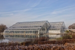
The structure was designed by the architect Peter van de Toorn Vrijthoff (Colborn & Terry, 2007) in conjunction with landscape designer Tom Stuart-Smith. It had to be designed to provide maximum light through the glazing whilst being strong enough to withstand severe weather. The glasshouse needs to keep plants warm on cold winter nights but not overheat during summer – and needs to be warmed or cooled with minimal use of energy.   It has fuggers in the roof to maintain correct humidity and retractable sunblinds which double as heat-conserving thermal screens, with sources of artificial light to assist winter growth. It was designed to provide as authentic an experience as possible in each of its 3 interlinked climatic zones – dry temperate and moist temperate (adjacent in the main area) and a tropical zone overlooking the lake at the front.  The lake itself acts as a reservoir in case of drought.

There are no barriers or doors to pass through and pathways and naturalistic landscaping enhance the atmosphere by showing distinct transitions between the zones.   There is one main pathway in a figure of eight that leads you around the structure as you follow the contours of rocky outcrops and gently sloping gradients, with raised viewing platforms. A focal point inside is the temperate waterfall, in fact without it one would be able to view the entire floor area. The Glasshouse also has an interactive root-zone. Another area leads to a walkway to the linked teaching area.

I’ve been there several times before.  It’s a good feeling to enter such a different space – wide, airy and full of greenness and the scent of flowers. It’s peaceful, never seems crowded. They have butterflies in the tropical zone for several weeks starting in January – weather hasn’t allowed a visit yet this year. They’re not easy to photograph though. It depends on how much moisture is in the air at any particular time. I think the whole design works excellently.  It wasn’t until I went in there, looking with different eyes, that I appreciated how it has all been put together. The structure and design are all focused to enable the visitor to experience the ‘outside’ inside.  It’s accessible to all ages and wheelchair friendly.

When photographing I had to allow for the dynamic range between the brightness of the light coming through the roof and the dark greenness inside.  I visited twice. The first time the sky was almost white and so I went again the moment I saw a blue sky.

I wanted to find a way to show the height of the space and the way in which the different areas had been created. For this I went on the walkway which leads over the top of the waterfall.  As I walked back down the slope I shot through the waterfall. The sight of people beyond the water always pleases me and I’ve noticed that many other people spend time there. Other shots were at ground level. When I went into the rootzone I had my tripod at a very low height so that I could gain a childs-eye viewpoint. I went into the tropical zone but my lens immediately misted over. One thing I noticed though was that the lift is camouflaged so that it fits in with the plants and I did take a quick couple of shots.

Images 1-4

I chose an initial selection of  36 and a second selection of 17, from which I chose 4 plus one of the exterior for context. My intention was to show the height of the structure; how the waterfall feature intersects the space and creates a topography.

As I worked through my choices and printed them I started to think I’d made the wrong choices because really, I think. People visit the Glasshouse for that overwhelming sense of warm greeness.  I want to show, though,  that there are other areas of interest.

2: Lindley Library, RHS,Wisley

Parish of Pyrford and Wisley_50 lr

I hadn’t been able to find information about the architect of the Glasshouse so went into the library which is situated so that you walk past it on your way to the exit.

Anyone can access the library and look for information there and, if you are an RHS member you can also borrow books. The librarian was very helpful and found the book referenced below. It isn’t a large library but is very comfortable with almost a country house feel. Curtained windows overlook the Garden and botanical paintings are on the walls. There are laptop outlets (with PCs available) The book shelves are along one wall whilst the study areas are on the garden wall, with table lamps; Lloyd loom type cushioned- chairs and laptop outlets, plus some PCs available. One of the tables has a selection of children’s toys, books and drawing materials to keep children happy whilst parents do their research and reading.  It’s obvious that considerable thought has been given to providing a comfortable and relatively studious atmosphere yet with some diversion for young children.

I didn’t think it would be appropriate to take out my large camera and so I used my Canon G12 after asking permission to take some photographs.  The major problem was the mix of lighting – daylight from the windows, plus fluorescent ceiling lights and the tungsten table lamps.3

I chose 16 images and then 13 as converted jpeg, from which I chose 2 plus one of the exterior for context .

Images 5-7

Images 5 and 6 don’t capture the colours entirely correctly and adjusting white balance was difficult. I think auto to begin with was the best choice in view of the mixed lighting. I adjusted warmth and colour in PS also using Nik Viveza for some finer adjustments and added more saturation to the toys in No. 7 because bright colours are more attractive to children.

5:  Wisley Church 


This is a very small church but, even so, I’m surprised that there is one at all in Wisley as the place seems very much a road on the way from one place to another.  It doesn’t have a village hall or shop  and the nearest pub, the Anchor, is just outside Wisley. The information I have states that the village never consisted of more than a few farms and cottages (it’s hardly larger now) but its church was more important  than its sister church in Pyrford. (Lewin & Blatch). Foundations of an earlier Saxon chapel (mentioned in the Domesday Book) were uncovered under the present building in 1903, but it is basically Norman work of the mid-12th century.

The stone on the exterior is undressed, apart from the rough flint C19th century vestry exterior and, because of this, of has had to be covered over with a rendering of sand mixed with lime. A hard form of chalkstone was used for the interior and small flints can still be seen embedded therein.  There are many traces of original wall-paintings and three consecration crosses remain. The porch is C17th with a saw-toothed or notched bargeboard. A later brick base has been inserted but much of the timber framing appears to be original (Lewin & Blatch p.4).

I have visited this church once before. To me it seems a simple church without show or finery, more homely somehow than even its sister church St Nicholas in Pyrford.  It has a peaceful air to me (as a non-believer) providing a space for quiet reflection and contemplation without distractions.

I visited the church twice for the purpose of the assignment – the second time when the day was brighter and the sky more blue. The major difficulty inside was due to the high dynamic range of the light.  This is a low -built church and light falls through the windows into the darker interior in such a way that it can’t be avoided, even low-down.

From an initial choice of 40 I reduced this to 14 converted as jpeg  and finally selected 4.  plus two of the outside for context.

Images 8-11

4:  Pyrford Golf Club

_MG_4020 lr

This club was established in 1993 so is relatively new.  It was designed by former Ryder Cup Players Peter Alliss and Clive Clark and they were involved in the building of quite a few new clubs in Surrey around the same time. Plans first went before Woking Borough Council in October 1990. I remember there was continuing  opposition from some of the nearby local residents who were concerned about the potential increase in traffic plus possible loss of freedom to walk on public footpaths.

Thinking about my ‘road trip’ I plucked up courage and phoned the current Manager, Nick Hughes, explaining I was a photography student, and asking if I could take some photographs. He said yes almost before I’d explained and was very welcoming, telling me to photograph whatever I liked and maybe let him have some of the good ones.

This is a modern clubhouse that, I think, is built to a general specification along the lines of the need for it to merge with a landscape and not be over-imposing in height (pre-existing pylons have been incorporated into the design).  The landscaping of the course/s is very important because it has to provide challenge and variety.  I’ve been told that this particular course is definitely a challenging one in the way it has been designed.

Thinking about the basic ‘function’ of a clubhouse, this would be to provide somewhere for members to change clothes; relax and socialize after a game and to have some refreshment. There also needs to be a shop to buy the various needed accessories and clothing. This is not a men only Club and so there needs to be separate changing facilities for women members.  I haven’t been in that many golf clubs but I still have the impression of them being a place for men rather than women, with fairly dark walls and furniture. I was therefore particularly interested in how women were catered for. I spent some time in the ladies locker room; wandered in and out of the shop, and spent some time in the bar. The weather was very bad so there was hardly anyone playing golf outside but a few members were in the bar having breakfast and generally chatting. I had a nice conversation as well with the club captain who’d come over to ask what I was doing.

I think the Club does fulfil its function although it still has more of a masculine feel, despite the deep pink seating. This is probably due to the heaviness of the colours. The Ladies locker room has a softer feel with flowers and lighter wooden fitments.

From an initial selection of 40 I processed a further selection of 22 as jpegs and chose 4, plus 1 for exterior view.

Images 12-15

I used a remote speedlite flash for Image 13 that worked reasonably well against the rather dim overhead lighting.  I’m not happy at all with 14 and 15. I toyed with the idea of not submitting them but decided against this.  I need to learn from my mistakes and show my tutor how it affected the prints.  Obviously the mixed lighting was a real issue again and with No. 15 there was the additional problem of light from the TV. Again – I adjusted individual colours.

5:  St Nicholas Church, Pyrford 


This Church is a Grade I listed building. I’ve read that it was completely re-built between  1140-60 under the auspices of Westminster Abbey so presumably it was built upon the foundations of an earlier Saxon church.  The situation of the church, in a circular churchyard on the top of a hillock, indicates that it was a pagan holy place which was adapted by the early Christians. (Lewin, S, p.1).

Wall paintings

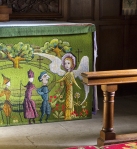
that were part of the original decorative scheme were whitewashed over by Protestant zealots in the reign of Edward VI (1547-53) but some remains of them were re-discovered during a sensitive restoration scheme in 1868-70. There are two sets, one painted over the other. The first series (dating from around 1140) shows scenes from Christ’s passion. The second series (from around 1220)) is known as a psychomachia, a battle between virtues and vices. The details are not very clear, but the painting is represented by the mysterious procession of armed men and a group of horsemen (A. Crosby, (2003) p.19) Crosby also quotes from the diaries of an Arthur Mumby of Wheelers Farm who described the work in progress, The interior was a heap of rubbish; all the old pews and seats gone or waiting rearrangement. A few scraps of old fresco, scraped bare, showed on the walls.” (ibid p. 20).

I’ve visited this Church many times over the past few years and have puzzled over its attraction for me.  I think that a part of it is that I can sit there and feel surrounded by a great sense of history.  There’s no pomp and splendour, glittering gold and noble tombs. This space and its surroundings have been considered ‘holy’ for centuries. What would people have felt/seen in pagan times? I put myself in the situation of someone sitting there in the 1200s during a service – the wall paintings might be viewed as a distraction but they were there to convey religious ‘messages’ to a mainly illiterate population.

Now, as I sit there, light pours through the low windows. I see flashes of colour from the bright hassocks. My eye catches the faint wall-paintings and is then drawn to the altar – its tapestry cover with Norman style figures. Everything delights my eyes and I feel at peace. This is what I’ve attempted to show in the images.

I chose an initial 20 images from which I selected 16 to convert to jpeg, and then a final 4, plus 2 for exterior context.

Images 16-19

Clipped highlights and whited windows really bothered me.  Combining different exposure doesn’t seem to work with such a high dynamic range as in this church. I suppose if I could ask permission to go at night and then use my own lighting I might be able to resolve this for myself.  Yet as I’ve researched on the internet and seen interior photographs they’re often there as well.  Am I being too hard on myself?

Conclusions

Technical aspects

I have referred to these when discussing the individual buildings and have also provided my tutor with a chart of camera settings used in my final selection. I used a tripod wherever possible, apart from in the Library and Golf Club. It wasn’t always possible in the churches because of narrowness of pews etc where I wanted to get close to something but I rested my camera on top of pews or other available flat surfaces.

Using auto white-balance usually seems to work well but not with mixed lighting.  In a perfect world I could switch off lights, mask windows etc but that wasn’t possible with this assignment. I have had to acknowledge that I need to get used to doing a custom white-balance in camera in such situations and not rely on post-processing. I also intend to get more to grips with adjustment layers in Photoshop and all the adjustments that Lightroom 4 offers.

Personal aspects

I started off not wanting to do this part of the course at all but gradually found myself drawn into the buildings;  how their space  is used and the atmosphere engendered.  I’ve also been thinking about particular elements that made me choose these specific buildings – being able to enjoy ‘nature’ whilst being protected from the elements; feeling in tune with history and that sense of being in a timeline; early memories of being a child lost in books and stories and the wonders of the public library.

There are three books that have been shaping my thoughts around this and I intend to write more on this in another blog post. Briefly the books are Gaston Bachelard, The Poetics of Space. (1958); Simon Schama  Landscape & Memory(1995) and Joel Smith The Life and death of Buildings: On Photography and Time (2011).  Smith writes that “Buildings embody durational time” (p. 13) and that photographs are made of time, “Whatever a photograph represents, it represents in time; it represents a thing by representing a state of the thing” (p.14) they project the past. I was reminded of this looking at the drawings and photographs of St Nicholas Church taken at different time periods in Crosby’s book on the history of Woking.

Whilst Schama writes about the way in which landscapes embody culture and folk memories, Bachelard  muses upon the way in which we bring our phenomenological experiences of our earliest homes and shelters into our dreams and memories  and how, “…..the house we were born in is physically inscribed in us” (p. 14).  I realise that this has implications in terms of how spaces are designed and created in buildings and how we interact with our present surroundings.  Maybe an example of this is the way I react to St Nicholas’ Church. It has an almost maternal feel about the way it is designed with it curved roof and I have strong memories also of the dark wood and enclosing spaces in the house where I was born. Schama also writes of how the  primitive grove of trees became translated into gothic churches. In the case of St Nicholas and Wisley churches we have the much earlier version where the trees have been brought into the church in the form of the roof timbers.

29th January 2013

References

Bachelard, G, (1958) The Poetics of Space, Beacon Press, Boston [1994 Ed.]

Colborn N & Perry, C (2007) A Garden under Class: The Glasshouse RHS London

Crosby, A (2003)  A History of Woking Phillimore & Co. Ltd., Chichester, UK

Lewin,S & Blatch, M (1987) Wisley Chuch – Short History and Church Guide Printed pamphlet

Lewin, S (d unknown) A Short History of Pyrford and Wisley Printed pamphlet

Schama, S (1995) Landscape and Memory, HarperCollins Publishers, London

Smith, J (2011) The Life and Death of Buildings: On Photography and Time, Yale University Press

http://www.british-history.ac.uk/report.aspx?compid=42991

http://list.english-heritage.org.uk/resultsingle.aspx?uid=1044721

Church wall paintings

http://www.pyrford.com/history/pyrford.html

http://www.pyrfordgolf.co.uk/

http://www.rhs.org.uk/About-Us/RHS-Lindley-Library

http://www.rhs.org.uk/Gardens/Wisley/About-Wisley/History

http://www.rhs.org.uk/Gardens/Wisley/The-Glasshouse

Home

3. Advice accessed on how to photograph buildings and interiors, plus dealing with lighting

People and Place Part 3

3. Advice on how to photograph buildings and interiors, plus dealing with lighting

Buildings and man-made spaces

I’ve written previously on how I approached the assignment in the wrong order. However, researching how to photograph buildings and interiors made more sense to me when I’d actually finished taking the photographs. I was able to think back into how I approached it all. ).  It is this notion of buildings and man-made spaces as subjects that took a while for me to get my head around. My understanding so far is that, yes, it involves using skills/techniques of, say, architectural photography whilst, somehow, conveying a more tangible sense of a building/man-made space and how it functions in relation to people.

I read two books; four ebooks on lighting  (thanks to Vicki for guiding me there) and looked on the web. I made quite a few notes so all I’m going to do here is to comment on a few aspects that strike me at the moment.

i. Exteriors

I acquired a copy of Gary Kostelow’s How to Photograph Buildings and Interiors (1998).  It’s not up to date of course (there is a later book, 2007, which looks at digital and buildings) and mainly concentrates on analogue in terms of equipment etc but, that apart, I found it very useful in terms of aesthetic aspects to consider. He also provides an illuminating description of an actual exterior shoot (pp. 67) plus some anecdotes around advanced interior photography (pp 159).

Philip Greenspun (1997/2007) suggests, in terms of exteriors, that you need to give old buildings some space – the older the structure the more environmental context is required. Compositional aspects such as compressing the perspective with a telephoto lens often brings out an interesting pattern and you can get increased abstractions. Natural frames such as doorways and windows and fences can frame a subject and draw the eye of the view, as can a visible footpath. I read advice concerning sun angle and the specularity of light;  how the design and texture of a given building will dictate the sun angle best suited for a powerful image.

ii. Interiors

Kostelow states that exterior photography is mostly concerned with form and texture whereas, in interior photography, form and texture take second place to context because a room occupied by humans is entirely related to function:

An interior space is almost always a locus for some manifestation of human life; therefore, interior photography is almost always a specialized form of photojournalism. We record the three-dimensional interplay between cultural artefacts assembled inside a room, and the result is a peculiarly precise and intimate cultural snapshot. This snapshot can be a crude likeness, or it can be an aesthetically elevated, technically faultless representation”  (G. Kostelow, p. 154)

He also remarks that advanced interior photography can be an athletic pursuit where one is physically interacting with the subject and moving around to understand how it functions (p. 159) Similarly, Mark Galer (1999/2006) comments that the choice of vantage point can often reveal the subject as familiar yet strange.

I found three simple guidelines in an ezine from the New York Institute of Photography

  • What is the subject of my photograph
  • How can I give emphasis to my subject – making it large in the frame and featuring a key element prominently
  • What can I do to simplify my photograph or to remove distracting items that take away from the subject such as lighting issues, crooked lines and clutter (thinking about Galer’s comment  regarding vantage points and how they can overcome a distracting background (Galer, M p.86)  ,

iii. Lighting

This was my biggest problem due to some of the buildings I chose –such as a large glasshouse in RHS Wisley Gardens and two old churches. How to balance extremes of contrast in places where I couldn’t do something like mask windows or use much in the way of additional lighting to brighten dark interiors; fill-flash couldn’t quite reach far enough.

Hunter & Reid (2011) reminded me that cameras aren’t like our brains that can deal with extremes of light so one has to sacrifice one or the other. It’s amazing though how the light from church windows can creep into the edges of the frame. I think this is because these are more humble churches – their interiors are smaller and their eyes from the world are much lower.  As the sun was lower, due to the time of the year, going at different times of day (as suggested) didn’t seem to make much difference and even bracketing exposures then merging,  produced a rather artificial image. These churches don’t stay open late either.

That apart, the lighting books were very helpful in general in and the properties of light reminding me about ways of dealing with different kinds of light

Conclusions

My next post will be the write-up on the Assignment itself and I’ll make sure to include information on my choice of  time of day; focal length, aperture; vantage point, and how I dealt with lighting issues.


Bibliography/References

Child, J & Galer, M (1999) Essential Skills : Photographic Lighting, Elsevier Press, Oxford 4th Ed 2088

Hunter, F & Reid, R (2011)  Focus on Lighting Photos Focal Press, Oxford

Galer, M (1999) Digital Photography in Available Light, Focal Press, Oxford 3rd Ed 2006

Kopelow, G (1998) How to Photograph Buildings and Interiors, Princeton Architectural Press, NY

Peterson, B (2010)  Understanding Exposure Amphoto Books, NY

Prakel, D (2007) Lighting: Basics Photography, AVA Publishing SA

http://photo.net/learn/architectural/exterior

http://photo.net/learn/architectural/interior

http://www.nyip.com/ezine/techtips/interiors.html#ixzz2FEYd11GD

(all re-accessed on 9.1.2013.}


People & Place Part Three : 2 – Interiors as Stage and Subject, Looking at some Photographers

People & Place Part 3

Interiors as Stage and Subject : Looking at some Photographers

Andre Kertesz

The book On Reading (2008), contains photographs taken between 1915 and 1970, all on the subject of reading and taken in many places.

It’s a lovely little book to look through, with a delight on every monochrome page, including some images where a room itself is the subject. Bibliotheque de l’Institut, Paris in 1929 (p. 8) a cavernous space with books layered in and  on top of cabinets, spreading upwards onto  a mezzanine gallery. The portrait format image is composed to show the layers – the books, shelving,  the lights and also the aged/braced roof timbers above. Looking at these aged timbers reminded me,  that paper is made from wood and I wondered if that’s why Kertesz framed the shot in this way.

Another portrait format image (p.45)  is taken in the Academie Francaise, Paris, 1929. A man standing, reading, on a library ladder  sets the scale of the towering bookshelves and the image  is composed in such a way that a mirror over a mantelpiece, reflects other parts of the room.

In another image (p. 56) it appears that both a room and a person are subjects as the title is Andre Jammes, Paris, Paris, November 4, 1963. However, the landscape format allows more space to the room itself than Mr Jammes. Mr Jammes and his wife were French antiquarian book dealers so, presumably,  books played a very important part in their life, which is why this image is more than just a portrait , or  even an environmental portrait as such (where the human subject still has prominence). Books spill around the room- large in the foreground on a table, in piles on the floor and neatly on shelves.

Rene Burri 

Magnum Photographer, Rene Burri worked in South America over many years. One of his contact sheets  (Magnum Contact Sheets, 2011) includes the Ministry of Health, Rio Janeiro, 1960. This modernist building was designed by  a team that included Oscar Niemeyer, and was notable for its system of movable sun-shade louvres. The interior shots look as if taken from above a very large, pillared,  entrance hall and one of them (p. 111) shows two women walking across this space. There is a quote in the book (p. 109) by Arthur Ruegg:-

The room with its criss-crossing shafts of light, becomes a stage.  Two women are walking across it with a clear sense of destination their path marked by sunlight. Standing together in the shadows, three men have turned around and are gazing after them.  It is a woven metaphor for the opposite poles of man and woman, light and shadow, soft and hard, horizontal and vertical.

Other images show the men watching as the women approach and then following on. Some of them can be seen here where the room itself becomes a stage for the interplay of light between its inhabitants.

Candida Hofer

My student colleague Keith Greenhough mentioned several photographers in one of his comments to my previous post and I looked at Candida Hofer  who is a former student of the Bechers. She specializes in large format observational photographs of  rooms which often have no human presence yet which have evidence of activity as described here .  I have downloaded  a wonderful one of a library for my paper log. Keith also mentioned the architectural studies of Robert Polidori. I couldn’t find a personal website although I have seen reference to work he did in Versailles. Again I have downloaded an image for my paper log.

Sarah Malakoff :

I discovered her photography through Le Journal de la Photographie  and her website is here .  There’s a post about her in Lenscratch where she is quoted as stating that her photographs are, “examinations of the home as both a refuge from and at times a re-creation of the outside world.”. I contacted Sarah and she gave me permission to download some of her images for this post:-

murals

world

There’s a formal framing about them which resembles staged interiors and yet, still a sense that people live there.

Tanya Ahmed

Tanya is studying photograph with OCA at the advanced level.  I’ll be saying more about her work on East 100th Street, NY when I move onto Part 4 but here I wanted to refer to the work she has been doing on ‘built environments’ .

In her ‘Advanced’ Module Tanya devised a collaborative project, initially with creative writers, where she posted her own photographs of interiors and exteriors (no people), without captions,  and asked for responses to them. Tanya gave her permission for me to show a couple of them here:-

tumblr_m6j4dfe1en1rtfbybo1_500

(c) T. Ahmed

tumblr_mag49jDR161rtfbybo1_500

(c) T. Ahmed

Comments were posted on the project site and/or on the OCA student site (the latter is password protected but the link for those who have the password  is here ) . I contributed and was fascinated by the many different responses and the moods, memories etc which were evoked by the same image and the influences of colour, texture, angle and line. Tanya has evaluated the project and referenced the photographers and artists who influenced her (including Candida Hofer) and she was happy to allow me quote from this.  In describing her images she contrasts them with those of Hofer, writing:-

I am not celebrating grand architecture or design …I am isolating quiet moments of communal life in the city and not abstracting them or making them impersonal”. ……Whereas Hofer’s libraries and theatres offer recreation and specific higher purpose, my spaces offer only personal purpose as determined by the individual not by the space. They are in effect spaces where the human mind is free….. (2012)

Richard Rowland : The Regency Project

The Regency House, 29-32 Oriental Place, Hove has been through several incarnations in its lengthy history – originally four houses, then combined into one in the 1930s, it had been an hotel; YWCA and then a hostel for the homeless before being acquired by the Brighton Housing Trust (BHT). BHT made the decision to re-furbish the building , in fact virtually dismantle the interior, in two stages whilst residents still lived there and Richard Rowland was commissioned to  document this three year process through photographs.

The images below are reproduced with Richard’s kind permission.

bob_bed

The Regency Project Image 2               © Richard Rowland

wall_mirror019

The Regency Project Image 12                   © Richard Rowland

I can do no better than quote from an essay in the book, by David Chandler, Photoworks, that sets the context of this project.

‘Rowland’s photographs do not attempt a comprehensive record of the building work. He steps back from the process of structural transformation in search of what the building might reveal or suggest as it is systematically taken apart and then remade. And, importantly, he has chosen to place the experiences of the residents at the centre of his work. For him the building process was as much an excavation as it was a renovation, both in the uncovering of a material past in bricks and mortar and in the releasing of long forgotten atmospheres, as though the house itself had in some way absorbed the memories and experiences of people who had stayed and lived in its rooms over generations.’ (p.37)

The essay itself can also be read here .  The book is very interesting with its combination of photographs – old and new, with the shots taken of the interior before it was gradually re-structured and brought to new life. There’s a strong presence of the people who live there even though there are very few photographs of them.

Summary

I can go on looking at, referencing, and writing about photographs who have interested and influenced my thinking about interiors but will stop here.  What I’ve learned is that there don’t need to be actual people in images of interiors to evoke particular moods or the presence of people.  it can be small details, seen as the eye searches an image, that can achieve this. The distance of subjects/focal length also has an effect – e.g. in Hofer’s photograph the image is taken from above so that the lofty height of the room can be seen and this evokes grandeur and majesty. In Tanya Ahmed’s image of the corner of the room this is much closer; a space within a room; showing the soft colours which suggest intimacy and comfort.

I’ve already acknowledged (confessed!) that I looked at other photographers mainly after I had taken images for the assignment itself so hope I have built upon my learning for the future.  I was aware though, from the start,  of, somehow, beginning to enter into the atmosphere of a particular environment, to imagine I spent considerable time there and to look around to see what was catching my eye the most, what attracted me either positively or negatively. I think it was looking at Tanya Ahmed’s project photographs and thinking/writing how I responded to them that influenced me here from the beginning and now I also have Richard Rowland’s work to think about.

Having to cope with various types of lighting indoors was challenging for me and I realised that I still haven’t fully absorbed the relevant skills/techniques that are needed for interiors. This led to more searching on the internet and looking at books which will be the subject for my next post.

References

Ahmed, T (2012) Assignment 5-Advanced, Unpublished Paper

Lubben. K (ed), 2011,  Magnum Contact Sheets, Thames & Hudson Ltd, London.

Rowland, R (2007) The Regency Project, anotherpublication 2007,

Websites

http://builtenvironmentphotos.tumblr.com/

http://buserver15.aharonic.net/RICH/Essays/essayRR_DC.pdf

http://lejournaldelaphotographie.com/archives/by_date/2012-08-18/7978/sarah-malakoff-untitled-interior

http://sarahmalakoff.com/

http://www.bookpatrol.net/2008/08/andre-kertesz-on-reading.html

http://www.icaphila.org/exhibitions/past/hofer.php

http://www.lenscratch.com/2012/04/sarah-maklakoff.html

http://www.magnumphotos.com/C.aspx?VP3=SearchResult&ALID=2K7O3RP0468

http://www.magnumphotos.com/Catalogue/Rene-Burri/1960/BRAZIL-Rio-de-Janeiro-NN136751.html

http://www.richardrowland.co.uk/


Part 3 : Buildings and Spaces – 1. Approaching buildings and spaces

People and Place

Part 3 : Buildings and Spaces

1. Approaching buildings and paces

I’ve been thinking that I did this all the wrong way round, mainly from that feeling of anxiety that seems to have been with me all the way through this particular module.  Knowing that this is because I’m being challenged to step outside my comfort zone doesn’t seem to have helped me! For quite a long time my energy was directed more towards the inner anxiety than getting out and about, with the result that I felt quite ‘stuck’ and lost any pleasure in taking photographs .  Thankfully I did struggle on, even if lamely, and slowly got more interested in buildings and how they function.

My process has been to go around taking photographs using my smaller camera to just get a grip on photographing the buildings both before and after taking the shots for the assignment itself. It was only when I became more interested that I knew I had to read more about lighting and also look at some photographers. I actually think that if I’d done the latter before taking the photographs it could have made me more anxious so, although it seems topsy-turvey, it has been a more effective way for me to learn.  I think the outcome might eventually been that I re-do the assignment, but I’m staying with what I’ve already produced for the time being.

The Projects and exercises are around Space and Function, including the user’s viewpoint, and Space and Light.   It was light that was particularly challenging because, at this time of year the sun is low on the horizon; days are darker and interiors are lit by artificial light. I haven’t precisely followed the Project briefs but have kept them in mind. I used automatic white balance throughout to allow for the mix of daylight and different types of artificial light.

Here are some buildings and their interior spaces:-

Town Centres


Town centre 12x3 low res


A recently revamped Woking.  The newest shopping area is on four galleried floors so, if you suffer from vertigo, it’s best not to look down from the top!  The top floor contains the Cinema and Theatre and the bottom one (below ground level)  is mainly a café/food outlet area. There are some food outlets on the other floors but not many and I don’t know what the psychology is concerning having most eating areas on one floor.


Guildford

I was there recently with my youngest grand-daughter and she introduced me to shops I’d never visited before. In one of them she warned me beforehand, “It’s very dark when you go in and there’s a strong smell from their perfumes”.  She was right! It’s accessed from a lower entry level of the Friary Centre (actually built on the site of a former Dominican Friary.   I was quite intrigued by the way the space was used. It is dark so you can hardly see the clothes but there are spotlights around which highlight say, one shirt amongst many.  The whole effect to me was of going into an Aladdin’s cave, and the only problem was that I found it really hard to read the price labels.  There is a comfortable seating area by the cash tills so that friends can wait for you to pay and, should the queue be rather long, there are the perfumes and potions stacked on shelves to tempt you. A major problem for me was that the cash till area is also gloomy so it was quite hard to see to pay. This really is a shop for young people with their keen eyesight.

Thinking about function and a user’s viewpoint I took a straw poll amongst some of my grandchildren.

“It caters to teenagers’ needs. The style of the shop is dark and gloomy and they like the vampire feel. With the spotlights on the clothes it’s as if the spotlight is on you when you wear them. The clothes are slightly more expensive so it makes you look richer when you wear it” (12 yr old girl)

“It’s dimly lit so you can’t see the clothes. It’s cramped in size and the clothes get jumbled together. Because everything is in piles you could pick up the wrong size. The clothes are expensive for what you get”  (16 yr old girl, who is a fan of Topshop and H&M)

“It’s different from other shops and has a completely different layout. Because of the darkened interior any lighting on the clothes makes them stand out” (19 yr old boy).

I should add that after the shopping, we went to the food court which, in this case was on the top.

IMG_1201 lr


Hotel

My usual complaint when I stay in a hotel is that it must have been designed by a man.  Mirrors never seem to be located near enough to an electric socket where I can plug in my hairdryer. If a hairdryer is provided it’s usually very slow on speed and the cord often isn’t really long enough.  I’ve also noticed that quite a few boutique hotel rooms are decorated in masculine shades of brown, with low lighting. This might be good for creating an intimate, cosy atmosphere when you’re going to bed but not in the daytime.  However, my prejudices were more or less confounded when I recently stayed in the Hotel Metropole in Brighton when I was down there for a weekend study Visit with OCA.

The Hotel is currently part of the Hilton group.  It was designed by Alfred Waterhouse in 1888 and built in 1890, see here . It faces the sea and has a wonderfully gracious air of Victorian splendour, combined with a modernized interior, including the bar .

On the ground floor the areas are spacious and lofty. Artificial light on shiny floors adds to the glitter of the chandeliers. The first impression is of ritzy opulence and is in keeping with Victorian grandeur and a 4* hotel.

IMG_0982 low res


The bedrooms are according to price – mine was an upgrade from a single to double. The room was mainly bed but with space for an easy chair and I was pleased that mirrors and electric sockets were in the right place together. I would have needed a very wide-angle lens to make the room look spacious in a brochure but it was sufficiently large for its purpose, which was somewhere comfortable to sleep. I took the shots in the bar from a seated position. The bar area was large and chairs were arranged in clusters.


Library

I still frequent the library where I used to live. It’s fairly small and the shape is a unusual

IMG_1204

It was built in the 1950s I think and is round inside.  The panels on the exterior make it look a hexagonal shape. It sits in one of the car parks close by the shops, with the larger supermarket across the road. I looked at it from a seated point of view and then I crouched right down to get a child’s view of the children’s area.


Coffee Houses

Costa Coffee is well-known.  It’s now owned by Whitbread plc.  The ones I’ve been in have all had comfortable, leather-like chairs’ a fairly dark interior, artificially lit even in daylight, which adds to a more intimate atmosphere. Papers are available for people to read. This is one is in the same  village as the library above. It opened some months ago in a part of the space which had previously been occupied by Woolworths.  It’s very popular and busy for a small shopping area but there’s no apparent pressure to finish your coffee quickly and leave.


On the other hand, an independent coffee house has recently opened in Ripley, a village nearby. There are more than 20 listed buildings and cottages in the village and Pinnocks is in one of them 

IMG_1098 lr


You get a warm welcome and coffee produced from the drip feed method here.  It’s a wonderful combination of the old with the modern and good use is made of the interior. Downstairs there is the serving counter, a small shop area to one side and a few tables – arranged between the old wooden beams. Upstairs is ‘the library’. Low, squashy, more traditional type armchairs nestle in clusters beneath the exposed rafters.


Summary

At first it seemed like a chore to have to photograph buildings and interiors as they’re not usually the type of subject I’m interested in.  I made it easier for myself by using my smaller camera, so as not to draw too much attention to myself. This worked because I’ve now become much more aware of and interested in how interiors are designed to produce particular atmospheres and suit users.  My next post will be based on books and other photographers.


References

http://britishlistedbuildings.co.uk/en-288713-pinnocks-cafe-and-clifford-james-shoe-sh

http://en.wikipedia.org/wiki/Guildford_Black_Friary

http://pinnockscoffeehouse.com/

http://shoppingwoking.co.uk/

http://www.dexigner.com/news/25307

http://www.mybrightonandhove.org.uk/page_id__6018.aspx


Prix Pictet : Saatchi Gallery


Prix Pictet at the Saatchi Gallery

OCA Study Visit : 20th October, 2012

I’m late getting around to writing this up but here goes:-

Objectives:

  • Gain a personal perspective on the work of photographers shortlisted
  • Reflect on the expereience of seeing photography in a gallery
  • Network with other OCA students

Suggestions for looking and reading were to  look at the shortlist on the Prix Pictet website ; look at Luc Delahaye’s work on the Guardian website and read what Sean O’Hagan had to say in the Guardian here

The Prix Pictet – information summarised from the website

The first prize was inaugerated in 2008 and operates on an approximate 18 month cycle.  It is sponsored by Pictet & Cie the private bank in Geneva which was founded in 1805; has focused solely on managing the wealth of private and institutional investors and was a pioneer in the field of  institutional asset management.  The prize, “aims to uncover photographs that communicate important messages about global environment and social issues within the broad theme of sustainability”. Different years have had different themes and the theme for this year was Power.

I found entry requirements to be rather ambiguous. Although it is stated that entry is by nomination (from a long list of leading experts who can nominate up to 5 photographers) information also stated that photographers not nominated, but wishing to submit work for consideration, are invited to contact the Secretariat.  Once submitted the independent jury draw up a shortlist and select the winner. The jury are looking for work with a high artistic quality and considerable narrative power and no preference is given to any particular genre or technique or “different potential type of audience for any class of photograph”  etc.  I think that’s a very egalitarian approach. There was no indication I could find on who nominated which photographers and whether any of the photographers had nominated themselves.

The Exhibition

It was lovely, as ever, to meet up with OCA staff and students and debate/compare impressions and views. On this occasion I didn’t experience that kind of confusion which occurred on my previous visit to the Out of Focus Exhibition at the Saatchi. The images seemed more straight-forward to me and I understood the concepts behind them in relation to Power in some of its many guises.

I’m not going to go through all the images and photographers short-listed but choose a selection I found particularly interesting. I contacted Prix Pictet via Candlestar  and have their permission to download images from their site with full captions and credit to the artist.

I’m currently reading Visual Methodolgies(2012) by Gillian Rose. She is a professor of culture at the Open University and I gather that her background is in geography and her current research interests are within the field of visual culture. Her staff profile   “I am interested in visuality as a kind of practice, done by human subjects in collaboration with different kinds of objects and technologies” . Prof Rose also has a blog here .

Visual Methodologies  looks at ways of researching visual materials and outlines her criteria for a visual critical methodology:-

Visual imagery is never innocent; it is always constructed through various practices, technologies and knowledges. A critical approach to visual images is therefore needed: one that thinks about the agency of the image, considers the social practices and effects of its viewing, and reflects on the specificity of that viewing by various audiences, including the academic critic. (Summary p.17)

I have kept this in mind in thinking about this Exhibition.


Luc Delahaye – The winner

Sean O’Hagan described Delahaye as a controversial winner here.  I’m not sure why exactly.  Is it because he now considers himself as an art photographer rather than a photojournalist; the scale, detail and detachment of his images, the prices they bring or that his work “willfully blurs the line between reportage and art, with all the underlying contradictions that suggests”.

I found an earlier piece by O’Hagan  regarding Delahaye and war photography and an Exhibition at Tate Modern in 2011. This again commented on the blurring between reportage and art; the scale and the sense of detachment.  I noted that O’Hagan is one of the nominators for the Prize – presumably he didn’t nominate Delahaye.

Delahaye was awarded the Prize for various works, all concerned with issues of power.  This one commanded my attention the most and not just because of its size.


132nd Ordinary Meeting of the Conference<br><a href='/portfolios/power-shortlist/luc-delahaye/luc-delahaye-002/'>More information</a>

Prix Pictet Power Winner – Luc Delahaye

132nd Ordinary Meeting of the Conference
15 September 2004, OPEC Headquarters, Vienna, Austria

The image is very large and has a much more powerful effect seen in its actuality as opposed to on a computer monitor where its chiaroscuro effect comes over more as murky rather than a shadow play of light and dark (the work has been likened to those by Caravaggio) . Certainly, overall, there is an   impression of  shadowy politics, power-plays and deals done in private at a time when world oil prices were soaring (and continued to do so).  Is this about the power of the press who can bring such practices to light or on the power of the oil nations? The press  are really the ones in Delahaye’s focus here as they  thrust microphones into faces and lean over the table. Going back to the power issue – if it’s about the power of the media then what did they achieve here?

I spent quite some time pondering over the point of view  – how large was the room; where was Delahaye standing; who were these people at the back; were there any women there?  I wondered what the room was like to such an extent that I did a web search to see if I could find other images of the event. Here is a different view from an earlier conference of that year where you can see the dimensions of the room.

I also discovered an image similar to Delahaye’s taken by Joe Klamar  (of the 2012 Olympic Athletes portraits fame) which is on the Getty images site – Image No. 51309330 – taken from a similar vantage point but narrower focus. (the link is too long to include under References)


Daniel Beltra : Spill

Beltra took photographs from 3000 feet above following the April 2010 BP oil spill in the Gulf of Mexico.

Oil Spill #4: Oil mixed with dispersant rises up to the surface near one of the relief wells.<br><a href='/portfolios/power-shortlist/daniel-beltra/gulf-of-mexico-louisiana-usa-may-18th-2010-aerial-views-of-the-oil-that-still-leaks-from-the-deepwater-horizon-wellhead-the-bp-leased-oil-platform-exploded-on-april-20-and-sank-after-burning-2/'>More information</a>

Daniel Beltrá 
Oil Spill #4: Oil mixed with dispersant rises up to the surface near one of the relief wells.

Series: Spill
18 May, 2010
Gulf of Mexico, United States

The images are beautiful in themselves, despite the devastation caused by the spill, and I know disquiet has been expressed regarding making the ugly beautiful. Of course I understand that but, on the other hand, oil has no intent to harm or consciousness (so far as I’m aware). It just ‘is’. It’s the uses and misuses it’s put to that can cause the damage. In the series as a whole, Beltra has recorded the devastation and how the environment has suffered – see his website here but those images weren’t exhibited at the Saatchi.

Edmund Clark – Guantanamo : If the Light Goes Out

This series explores the spaces and objects of power and control at Guantanamo.  He also followed this up with a series Control Order House (exhibited recently at the Brighton Photo Biennial http://lighthouse.org.uk/programme/monthly-talk-edmund-clark , where he photographed one of the released Guantanamo inmates back in the UK and subject to a variety of restrictions upon his ability to move freely.


Camp Six, Mobile Force-Feeding Chair<br><a href='/portfolios/power-shortlist/edmund-clark/camp-six-force-feeding-chair/'>More information</a>

Edmund Clark
Camp Six, Mobile Force-Feeding Chair

Series: Guantanamo: If the Light Goes Out
2009
Guantanamo Bay Detention Facility, Cuba

The images are stark and there are no people.  It was a strange experience, because looking at these images took me back to other places.  I immediately thought of the electric chair which is still used in some US States. The chair also  reminded me of a visit a year ago to our local Lightbox Gallery, Woking.  One of the permanent displays concerns Brookwod Hospital – and changing attitudes towards mental health. The hospital is now closed and replaced by care in the community,  on which I shall abstain from comment,  and also a fairly large private housing estate. In one of the display cases there is a replica of a ‘whirling chair’  used as an early treatment for schizophrenia, and to tranquillize patients. I feel dizzy thinking about it and can only imagine the effect on those poor souls.

I watched a video podcast on the World Photography Organisation site where Clark is interviewed by Keley Sweeney. The link was in the December 2012 Newsletter which I now can’t find but, thankfully, I did make notes. In the podcast Clark explains that the underlying concept in the Guantanamo series  was to fine a new way of looking and conveying the disorientation and dislocation experienced by the inmates without displaying the face of a detainee. He is asked about the restrictions he had to deal with and explains how  he explained his intentions to the authorities. He had to use a digital camera and the photographs were reviewed at the end of the day.  Disorientation of inmates was central in the Guantanamo regime as a means of control and part of the way he conveyed this was to have mixed-up images in his book. So far as the follow-on was concerned in Control Order House Clark said that  these men were innocent but the dehumanization and demonization remained. He wanted to look at the normality and ordinariness of their domestic space so as to present a mirror to bounce preconceptions back at the viewer and provide a way of bringing the experience closer to their own experience.  I won’t write more here but, apparently, the book is due out this New Year.

Camp Six, Unused Communal Area<br><a href='/portfolios/power-shortlist/edmund-clark/camp-six-unused-communal-area/'>More information</a>

Camp Six Unused communal area

This one reminded me of a visit to Broadmoor Hospital some years ago when we were shown some new cells. All the fittings were fixed to the floor, made of either stainless steel or plastic and had smooth/rounded corners so that they couldn’t be used as weapons or for self-harm. Overall, looking at all the images reminded me of the uses of various forms of detention and what goes on behind locked doors that we might suspect but shut off in our minds somewhere.

Rena Effendi : Still Life in theZone

Haunting images

Gas masks scattered on the floor of a school lobby in the abandoned city of Prypiat. As a result of the nuclear accident and the subsequent...<br><a href='/portfolios/power-shortlist/rena-effendi/rena-effendi-still-life-004/'>More information</a>


Gas masks scattered on the floor of a school lobby in the abandoned city of Prypiat. As a result of the nuclear accident and the subsequent radioactive fallout the entire population of Prypiat had been evacuated and never returned home.

Series: Still Life in the Zone
December 2010
Chernobyl, Ukraine


A while before the Exhibition visit I had read an interview of Rena Effendi by OCA tutor Sharon Boothroyd recorded in her blog Photoparley .  At one point Sharon asks Effendi, “Do you think being a woman has influenced how you take pictures”.  I would really have been interested in a direct answer to this but one isn’t exactly forthcoming. Instead, part of the response is

 “I think that acknowledging the fact that you are not in control is very humbling for both men and for women….I have found that what interests me most is these tender human moments in the face of disaster or brutal life experience”

This series uses still life images to convey the long term effects of this nuclear accident and also the way in which the human spirit can survive. Effendi’s  Artist’s Statement informs us that the ‘Zone of Alienation’ – the area around that which is restricted, has a population of 200 people, mainly elderly women. What is it that would make these women choose to return? Also, I’m going to have to remember to keep this question of differences between male and female photographers in mind.


Summary

I enjoyed the Exhibition. It made me think around the issues involved in what was being depicted, without having to go through confusion and frustration as to the underlying artistic concepts. Maybe I’m too simplistic or maybe it’s because I do have leanings towards photo-documentary. Although I haven’t been precise about this I do think that I have also followed the sense of Gillian Rose’s methodology


References

Rose, G (2007) Visual Methodologies, Sage Publications Ltd, London


http://kamame0.tripod.com/treatment/id3.html

http://lighthouse.org.uk/programme/monthly-talk-edmund-clark

http://thelightbox.org.uk/about/wokingsstory

http://photoparley.wordpress.com/category/rena-effendi/

http://visualmethodculture.wordpress.com/.

http://www.candlestar.co.uk/about-candlestar/

http://www.chinadaily.com.cn/english/doc/2004-04/01/content_319712.htm

http://www.danielbeltra.com/spill

http://www.guardian.co.uk/artanddesign/2012/oct/09/luc-delahaye-wins-2012-prix-pictet-award

http://www.guardian.co.uk/artanddesign/2012/oct/09/luc-delahaye-wins-2012-prix-pictet-award

http://www.open.ac.uk/socialsciences/staff/people-profile.php?name=Gillian_Rose

http://www.prixpictet.com/