Reflection on Assessment Feedback

Completion and moving on to the next Module

I was very pleased to be given 75% for People and Place. It’s taken a while to sink in I think because I felt quite ‘flat’ for a while. I received the written feedback two days ago and it’s quite brief. In fact comments on achievement against assessment criteria pretty much match the wording for the criteria. However, the Overall Comments and Feed Forward state:-

This is an excellent submission and your dedication to your studies and furthering your understanding is exemplary Your final project is visually accomplished and effectively and evocatively conveys a sense of the spirit of the place, and responds very well to the theme of the module as a whole. Great to see you developing personal projects independently of the module – try to pursue these in Assignments.

I felt particularly pleased at the words, “…evocatively conveys a sense of the spirit of the place” because that is something I’d been aiming for since Assignment 3. I’d also expected I might get a comment about the personal projects as well.  Somehow or other I just hadn’t been able to think around them enough to fit them into an Assignment and yet I’m not sorry about that. The work I did on Winchester Cathedral transferred into Templemere in terms of endeavouring to enter into the spirit of those different places.  Somehow, I think I’ve found an inner key; a floating absorption that seems to alter my vision and breathing and allows me to connect people and place in a way that satisfies me.

I feel more grounded now and in a better place to approach Digital Photographic Practice where I’ve been lagging for various reasons.  Many thanks to all those who’ve followed and encouraged me with feedback and support and I hope you’ll stay with me on my journey.

My new blog for DPP can be found at http://catherinebanksdpp.wordpress.com

13th December 2013

Part 2 : Arles in Black


Arles in Black 

Looking back at my notes I realise I actually forgot another of my aims  for the weekend – an unvoiced one at the time which was “To experience creative anarchy”, and that’s what happened as Space, Place, Imagery and Heat combined! What particularly struck me at the time, and has stayed with me, was presentation – how the work was put together conveyed and in what type of space. Of course, whilst reflecting on the impressions since then I’ve also been doing some further research. Don’t know how this will turn out – let’s see. I won’t be writing about all the photographers I saw, just ones that struck me the most at the time. I’m sure I’ll rediscover the others as I continue my journey with the OCA.

Guy Bourdin 

The Darkroom

Our first Exhibition viewing – in a beautiful building,  Espace Van Gogh  but within a created, dark space

_R010148 lr


Bourdin was a fashion photographer between 1955 and 1990.  The Arles Catalogue (p.63) describes him as “an autodidact, whose life was devoted to a wide spectrum of artistic research: painting, photography, filming and writing”.  I like that word, “autodidact”. – self-directed, learning through a contemplative and absorbed process.

This Exhibition (as other previous Exhibitions) was curated by Shelly Verthime who must know his work so well.  100 manila envelopes, each containing a single negative, with a contact print attached to the front with sticky tape were found by her in 2011 when she was working with Bourdin’s archive. Shelly Verthime has written three books about Bourdin. I know she is London-based but can’t find out who she is, just the occasional comment on the web that  refers to her as a Cultural historian, Bourdin’s biographer, art maven. Here Shelly Verthime talks about Bourdin’s use of mirrors in his images

There is magic in the mirror as much as there is magic in Guy Bourdin’s work. With both, the more you look the more you discover. The mirror tells you the truth. (2011 in Dazed Digital website)

According to Linkedin she has an MA from the Royal College of Art.  Trying to find out who she was and how, she became involved in the Archives became what I realised was a ‘search for Shelly Verthime” rather than for Guy Bourdin. In fact there was little I can find so I think she must be quite self-effacing. I became curious about her choices of image and presentation from Bourdin’s archive and the fact that, actually, we are seeing him through her eyes as she looks through the mirror.

What I thought as I looked through his fashion images was of how often I might have seen them in magazines in the past and just flicked over the pages so quickly not taking in how he was portraying these beautiful women and his use of layers, sun and shadows. There was much about frames here. The compositional frame and also the image frame.  Why were very ornate frames used on some black and white images and not on others? Were these frames ‘old’ or newly created? What did each frame achieve? The ornateness of the frame stopped my eye.  I wanted to get rid of the frame to get closer to the image but the frame got in my way. These images were of ‘ordinary’ people including children, and we discussed the intention of the frame. Was it to make these ordinary people special; just as special as elegant and glamorous models or famous people. The polaroids were in the exact centre of a white mount within a white block frame. What if they  were swapped with those other frames. How might they look then.

Hiroshi Sugimoto

Revolution

New work in black and white resulting from an out-of-body experience whilst gazing at the horizon and his sense of the earth being a watery globe.

_R010158 lr


Again the room was dark with the large (2.70m) prints, arrayed around the walls, “that immediately immerse visitors into meditation”  (Catalogue contents page). Actually I was immersed into craning my neck to see the images the right way up and wondering why he chose to up-end them. I think the prints were aluminium; certainly the spotlights reflected off them.

Couleurs de l’ombre

The result of Hermès Editeur – editions of works of art on silk,  otherwise known as scarves – a project dating back to 1937 and involving collaborations with contemporary artists, the first edition being Josef Albers.  Available Sugimoto scarves are retailing at €7,000 according to the Hermes site.  I love silk but this is a lot of money!

This series emanated from Colours of Shadow – polaroids by Sugimoto taken at 5.30am every day from late 2009 to the beginning of 2010 through a fascinating process whereby sunlight striking though a prism refracted into colours, which were then projected onto his mirror and reflected into a dim observation chamber where he reduced it to Polaroid colours.  (p. 26 Catalogue).  In the project with Hermes  20 polaroids were transposed onto silk, in editions of 7 giving a total of 140 scarves each measuring 140cm x 140cm.

The Exhibition was in the Eglise Saint-Blaise which was founded in the 6th Century and abandoned and sold as a national property during the Revolution. Presumably it’s no longer used for religious purposes.


The scarves hanging like pennants on the old stone walls – a gangway for the viewer to walk along (instead of a model wearing one of the scarves);  small polaroids contained in glass ; the prism on a plinth where the altar might have been, with the backdrop of  “The Last Supper” (from an edition of 5) a print that was damaged in Hurricane Sandy.

To me this Exhibition was about worship – of money and the cost of beautiful objects. It was about patronage of the arts by wealthy benefactors. The pennants of scarves reminded me of the flags hanging from the walls of Churches and Cathedrals. Was this about the glory of Hermes; the glory of Sugimoto’s art? Has Sugimoto given in to the blandishments of wealth and commerce?

Eric Kessels 

Eric Kessels is an artist, collector of vernacular photography and co-founder and creative director of KesselsKramer, an independent international communications agency.  He had two Exhibitions at Arles in the Palais de l’Archeveche another lovely building with an impressive entrance

_R010168 lr

Up the stairs we went into rooms full of photographs

24 Hours of Photos

Taking a physical look at 24 hours of digital images uploaded to  Flickr. A windowless room flooded with them creeping up the walls.  We could look from below and from a platform above.

_R010174 lr

Actually I could see the installation base underneath so there weren’t as many as there seemed, but still – it was a graphic representation of the way in which we’re deluges with digital images day after day – and contribute.  It’s just occurred to me as well that maybe some of my images might be there. What day, month, year?

The Family Album

Several rooms – spacious high-ceilinged with beautiful windows and fireplaces. Photographs – single and in albums – large and small, some stained and creased. In heaps, displayed on the wall in various sizes, printed on rugs on the floors


All those people and discarded memories.  It reminded me of clearing my parents’ house after they both died; having to decide what to keep and what to throw away. Think of all those millions of people who go through the same process. I just wonder if any of them were there in those rooms in Arles and recognised a relative.

There is a quote by Kesslers in the catalogue (p. 346)

A long and dedicated search through photo albums will occasionally reveal something less than perfection, something other than an entry in the competition to appear normal. And in these cracks, beauty may be found.

I think he created such poignant beauty there in Arles. I sense a tenderness in the way he put all those images together and considered them worthy of display.

Some Conclusions

Here has been just a snapshot of images seen and places visited in the old City of Arles with its beautiful, old buildings.  Thinking about it now I realise that I was more affected by Exhibitions in those buildings than the ones in the Ateliers.  The environment does make a difference (at least to me) so does this mean I’m more concerned with style than content – something I need to think about.  As a postscript to that,  I had wanted to see Bibi  the Exhibition of photographs by Jacques Henri Lartigue. The Exhibition had been in Eglise des Trinitaires but had closed by the time we arrived. However I did have an opportunity to see it on a visit recently with John  to the Photographers Gallery . It  was a busy day for the Gallery, with a group of young people on a guided tour with one of the Exhibition staff. The Photographers Gallery is plain, modern, the talk was loud and distracting.  I looked at the images and thought, “Family photos with a flair. Wealthy people in wealthy places. Interesting as a historical record on dress and lifestyle etc.”. I talked with John about it and he said the photographs looked very different here in a plainer environment than they did for him in that Church in Arles.

The Bibi photographs reminded me of visiting Polesden Lacey in Surrey – home of Mrs Greville an Edwardian hostess and friendly with Edward VII and his coterie.  Earlier than Lartigue but still that rich lifestyle and many photographs from that era scattered around the luxurious rooms. Sounds like Kessler’s Exhibition a little maybe, although his images were of ordinary people doing ordinary things. No less interesting for that!

I think my Arles experience will stay with me for quite a while. I learned more about the difference that presentation and the environment can make to a viewing experience.  Another aspect for me is that I felt much more connected with those photographs from Kessler’s, the Family Album than I did with that Flickr River and its torrents.

References

Les Recontres Arles Photography (2013), Arles in Black, Actes Sud 2013

http://www.dazeddigital.com/artsandculture/article/5378/1/guy-bourdin-ses-films [accessed 24.10.13]

http://www.rencontres-arles.com/A11/C.aspx?VP3=CMS3&VF=ARL_1024_VForm&FRM=Frame%3aARL_1131&LANG=English

http://www.telegraph.co.uk/culture/photography/10149023/Les-Rencontres-Arles-Photographie-2013-The-unseen-work-of-Guy-Bourdin.html

http://en.wikipedia.org/wiki/Guy_Bourdin

Overall Self-Assessment for People and Place


The Digital Photographic Practice Handbook has now arrived so this seems the right point, just before the Assessment event, to look back and assess my overall progress since April 2012 when I first started People and Place. I won’t go into any particular detail here because I reflected all the way through my blog on specific aspects as I’ve written up the Assignments.

Progress through the Module

There were times during those first months when I wondered whether I would get through it and felt ‘stuck’ because so much was challenged in respect of my inhibitions, skills and general competence around photography.

_MG_5354 12x8 lr

I worked at a much slower pace compared with TAOP but I’ve realised recently that I’ve covered quite a lot of ground in terms of taking on new ways of looking at photography; reading; understanding, and also building supportive networks. The first Assignment, being portraiture, seemed a big hurdle to jump but I learned through completing it that I do have some interest in environmental portraiture and so I enjoyed the second Assignment more and photographing people in their allotments.  I hadn’t expected to enjoy photographing buildings for Assignment 3 but, although I struggled with interiors and working in low light, I became absorbed in understanding how people experience space and place and practised achieving an almost meditative state to gain a sense of place and find the personality of a building. It was also at that point that I began to contact photographers to ask permission to use their images on my blog.

Building supportive networks

I can’t say I’m a group person but I’m certainly not a lone worker and links with other students continue to be very important to me. I began the Module with an independent Residential Workshop at the Photographers Place in Derbyshire but have been on a further three OCA-related residential visits – the student organised weekend in Leeds, and the OCA visits to the Brighton Biennial and Arles. I’ve continued to join day Study Visits, including the Talk by Tom Hunter where it was fascinating to learn about his experiences and approach towards photographing ‘ordinary’ people and making his chosen home area come alive. At one point I realised that I was getting over-saturated with images and overwhelmed by all the reading and research I was doing after Study Visits and so I have cut down on this to some extent and attempted to get more of a balance. I was very pleased though to be named as ‘Blog of the Week’ in August last year on the WeAreOCA blog.

The OCA Thames Valley Group meetings have been very important in motivating me to improve my photography practice. It’s certainly helpful to discuss photography on the online Forums and Study Visits but there’s nothing to beat sustained face-to-face discussion and risking showing ‘work in progress’. An outcome of that has also been some informal, smaller get-togethers to look at Exhibitions etc. I

What kind of photographer might I be becoming?

It was only when I was working on Assignment 5 though that I realised that everything seemed to be coming together for me.  I had built a Project that combined People and Place and past and present in terms of looking at how an architectural concept from the 1960s worked in practice and I enjoyed every aspect of this.  I have also begun to get an inkling of the kind of photographer I might be developing into.

I’ve realised that I am particularly interested in Cultural Geography, the interaction between people and their environment and living history. I was reading somewhere about ‘quiet’ photography that somehow allows the subject to speak for itself and that appeals to me.  Some ‘sleeping’ skills also re-surfaced during Assignment 5 and that was talking with people about their lives and hearing their stories – something that was the backbone of my working life. Writing about all that isn’t a problem at all but I know that what I need to develop is my confidence that I can do people justice with my photography.

Areas for improvement

Obviously I need to improve and develop generally but there are some aspects that I think need particular attention. I enjoy the printing process and have always submitted prints as well as digital files for Assignments.  My tutor on People and Place was generous with his suggestions for improvements and generally positive about my prints, given that I am still on Level 1 but I want my prints to be more than’ acceptable’ so my action plan for my next Module (Digital Photographic Practice) includes a Workshop on printing techniques.

My tutor also ‘re-edited’ my last two assignments.  This did give me a jolt because I hadn’t been expecting something like that, even though this happens regularly with the Thames Valley group.  Doing it face to face though is very different from experiencing it a distance where there isn’t much space for on-going discussion. What was positive was that I had enough good images to put together different edits. Going on from there I do want to develop my editing skills. Editing and printing come together in Photo books and that’s another area for further development and exploration.  I’ve already enrolled on an evening class in Book Arts and book-binding techniques because I find the whole area of creating books fascinating, although this isn’t discounting other methods of presentation.

I began several personal projects, including working with film and also a medium format camera. I’ve been very stop-go at this, somehow viewing it as separate from Coursework and so I want to focus more and, plan for these to become more cohesive with assignment work.

Multi-disciplinary work is another area for exploration and I already subscribe to a number of blogs in art, creative writing and video work. I’ve experimented with poetry in past years and now have renewed interest in combining this with photography. I like the idea of collaborative work. There is much I would like to do and what’s needed now is to condense my thoughts into my action plan for my next Module. I’m feeling enthusiastic and that’s a good feeling.

1st November 2013

OCA Thames Valley Workshop : 19th October 2013

OCA Thames Valley Workshop : 19th October 2013

 Photography, portraits and prints

Eight of us met, with tutor Sharon Boothroyd in attendance.  The format, as usual, was a portfolio review in the morning and then a discussion in the afternoon.  Our homework for the discussion was to read Chapter 4 of David Bate’s book Photography : The Key Concepts.

The morning session

Experimental work, a photo essay exercise and two sets of work towards assignments for AOP and DPP provided a lot to think about and digest here. I was able to experience a microcosm of the way in which my own process of “compassion fatigue” sets in, despite the strategies of the photographer to challenge this. I realised over again how difficult I find it to edit a selection of photographs to produce a ‘story’.  We also discussed methods of presentation – size of prints and use and placement of captions.  Sharon then shared her progress on a new series she is working on at the moment, including giving us a live demonstration of how she works later in the afternoon.

My print experiments

_MG_5525 2 edit 12x8 low res


As there was time, I took the opportunity to ask for some feedback on two prints of the image above.  The background to this was that, since the Arles Residential Visit I had been thinking more about presentation. I’ve been working on edits of my Templemere project and I wanted to achieve a print with a dark glow, perhaps an aluminium print.  I asked for some suggestions on OCA Flickr and decided to use The Printspace and Kodak metallic paper. The print arrived the next day and I’d liked the effect but it was quite glossy and almost like a print on a mirror or on aluminium. I knew that, if I was going to submit such a print for an assignment or Assessment, then I would have to have a good justification for it. Kodak Metallic paper doesn’t seem to be generally available so, after more discussion on OCA Flickr, I decided to experiment with Permajet Titanium Lustre using my own printer.  It was definitely less glossy and had a slight texture to it that gave almost a painted effect.  My next step was to bring the prints to the TV group.

Feedback was generally positive with not a lot of difference seen between the two. Comment was made that the narrow border on my own print made it slightly more difficult to compare as the Printspace print was full bleed. I had aimed for full bleed  on Titanium Lustre print but my sizing was inaccurate and I need to work on this. My Titanium print was considered to be slightly cooler than the Kodak metallic in having a slight blue tone and suggestion made to warm it up and print it again. John had also thought he could detect ‘bronzing’ on the shadow areas but when he double-checked it wasn’t there.  I’ve looked this up and found this discussion.   I need to read it again but is seems to me that having two different types of black ink (as in more expensive printers) is a way to overcome this effect which appears to happen sometimes on glossy paper.

Dave also reminded me of the photographs we had seen at the Somerset House Exhibition,  Henri Bresson-Cartier: A Question of Colour  – a Russian (?) photographer and  the low-key prints were very large and on aluminium. I immediately recalled how their rich, dark tones deeply glowed and also how we commented at the time that you had to stand in a certain place to avoid the reflections on them from the lighting.

The afternoon Session

Portraiture

The points I picked up from my reading of Bate’s chapter were

  1. Portraiture is a semiotic event for social identity and aims to say, “this is how you look”.
  2. Painters began to use photographs as a basis for their paintings and this changed the conventions of posture and style – e.g. hand used to prop the face. Photographers also borrowed from paintings.
  3. All classes could benefit from photography in different ways and to meet their different aspirations.
  4. There are 4 basic elements of portraits that work together to make up their codes of description – Face; pose; clothing and location/background setting.
  5. The question of how much can be ‘read’ from an image goes back to Plato and his distrust of surface visual appearance so there is always a critical suspicion that the surface is hiding or covering something over. It’s like the “wolf in sheep’s clothing” I suppose or “handsome is as handsome does”. However this leaves out the intentionality of the spectator in the equation.
  6. When we look at a portrait we ‘recognize’ the human figure and this process gives us pleasure – the pleasure of looking (scopophilia). The fact that we ‘recognize’ means that we are returning to something already known, and this fits with the ‘compulsion to repeat’.
  7.  This pleasure of recognition applies to 3 general categories of people – familiar, unfamiliar and known representations (e.g. celebrities). We are a viewer with the camera and looking at images of others engages our own sense of self. The latter links with Lacan’s ‘mirror’ phase – the process by which the infant recognizes itself as a person through identification with its ‘mirror’ image of another person and, in this sense, human identity is a precarious structure because it is subject to ‘others’.
  8. A central gratification of portraiture is that it addresses the question, “Am I like this person or not?”.  This can link to the phenomenon of projection where we relocate feelings (usually uncomfortable) about ourselves within another person or thing. This process of projection also has implications for what we do with portraits, e.g. we can confirm our own stereotypes.
  9. There are certain techniques which can be used to encourage viewers to use their imagination to prove to themselves that the traits they believe they see do exist. The artist Gainsborough achieved this through leaving some features undetermined. Leonardo da Vinci used the technique of sfumato  – slightly smudging Mona Lisa’s face to give her an enigmatic quality such that she seems to smile or frown according to the mood we project when we look at her face. Photographers such as Julia Cameron and Edward Steichen used soft-focus blur similar to the painting technique of Rembrandt. An opposite technique to this can be the use of excess detail in an image such as images by the photographer Thomas Ruff where the viewer will search for meaning.

An interesting post on WeAreOCA blog by tutor Russell Squires also gave me food for thought. This concerned Russell’s experience of photographers not wanting to be a ‘subject’. His point of view is that to be a portrait photographer one must go through the process oneself,

You must understand what it is like to be in front of the lens and relinquish your power to another. And it is the power and control element that fundamentally drives a portrait photographer. Take note, they are in charge, dictating the lighting, the pose and the focus, then at a precise moment firing the shutter, capturing a moment that is theirs and theirs alone (R. Squires, 14.10.13)

Russell goes on to talk about the ways in which some photographers are endeavouring to circumvent this and he refers to the idea of a ‘controlled chaotic environment’. I have certainly been photographed umpteen times in my life.  For me it’s having to sit still for a certain length of time in what feels like a frozen pose that’s the most difficult. I had a very different experience though when I was a guinea pig/subject for Keith when he began exploring his idea for a project on women and landscape photography . It felt much more collaborative because he talked about what he was doing and why and we discussed where I should be and how I should pose.

Group Discussion and Exercises

“Can we tell anything about a person from a photograph of them?” Sharon shared four different photographs of herself to illustrate this. I have always been interested in this searching for the ‘true’ person underneath (linking with (6) above) and the two poles  –  every portrait shows something of the essence of a person versus we only see what the person/subject wants to portray.

Sharon then led us into some exercises around the aspect of the how we can be manipulated by whoever uses the image to see what they want us to see.  Three images – an older man (I was quickly aware that he reminded me of my husband!) and a young man and woman. We had to write down what came into our heads when certain were made – “This person is going to be famous, committed a serious crime,  is a a philanthropist. I found it hard to project anything particularly imaginative. It’s hard for me to do that when all I see is a face without any context – but then to see them in some kind of context might make me project more. On the other hand, maybe I’m resistant to directions to think in a certain way/the statements were too closed.

Following this we looked at elements of portraits with Dave as our willing guinea pig. We thought about this in three different ways – writing a sentence about how we saw him; thinking of a photograph that could tell a lie about him and then discussing with him how he would want to be taken.  It was the third method that I was most interested in and it opened my mind more flexibly towards portraits, helping to dissolve a few of my inhibitions I think.  Dave said he would like to be seen in a more serious, thinking pose and Sharon asked me if I would take the photograph using her Canon 5D. I was pleased that Dave said he liked it and it’s a pity I can’t show it here but there it rests on Sharon’s camera card.

We then went to the laundry area as Sharon was very interested in its pictorial qualities and I ended up being a ‘subject’ as she used her Mamiya film camera. I knew this was how it worked but hadn’t really thought about the effect of having to make a photograph when what you see is upside down and this led to some interesting effects as Sharon was ‘staging’ me.

Immediate thoughts of the day

Interesting, interactive and it moved me on in a positive way. I enjoyed seeing how people were progressing with their various projects and was pleased to get some feedback on my prints.  Also a different way of looking at portraits in a collaborative sense – not how people don’t want to be portrayed and trying to meet that, but working with people on how they do want to be portrayed.  Each has its pitfalls and difficulties I’m sure but it does seem more freeing somehow and fits in with Russell Squire’s point in his blog post.

How I’m moving things forward

Portraits

Discussing them as opposed to taking them as yet!  There’s been another interesting post by Russell Squires on WeAreOCA as a follow up to the first one were he talks about self-portraiture  He writes,

I ask now, why produce a self-portrait; is it to construct another identity in which to provide a sense of externalisation. Or do we create these images to see a perceived idealised version or ourselves?

This accords with Bate’s comments regarding narcissism. Conversely a visit to two recent Exhibitions under the umbrella of Home Truths: Photography, Motherhood and Identity contained self-portraiture that challenged idealized and sentimental views of motherhood and aimed to show how identity is altered through the process of becoming a mother.

Printing

I’ve looked back and the photographer at the Somerset House Exhibition was the Ukrainian photographer  Boris Savelev, here  and here  who prints all his photographs himself using traditional and alternative techniques.  The ones we saw at Somerset House were multi-layered pigment prints on gesso coated aluminium. There’s no mention of the type of gesso but I’m assuming it’s clear and applied as a primer.  They certainly have a dark and melancholy richness. The effect is very unusual but I do think that a lot of attention needs to be given to placement of this type of print.

There was also a discussion  about printing on the OCA Flickr forum  Technical for me, but it was regarding the use of either Perceptual (P) or Relative Colormetric (RC) rendering intent.  I’ve used RC up to now because that’s what Scott Kelby suggests.  Still, encouraged by the discussion I did two small test prints using each.  The difference is infinitesimal to my eye but Perceptual does seem to have a slightly lighter effect which I’ll bear in mind.

I also arranged to go and visit a local photographic printing company and went yesterday.  I’ve been exploring the idea of not having a whole book printed, just the images, and then creating my own covers. Actually I’ve been thinking about this for a year and so I decided to take some action instead of pondering about it all the time! Michelle, the owner, showed me the type of  books they produce. They provide software if necessary and generally use hard covers similar to those sold by Opus  – in fact I’ve had one of those – yes – for a year.  The full photo book cost is £60 for  15 pages/30sides which is more expensive than Blurb. They do have alternatives, such as just providing a cover-wrap for one’s self-created book.  The photopaper they generally use is Naritsu double-sided Lustre which is similar to  Blurb Premium Lustre but Michelle also showed me some Tecco Professional Matt which is 225gm.  I mentioned I’d tried some metallic paper and she also showed me some Tecco Iridium Silver Gloss that she mainly uses for Company work. After that Michelle showed me the large Epson printer she uses,  her smaller Noritsu mini-lab and we had a brief discussion on hand-developing black and white film.

All in all I came away with a lot to think about, although my tendency at present is still to think about either Blurb books or creating my own book. To that end, I have enrolled for five sessions on a weekly evening course which is an introduction to Book Arts and Book Binding run by Meg Green .   I’ve had quite a lot of email contact with her and was pleased to discover that she is particularly interested in ‘the psychogeography of place as an accumulation of cultural identity’ which seems excellent synchronicity. The course begins on the 7th November and I’m looking forward to meeting her.  Have several ideas of book projects I’d like to embark on.

Conclusion

The OCA Thames valley Group meetings are certainly continuing to exert a creative effect!  I think it’s because meeting face to face has so much more impact and seeing other people’s work spurs me on to progress my own. Additionally I’m beginning to feel more settled in myself in terms of my own photography.

31st October 2013


References

Bate, D, Photography : The Key Concepts (2009), Berg, Oxford

http://b-savelev.com/Web_2012_bosa/index.htm

http://www.michaelhoppengallery.com/artist,show,3,131,0,0,0,0,0,0,boris_savelev.html

http://photo.net/digital-darkroom-forum/00GDWU

http://someoddpages.com

http://www.somersethouse.org.uk/about/press/press-releases/cartier-bresson-a-question-of-colour

http://www.theprintspace.co.uk


People & Place Assignment 5: Response to Tutor feedback

I was pleased to have the usual quick feedback from my tutor, especially as this is the final Assignment for the module. His overall comments were brief but positive so good to start with:-

Overall this has been another good assignment. I was impressed with the lengths you went to find an interesting subject and explore it in an interesting way. I thought you hit upon something interesting by finding a long term resident and this may have been the best avenue to explore –a series influenced by Geoffrey’s memories of a life spent in this place. If you could fit in another trip then this would be a very interesting avenue to pursue –speak to Geoffrey whilst showing him your photographs and see what memories they conjure. If you record this session then you could use this information as the basis for captions for the photographs. This would form a fascinating link between the photographs of Geoffrey and his home and the photographs of the wider space. This is certainly not a requirement for level one though and may be just something to consider in later modules.

  • Re my query regarding different sizes of prints:  a  mock-up of a magazine article can dictate how the work is viewed and relative sizes of each photo.  I can still present prints of different sizes but this works better on a wall than submitting a portfolio of loose prints.
  • Agreement that this could be a very interesting multimedia project – with video and audio interviews alongside still photographs of the landscape.
  • I should have held out for the ultra-modern interior, ultra-wide lens shot from same viewpoint, as an interesting counterpoint.  Certainly ,Geoffrey and I had talked about how this type of house can adapt itself to different ages and types of furniture etc and this idea is something I can always return to in the future.
  • Portrait submitted of Geoffrey not the strongest and suggestion that 5579 is a more natural composition.  I had thought of that one but hadn’t been sure because of the angle that had been necessary due to the small amount of space for manoeuvring with my camera.
  • A portrait of Geoffrey is important to avoid interior shots becoming a bit “’Through the Keyhole-esque’”.   Also a detail shot does give the sense of the house being a lived-in space and my tutor liked the idea of 5722 which shows the built-in cupboard between kitchen and dining area.  Suggestions made re the crop and straightening but I’d already done that – I hadn’t included this in my final 12 because it was portrait orientation and I’d thought this would make it ‘stick-out’ and lead to a comment about it.
  • My overall edit is interesting – particularly those showing the close relationship between the estate and the landscape. On that point I may need to open the series a little differently – showing the houses within their setting.  5722 suggested but without the car. I had used that image in my write-up when discussing my visits to Templemere.   An initial attempt at ‘removing’ the car hadn’t worked. Also a suggestion that, (although I have already done it this way),  I more definitely divide  the series into 3 ‘Acts’  – houses in their setting, residents and interiors, wider forest setting.
  • With Geoffrey as the only person I need captions relating to how he sees the place. Suggestion of visit to him with my final pictures so that he can relate his memories of living in this place. This would tie the work together and make the series about his life within this space.
  • As I’d expected, my tutor also did a slightly different rough edit

Here is my original edit:

Screen Shot 2013-09-20 at 14.38.46

Here is my tutor’s edit:

Screen Shot 2013-09-20 at 14.35.24

My tutor has chosen the more contextual portrait of Geoffrey, and replaced the shot of the two chairs with a wider view of the living area that also shows his original room heater.  The closer shot giving more prominence to the room heater is replaced by the cupboard detail. I had originally thought of  5471 for one view of the houses but had decided against that because the grass had turned brown due to the prevailing hot, sunny weather without rain.

  • My tutor noted also that it might be useful to have a view out of a window that, ‘could serve to tie the forest and estate images together’.  Geoffrey has nets at his window which was why I hadn’t done that.
  • So far as technical details were concerned my tutor had noticed I was getting some chromatic aberration where the sky comes through the trees and suggested the fix. This was because of my attempts to reduce the extremes between almost white skies at times and dark greenery. Prints generally acceptable although some a little cool looking and one print (No. 12) was a bit green. Fix suggested.  I’ll do a re-check when the prints have been returned to me.
  • A wider reading list of blogs suggested. In fact I do have a long list of blogs I follow which also include art; creative writing and design. Some I follow through WordPress but others from different hosts are followed via Bloglovin. I hadn’t entered links onto my blog because it is such a long list. In fact I’ve decided that for my next blog (DPP) I won’t include a blog roll unless there’s a different way of doing this.

Action taken

I arranged another visit to Geoffrey. I intended to show him contact sheets of my edit, my tutor’s edit and the set of 6×4 prints of my second selection and then, after discussing them, to suggest he might choose his own 12. I also wanted to see if I could get another view of the houses in context, without cars, and maybe another with greener grass.

I had a really pleasant two hours with Geoffrey who was very interested in all the photographs (although not enthused about the portraits of himself that I’d  posted to him some time ago, thinking that he looked ‘so old’.) I recorded most of our conversation on my iPhone as well. After discussing both edits and  going through all the 6×4 prints Geoffrey then chose his own twelve. I must admit to maybe being over-encouraging that he should choose one of himself. I also mentioned about a shot from the window and he was all for that, although it would have to be through the net curtain downstairs as the rail was in a flimsy state for moving it.  I also had a tour upstairs and was able to photograph through an open window there. On the way back to my car I took more photographs of houses in context. Cars were still there and to cut them out gave a narrower view.  Here are the best of some of the photographs I took.

Templemere retakes ContactSheet-001 low resTemplemere retake ContactSheet-002 low res

I now had decisions to make about my own ‘final’ edit based on my tutor’s feedback, Geoffrey’s own views and the new images.  The ‘dialogue with Geoffrey has been very important to me in understanding the underlying approaches to the creation of Templemere and its continuing effect on its residents. I think I’ve been very fortunate in being able to engage in such a positive collaboration and with such an interesting and welcoming person. Not forgetting Bill and Brenda Boyd as well who facilitated my project so smoothly. I therefore want my final choice to embody something of their  attachment to Templemere,  whilst including my tutor’s suggestions but still being ‘mine’.

I chose my ‘final’ 12 but then got to wondering about differences between an original more spontaneous edit and then a subsequent one through the filter of other people’s feedback. There have been crossovers of course but any edits are the outcome of individual viewers’ perspectives. How much might I have lost my original response to Templemere? I decided to allow a night’s sleep to process everything. Woke up thinking about the woods and that I could do a ‘side’ series on them. I’ve done my own printing so far but it might be worth ordering a trial print on aluminium.  I put out a query on OCA Flickr and, having considered suggestions/advice I’ve went ahead and ordered one print on metallic paper. I actually like the effect but have heeded warnings on it not being a good idea to submit shiny prints for Assessment. I’ve now ordered a different type of ‘metallic’ photopaper from Permajet and will experiment with that in due course. This is a side series though so I must return to my Templemere edit which I decided not to change from the previous night.

Here are my final 12.

Captions

I decided that, here, it would be most useful for me to produce a book to contain captions and also a small amount of narrative. I prepared a proof copy and got some feedback and then re-edited a final copy. Here is a PDF (open it up in two page view)

Templemere final version reduced pdf

and here is the book on the Blurb site.

http://www.blurb.com/bookstore/invited/3822390/1881cb7402fdf2427ce00a92d66568e1935b7f2c?ce=blurb_ew&utm_source=widget

The book should arrive in time for me to send with assessment material as ‘supplementary’ work. I’ve been thinking a lot about narrative and I hope that the book can be understood in it’s own right.

Conclusion and thoughts for some continuing work

I enjoyed working on all aspects of the project.  I’ve been pleased as well that I have enough reasonable images to enable different edits. I had thought of recording an interview but that was more in passing, as in something to do for a future project, as I knew that I would have to do some concentrated learning on this.  I’m pleased though that my tutor’s feedback actually gave me the necessary push to go along with the recording and to talk more with Geoffrey about the photographs. I intend to create a book just for him as well, with his favourite images included and also to do one which will be just about Templemere itself.  This will enable me to include images I had to omit for the final 12 re-edit.  It really was hard to choose just 12! I have endeavoured to take into account my tutor’s comments on processing/colour whilst printing the definitive final 12, particularly with the colour green.

I still have the recording and will experiment with ways of linking it with some of the photographs in a video format.  I’ll add it here if I have time before assessment.  Now onward to getting everything ready to send off for Assessment and completing Study Visit write-ups etc before Assessment day..

30th September 2013

OCA Visit to Arles Photography Festival September 2013 : Part 1

1: Beginning


Golden stone soaking heat

Cobbled street hard on feet.

Baking sun sears my eyes and stamps its image on my brain.

Arles.

Ancient city.

Crowds throng to see and hear the ritual bulls and pounding horses hooves,

Whilst I retreat to corrugated ruins of sheds where once the workmen toiled their keep.

They house a different breed.

Rows on row of captive  moments seek my gaze

And jostle a kaleidoscope for me

We left London at 10.25am and arrived at Arles station at 7.22pm. “Let’s walk”, said Gareth, “It’s only over there”, pointing towards the next bridge. My suitcase rumbled along the cobbles like a miniature cart and there were Rob and Amano sitting in the hotel -waiting to welcome us. We’d arrived! At last! An animated meal and night’s sleep later, we all met together the next morning. “What do you want to get from the weekend?” was the question.

What I wanted was to gain the sense (again) of being part of a wider community (an international one at that). The opportunity to renew, reinforce and form new relationships. To see photographs in more unusual settings and in different forms of presentation.  I wanted to think about how the presentation affected my viewing – how did it draw me through the frame. I wanted to be surprised, enthralled.

This is just a taste of Arles

and also to show how engaged we were in this medium of photography – gazing; thinking; resting; talking and reflecting.

It was hot and I was exhausted at times, but the need to engage and be involved kept me going. The company was wonderful.

I won’t be itemizing everything I saw but picking up on particular aspects, themes that struck me. Onwards to Sugimoto, family photographs; looking at some representations of childhood, and realizing how much the Bechers have indirectly influenced me as they’ve passed down their way of looking at things through other photographers.

12th September 2013

Assignment 5 : People and Place on Assignment

A Design for Living

1: The Brief

I have my first commission. My ‘client’ is a Lifestyle Magazine called Designs for Living.  The Magazine editor is interested in the way that housing developments designed in the 1960s have survived (or not) over time.  The whole series will cover post-war housing developments from brutalist/high rise to neo-Georgian and all in between. I have been asked to :-

  • Photograph and research ‘Templemere’ a private housing estate designed by the architect Eric Lyons and built by Span Developments in 1965 in Surrey. It was considered avant garde at the time and has just celebrated its 50th Anniversary.
  • Visit at a time when the celebrations have ceased and the estate is functioning on an everyday basis.
  • Provide photographs of the exterior and interior of one of more of the houses and the grounds of the estate.
  • Interview and photograph one of the original residents and gain their view on how the original design has met its purpose.
  • Obtain the views of other residents who moved in more recently.
  • Provide contact sheets of at least 50 jpegs processed from RAW and suggest the twelve that I consider best reflect the brief and show how far the development has provided A Design for Living.

2: Planning

  1. Do background reading/research before the first visit to gain a sense of the intended ethos of  Templemere.
  2. Check whether there were any original plans, older photographs or previous magazine articles about the Templemere and Span.
  3. Check whether Templemere has its own website as this provides another view on how the residents perceive the development.
  4. Contact one of the residents who is/has been very active in the Residents Society and arrange an initial visit to gain a sense of the environment.
  5. Ask for an introduction to a resident who has lived there since the houses were new; arrange an interview and gain permission to photograph the house interior.
  6. Interview any other resident available and ascertain their views on the estate.
  7. Photograph the interior of a house that has been updated as this might reflect any improvements considered necessary on the original building design.
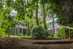
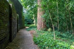
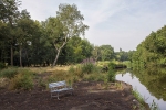
  8. Photograph the grounds of Templemere.
  9. Ensure that I visit more than once so that I can photograph at different times of day.

3: Background Information

I did considerable reading around Eric Lyons, Span and Templemere and a fuller PDF summary of my notes can be accessed from the reference list . Eric Lyons was a visionary architect and a disciple of Walter Gropius, founder of the Bauhaus in Weimar, Germany in 1919, who came to England in 1934 .

Eric Lyons eventually joined forces as architect with Span Developments, created by Geoffrey Townsend. Their concept was to place people in communities with landscaped parkland that provided open spaces for community living. It was also intended that residents should take an active interest in the management of the estates through Residents Societies, “to make sure that the principles driving the project were propagated, and that distracting personalisations of shared space were prevented”.  Amongst other developments Lyons, with Span, created and began building a village, New Ash Green,  Kent that was  subsequently sold and completed by Bovis when Span ran into financial difficulties. There certainly wasn’t unanimous approval of  the new styles of modern building in the 1960s, with their large picture windows

 Kenneth Mahood cartoons from Punch magazine Design and architecture cartoons from Punch magazine by Ken Mahood
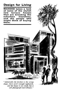
Reproduced with permission of Punch Limited., www.punch.co.uk

The house style is reminiscent of the ones created at Templemere and this cartoon appeared in a series by Ken Mahmoud in 1963 in Punch Magazine 
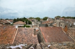
4: Templemere

_MG_5720

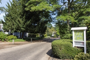
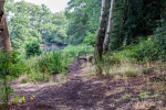
Templemere has its own website here  that provides a wealth of information. The new estate was built within an C18th landscape that had been created by the Duke of Newcastle. It included a small wood and access to Broadwater Lake – also created by the Duke to mimic a river.

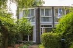
Previous Span developments had utilized courtyard gardens but it was realised that this would not work here as the houses had to match the C18th landscape. A new house type, L1, was created with an octagonal shape and linked/attached houses were staggered in outward facing groups with a central green area. 65 houses were built in 1963 and the estate won a Civic Trust award in 1964.

Eric Lyons gave a lecture to RIBA in 1968 where he explained that:-

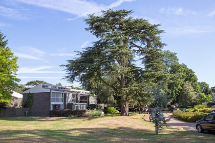
It was not until we moved on to a beautiful site at Weybridge that we started having enough confidence to move away from the kind of external spaces we have been creating. Because of the enormous scale of some splendid cedar trees on the site I attempted to approach the problems of spatial organisation quite differently, to try and create less defined space. The space flows on like a water course and loses itself in all directions bubbling around the trees and clusters, going down into the wood and disappearing:

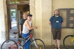
5: Meeting some of the Residents

I visited Templemere five times. I was concerned that this spread over in the school holidays and was worried that I may encounter problems if children were out playing, in terms of objections to photography etc. However this problem did not arise fortunately.

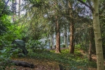
Two of the residents, Bill and Benda Boyd, spent some time with me on my initial visit, walking me round the estate and pointing out features of the grounds and house exteriors.  They drew my attention to the many old trees with a feature point being a 400 year old Cedar tree.

_MG_5722

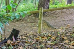
The wooded area by Broadwater Lake had been let go over the years but, 4/5 years ago, some of the younger residents got together and, with assistance from a specialist contractor, opened up the views. A special fund being created to pay for the work. They explained how the Residents Society operates. The management fee includes landscape maintenance of communal areas and painting of house exteriors on a rotational basis and the Residents Society organise several annual events as can be seen from their newsletter  when the  grassed community area in the centre becomes alive when residents gather. In the recent Queen’s Jubilee celebrations a walkway was built down to the woods by some of the men and opened with a ribbon. I was shown their names carved at the back of the post.

A few residents have made changes to exteriors, such as painting doors a different colour and the occasional installation of conservatories has created some controversy but, overall, I gained an impression of a very active Residents Society that is committed to maintaining a strong community spirit and upholding the original ethos of the development. I’m writing this advisedly because there will always people who want to make their own mark so there’s likely to be a continual process of discussion, negotiation and majority consensus. An Application is going to be made to have the estate deemed a conservation area and this should further protect the environment of the estate

I was told that the interiors of some houses have changed over the years apart from re-decorating. Some ground floors have become open plan; central heating has often been installed to replace the original more electrical underfloor heating and room has sometimes been found for a downstairs toilet. The houses seem to lend themselves well to this kind of adaptation and change.

Bill and Brenda enjoy living in Templemere. Bill likes their house for the large windows and light and Brenda likes the community feel – like a small village. She told me that 170 people came to the 50th Anniversary celebration earlier this year, including 30 former residents, which shows the hold that Templemere has over people.

b). Geoffrey Kemp

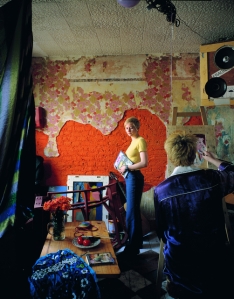
Bill and Brenda introduced me to Geoffrey and I had two visits with him. It was a real pleasure to talk with him, not to mention being introduced to a new delicacy – clotted cream and tawny orange marmalade on toast which was his late breakfast. He is very proud of his house and happy for me to have a look round and take photographs. He and his wife moved into Templemere as a newly married couple. He has been widowed for several years now but, at the age of 85,  wants to stay where he is for as long as possible. Geoffrey considers this estate to be one of only a few examples of 1960s domestic architecture that’s any good. – “I think he’s [Eric Lyons] the greatest domestic architect since the war”.

He said:

I like the house for its tremendous sense of space, plus the grounds, lakes and woods and I have lots of friends here who are very supportive and keep an eye on me.

At his age one snag is the lack of a downstairs loo, but he likes the original concept so much that nothing has been changed and he still uses the original underfloor heating. It’s rather expensive – he sometimes uses the convection from a 1964 floor heater – but he likes it. His house also retains much of the original furniture, including the original two-way unit constructed between the kitchen and dining area “which obviates the need for a sideboard” (from original specification sheet).

There was also a possibility to talk with another newer resident who has modernized and converted his downstairs area to fully open plan but the timing was tight so this did not happen. Still, the possibility is there if I return to do more photography at some point.

A fuller account of my talks with residents can be accessed in the reference list.
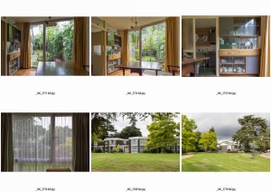
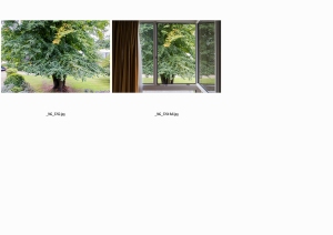
The Photographs

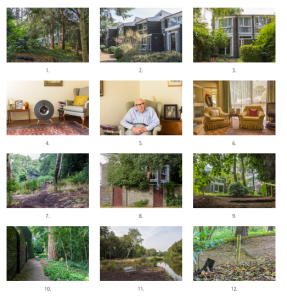
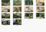
85 of the original RAW images were converted to jpegs.  From these I did an initial selection of 62 which I reduced to 34.

These fell into four approximate sets, Geoffrey’s house; residents; the houses/estate; the woodland.  I shared these (at 6×4 size) with the OCA Thames Valley group and it was really interesting to see how they started to put them together. Another advantage of doing this was that I could see from 6×4 prints images that would require some colour adjustment. My tutor will have access via Dropbox to digital contact sheets of all RAW files and the initial selection of 62 and I will send him printed contact sheets of the selection of 34 and A4 prints of my final 12.

I found it hard to pare it all down to 12. I wanted to avoid the look of an estate agent’s brochure and to bring Templemere to life somehow. I was drawn to the greenness of the woodland but then everything would probably have been too similar.  Some people might say that one piece of woodland is the same as another but there was a difference for me.  I experienced the woodland at Templemere as being a deeper green than my local Common – smaller and more intimate. Looking at my images I was reminded of Jem Southam’s work – see here and here   The wildness contrasted with the more careful organisation of the houses within their immediate environment, although the houses themselves were also shrouded in the landscape as they flowed along together in their groups – just as Eric Lyons described in his lecture in 1968.

I could have chosen just to concentrate on Geoffrey but then I wouldn’t be showing the environment he loves and has lived in for so many years.  He can no longer walk down into the woodland but I can show it to him. There were so many different edits I could do. I also started to wonder about sizes. For my tutor I’m preparing A4 prints with a border for handling. If I were to do it a different way – say for a small book then should the woodland be, say, full bleed so that the woodland flows off the page? Would it be better to have smaller images of Geoffrey and the interior of his house to show the scale of size compared with the buildings? It was certainly good to be aware of all those different possibilities but then I had to make a choice.

What came together for me was how the original concept has worked for 50 years and, in this particular instance fulfilled the vision of Eric Lyons and Span who aimed to create a particular kind of environment. Not a garden town, village or suburb but much smaller.  Facilities such as shops etc might not be included but they lie close by. Residents live close to their neighbours (indeed are linked with them in groups) However, they live in a house that, although not large in space, is filled with light. They have a small garden to enjoy with privacy,  yet are able to breathe and enjoy the environment around them as they step outside their front door. This small, self-organised community has the ability to support and offer friendship to its members as they grow older. Children can experience the magic of the woods relatively safely. I’m aware that all this might seem too fulsome but it works at Templemere because the residents, on the whole, are committed to such a concept.

I’ve been reading Yi-Fu Tuan’s book Space and Place: The Perspective of Experience (1977) as I’ve been pondering about sense of place for some time – see here .  There were two sentences that struck me as I thought about Templemere

Compared to space, place is a calm center of established values (p. 54)

When space feels thoroughly familiar to us it has become place (p. 73)

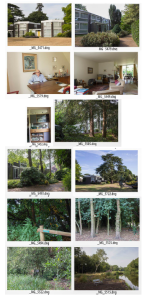
And, with this in mind, these are the 12 I have chosen.

Summary

The plan worked except for photographing the ultra-modernized interior of one of the houses, although that possibility is still available for me.  The variation in sunlight on different days meant sometimes the sky was blue and sometimes white. Is it best to have uniform skies or not?

I enjoyed the researching and tried very hard not to research too much at the expense of taking photographs. My research notes will be in my paper log, together with copies of the emails with Punch magazine and the signed permission note from Geoffrey. It was good to meet and talk with the Boyds and with Geoffrey Kemp. If I was going to do it all again then I would have experimented with video and/or audio work, but will come as I plan to learn this during my next Module.

I’m looking forward to my tutor’s feedback – guessing that he might do a re-edit again. I wish I could be sitting there whilst he’s doing it so he could talk to me about it. That’s one of the aspects that I’ve gained so much from with the OCA Thames Valley Group and it would be good to do it with my own tutor.

3rd September 2013

References

Books

Barrett, C (2005) Spanning the Years in Grand Designs Magazine, March 2005.

Evans, P (2012) The 1960s Home, Shire Publications Ltd, Oxford

Harbison, R (2006) Exhibition, Architects Journal 30/11/2006

Simms, B (Ed) (2006) Eric Lyons & Span

Strike, J (2012)The Spirit of Span Housing, Strike Print, (Kindle ed)

Yi-Fu Tuan, (1977) Space and Place : The Perspective of Experience, University of Minnesota Press, Minneapolis.

Fuller PDV versions of Research notes

Summary background of influences on Eric Lyons and Span Developments and Templemere

Talking with some of the Templemere residents v1

Websites

http://www.amazon.co.uk/The-Spirit-Span-Housing-ebook/dp/B0090L9BJ6/ref=tmm_kin_title_0

http://www.architecture.com/Home.aspx

http://www.architectsjournal.co.uk

http://www.fonagvc.co.uk

http://en.wikipedia.org/wiki/Span_Developments

http://en.wikipedia.org/wiki/Walter_Gropius

http://punch.photoshelter.com/image/I0000LdxLj3EF7QI

http://www.ribabookshops.com/item/eric-lyons-and-span/58648/

http://www.ribapix.com/index.php?a=wordsearch&s=gallery&w=Templemere&go.x=0&go.y=0&go=Go

http://www.seesawmagazine.com/southam_pages/southam_interview.html

http://www.span-kent.co.uk/about_span.html

http://www.templemere.co.uk

http://www.thenbs.com/topics/designspecification/videos/eric_lyons_and_span.asp

http://www.vam.ac.uk/content/articles/l/landscape-photography-jem-southam/

http://www.weymede.co.uk/index.htm

People & Place part 5 – 1: Orienting myself in Space and Place

During the course of this Module I’ve become increasingly aware of my interest in how we as people interact with our environment –  how we shape the landscape and then how this landscape, in turn, affects our perceptions; thoughts; memories and feelings.

I’ve lived in several places but never so long as the house in Sheffield I lived in with my parents from the age of 5 to 22 (when I married) not far from my maternal grandmother’s house where I was born.  That neighbourhood still lives so strongly in my memories and dreams that I was surprised, when I last visited there, briefly, last year that I no longer felt any sense of belonging. The area had changed so much, becomes so run-down and barren of life, that it was as if someone else had once lived there.

Conversely, I don’t feel particularly attached to the town I live in now.  There are no deep memories such as my children being born here. This is part of modern living I guess – on the move. At least part of my modern living. Even so there are some places and spaces here that I do feel an attachment towards. The Common where I walk with the dogs just about every day; the small Church on the hill not so far away; the old Muslim Burial Ground and the Bronze Age Barrows across the road from there. Is it their history that gives me that sense of place I experience – that connects me to people in the past and their lives, beliefs, hopes and fears? It’s as if there are whole other parallel worlds that I connect with through those layers of history.

I’ve referred to Simon Scharma’s book Memory and Landscape before and my growing interest in cultural geography. I had thought that this might be a diversion because I was finding People & Place so challenging as a Module. I’m now thinking, though, that this particular Module began to encourage me to start digging into what connects me with my environment; forced me from my chair of “Isn’t that interesting; maybe one day I’ll ……”. I’ve certainly been technically challenged but the psychological challenge has pushed me into being my own archaeologist; searching for the roots of what binds me to this earth. Discovering how a space becomes a sense of place.

I’m pleased that my notional client for Assignment 5 has provided me with further opportunity to explore these aspects and tread new ground.

27th August 2013

Talk by Tom Hunter: OCA Study Visit 2nd March 2013

Tom Hunter : The Way Home

_DSF0399 lr

As preparation for the talk I read an interview in Photomonitor by Katy Barron .  Photomonitor is an on-line magazine that includes our own OCA tutors Jesse and Sharon Boothroyd amongst its contributors. Sharon was also our accompanying tutor and had organised the visit.

_DSF0407 lr

I had already seen Tom’s work in “Seduced by Art” at the National Gallery and, of course looked at his website

Two aspects struck me in particular from the Photomonitor interview concerning his attitude towards photography. The first concerns his latest pinhole work and how the lens “slowly absorbs the scene rather than grabbing or taking it” giving him time to talk with people.  The second was about people’s attitudes towards Old Masters – “Rather like going to church where you have to bow to these great masters”, and how one can forget the context of a painting so that the subject matter becomes lost in the technical detail of the painting (I hope I’ve understood that right).

Tom has a casually relaxed style; is easy to listen to; engaging and obviously passionate about his work and the area where he lives. Basically, his talk covered the areas that have already been outlined in one of the essays on his website  the difference, of course, is that listening to him speak made his journey come alive; not to mention the images he showed and explained to us. I can certainly understand how he succeeds so well in getting his subjects to co-operate with him.

He has spent a long time looking at his surroundings; exploring his own neighbourhood and using different ways to portray situations. What came through overall in his talk was certainly the way in which universal themes and situations have continued in their different forms and how they can be portrayed, in what I think of as a painterly manner, whilst using ‘ordinary’ people and their lives as a context, through the photographic medium . What’s interesting to me is that this can now be seen as experimental/conceptual rather than ‘copying/mimicking’ as it might have seemed earlier in the history of photography. It seems to me that, on the whole, anything goes in photography so long as you can justify it comprehensively and articulately using the appropriate method of communication.

The other aspect that struck me was that continual search as a photographer for new ways of looking at things and yet retaining some beliefs/attitudes/passions as a core. A humanitarian ethos of respect for others and believing in the importance of engaging his subjects in his work.  Being welded to Hackney and its people and wanting to show that ordinary people have their own unique stories which are worth the telling.  There is also his use of an artistic approach to raise contentious issues and engage in a fight with local authorities.  This is an interesting aspect particularly at the moment having discussed Martha Rosler’s views on documentary in the recent OCA Thames Valley group session.  John  made a comment on my previous post here  concerning the question of whether documentary should appear on a gallery wall and Allan Sekula’s statement that

Documentary is thought to be art when it transcends its reference to the world, when the work can be regarded first and foremost, as an act of self-expression on the part of the artist” (A. Sekula,  1984, p.58)

How does that fit with Tom Hunter’s work?  To me his work is art as well as documentary.  He points to the universality of contemporary stories; bases them in his own neighbourhood and has found his own creative voice. His work appears on gallery walls and in museums. At the same time his images have achieved positive change.

His Degree Show in 1994 was The Ghetto. He and others were trying to save their squatted street in Hackney from demolition and themselves from eviction.  He produced a 3D model of the street (in his words to us his neighbourhood became an art sculpture). He had begun using a medium format camera and produced transparencies whose effect resembled being transported into a cathedral with it stained glass windows. These transparencies were placed in the model. His tutors encouraged him to look at Dutch painting and he discovered Vermeer and his use of light and the painting of ordinary people.  After travelling around Europe for a couple of years he went back to his squatting neighbourhood. Possession orders were again being issued, and he returned to Vermeer in his quest to raise the status of the fight with the Local Authorities.

One of his neighbours who had received an eviction order became Woman Reading a Possession Order from Hunter’s series Persons Unknown

filipa002

Woman Reading a Possession Order (1997) (c) Tom Hunter

Reproduced with his permission

the starting point was Vermeer’s A Girl Reading a Letter at an Open Window .  

Another example from the same series is the Art of Squatting .

the-art-of-squatting-1997-tom-hunter-email

                                                                                                                                   The Art of Squatting (1997) (c) Tom Hunter

Reproduced with his permission

The Art of Painting (1665-67)  was known as Vermeer’s favourite piece.  Vermeer’s painting has cloth/tapestry on the wall – probably a map of the Netherlands.  Hunter’s reworking has torn wallpaper that, to me,  looks the same shape as the map. Subsequently he has taken influences from other artists and lives of artists such as Millais  and the author Thomas Hardy. Hardy based all his stories on true stories and Tom Hunter started to collect people’s stories from the Hackney Gazette.   He noticed that the same stories repeated themselves over and over again and re-enacted some of them in his series Living in Hell and other Stories

This works for me as an artist in contextualizing my work, giving it multiple layers and asking classical and contemporary viewers alike to question art’s relationship to society (2012, p. 7)

He has wanted both to document life around him; raise issues and represent the beauty and dignity of ordinary people and his surroundings. One of the questions raised during the talk was whether he thought his views had become compromised by moving from documentary to a more elitist area, being shown in the National Gallery or Saatchi Gallery for instance. Tom Hunter’s response was that he had wanted to involve the whole society in a debate about ways of living and being shown in these environments gave him the opportunity to put his points of view to a wider audience. Making scenes look beautiful (as he does) will bring people in from all sorts of backgrounds. In terms of ‘realism’ he described how photojournalists may also compose and stage their images; instructing people to “Move here. Move there”.

I wrote above about Tom Hunter’s easy and relaxed way of talking to us. His view is that you have to prove to people that you’re honest and straightforward and won’t be “taking the piss”. He said there is an art in the way you talk to people. If they say, “No”, then that’s an opportunity to explain and engage them. I think that’s a good rule to follow.  I also hope that he doesn’t lose this as he becomes more famous. I don’t think he will somehow.

References

Hunter, T (2012) Tom Hunter : The Way Home, Hatje Cantz Verlag, Germany

Sekula, A Photography against the grain: essays and photo works, 1973-1983, Press of the Nova Scotia College of Art and Design, Halifax, 1984.

http://skd-online-collection.skd.museum/en/contents/showSearch?id=415429

http://www.khm.at/en/visit/exhibitions/past-exhibitions/2010/vermeer-the-art-of-painting/

http://www.franshalsmuseum.nl/en/collection/search-collection/the-art-of-squatting-1537/

Latest Features

http://www.tomhunter.org

http://www.tomhunter.org/the-way-home-book-introduction-essay-by-tom-hunter/

http://www.tomhunter.org/persons-unknown/

http://www.photomonitor.co.uk/2013/02/the-way-home

OCA Thames Valley Group Meeting 17th August 2013: (B) Discussing Martha Rosler’s work

 Martha Rosler In, Around and Afterthoughts (1981)

This was our ‘homework’ for theoretical discussion. Generally, I think it’s important to first have a look at an author’s context and general attitudes and beliefs so that I can take this into account. This time I thought I knew what she was about and so spent more time in reading the piece (three times), making notes, and making assumptions that were sometimes erroneous.  This is partly due to my own experiences at the time she was writing and also because I found her frustrating to read mainly because she seemed to wander around the years and switch between them as if her readers already knew what she was talking about – like a conversation amongst old friends; an in-group discussion. Of course, that’s what she was doing to some extent and I’ll come to that later. It was also a “This is so” analysis of documentary photography rather than a balanced view, looking at it from all aspects.  Whenever that happens I do tend towards looking for arguments against and know that I have to watch out for that – otherwise I’m doing whatever I’m complaining about!

Martha Rosler  (b. 1943) is an American artist who works with multi-media.”Her work deals with the separation of the public and private sphere, exploring issues from everyday life and the media to architecture and the built environment”. She is also a writer. In, around, and afterthoughts, is a 1981 critical essay exploring these questions more systematically and attempting to develop criteria to define contemporary photographic activities as meaningful social practice. What Rosler appears to be saying is that, in the earliest years, ‘documentary’ photographers were using their images to show how the “underclass’ of society lived and to gain some amelioration of their conditions. This was from humanitarian attitudes but also to encourage charitable giving to prevent social unrest.  In Rosler’s view such Charity “is an argument for the preservation of wealth” and “the need to give a little in order to mollify the dangerous classes” (p. 177, 2004).

In the 1930s (In the US) Roosevelt’s Administration responded to the Depression by instituting a “New Deal” – Relief (for the unemployed and poor); Recovery (of the economy) and Reform (of the financial system). One example of this was Farm Security Administration (FSA) created in 1937 that had a special photographic section  Again the images were used to gain sympathy for the plight of the poor and also to encourage the population to accept the New Deal and the move towards social reform.  The photographs achieved the aims of the FSA and did bring in money for general relief. However,  Rosler refers in particular to the photograph of Florence Thompson taken by Dorothea Lange; how Florence Thompson became a ‘symbol’ of the Depression and yet did not directly benefit Florence and her family (p. 185, ibid). All this is what Rosler terms “liberal documentary”. “Causality is vague, blame is not assigned, fate cannot be overcome” neither the victim nor the oppressor are blamed, “unless they happen to be under the influence of our own global enemy, World Communism”.

As I wrote earlier, Rosler does tend to skip around the years so I am making my own ‘logical’ order here.  She moves on to state how, “ 60s radical chic has given way to eighties’ pugnacious self-interest” (p.180) so that in the 1960s, photographers took the view that they were not there to reform but to show “what is” (I think of Robert Frank and William Klein here for instance) and thence, as photography moved into the Art gallery photographers aspired to achieve a higher status and fame. Her conclusion is

Perhaps a radical documentary can be brought into existence. But the common acceptance of the idea that documentary precedes, supplants, transcends, or cures full substantive social activism is an indicator that we do not yet have a real documentary” (ibid, p. 196).

In our group discussion we identified these different stages and particularly talked about photo-journalism; the role of war photography and other documentary that portrays misery and powerlessness. Does that change anything? If not, what’s the point. Are we as photographers just exploiting our subjects to take photographs that people will look at for an instant and then move on?

During the discussion I told myself that we were really only talking about an extreme – war photography and similar.  I began to  think about documentary photography that had influenced change, even on a more individual scale. Dana Popa and her project around sex-trafficking and how this work has informed a project to assist the victims. Jodi Bieber  and how her photograph of Aesha Mohammadzai the young Afghan woman mutilated by her husband’s family, led to free reconstructive surgery in New York. I hope that there are many other similar stories of the power of photographic images to influence change, but I still cannot help but feel despondent that, whatever, is done violence and war continue unabated so, is there any point?

Reading about “Radical Documentary” I began to think that this was concerned with marching alongside protesters; taking part in protests; gaining publicity for radical views. I think I was imagining Rosler as similar to the young Jane Fonda.  I was also linking into my experiences of social work training in 1978/9 at the mention of documentary photographers and ‘social work’. In the first term we had a series of lectures on radical social work – Thomas Szasz and “the myth of mental illness”; Howard Becker’s Labelling Theory; how social work was an agent of an “iron fist in velvet glove’ governmental authority, just placing a sticking plaster on the fundamental ills of the capitalist society. I remember feeling horrified and saying there was no way I wanted to be involved in that kind of oppression.   At the same time, I had this “Yes but ….” view. Surely that didn’t mean that one shouldn’t do anything right now to help people whilst waiting for the revolution to occur. There are so many shades of grey.

That’s the danger of making assumptions. I had to come back home after the Thames Valley Group meeting and read further to gain a more informed understanding.

Further Reading on Martha Rosler and “Thinking Photography”

Postmodern ideas encouraged new thinking around social documentary photography and Martha Rosler (along with Allan Sekula and Fred Lonidier was a member of an informal study group formed in California during the mid-1970s. The three of them were soon at the core of what was being called in the mid-1980s

…the new documentary, or the new social documentary, created by sophisticated, college-educated, politically active intellectuals who wanted to use photography as an important element of social critique.

(p. 438, M.W. Marien, 2002)

The group was influenced by Walter Benjamin’s The Work of Art in the Age of Mechanical Reproduction and the breaking down of the “aura” of the original work of art.  They were also influenced by the thinking of Bertolt Brecht – his notion that “less than ever does a simple reproduction of reality express something about reality” and Brecht’s understanding of how to affect an audience with a story. Brecht believed in constructing obviously artificial situations and disrupting the anticipated narrative with the unexpected.

The group linked conceptual Art with political protests/activism and so helped to form a new philosophy and practice that was very different from that of earlier documentary photographers. They wanted to find a way to comment on social oppression without generating what they called ‘victim photographs’ that only evoked self-satisfying sympathy or voyeurism among viewer.

Assumptions about the  causes of poverty and the power of photography to report them were challenged in relation to renowned images from the past (hence In, Around and afterthoughts) Presentations of gender and ethnicity in film and advertising were examined and also incorporated into visual analysis of the power of images. There was one comment by Mary Warner that reverberated with my own perception, mentioned above, that Rosler was writing for an in-group that already knew what she was talking about:-

The new documentarians wrote in language that required familiarity with history and philosophical distinctions, an obvious obstacle to non-intellectual audiences (M.W. Marien 2002, p. 441)

In the early to mid 1970s, Rosler had made three photomontage series called Bringing Home the War” (c. 1976-72) that combined mass-media images of the conflict in Vietnam with pictures taken from design and architectural magazines. Almost 20 years afterwards she revived this series in response to the Iraq War.

Watching this video and seeing the images on websites such as this  I could see Brecht’s influence. It made me think of  his War Primer   and also the recent  re-worked version War Primer 2 by Broomberg & Chanarin  that did take my breath with its poignant images and words despite my being used to seeing countless images of war, death, violence and bloodshed. I think this is what Martha Rosler and her colleagues were aiming to achieve; to find this new way of drawing attention. The main problem as I see it is that as with any genre the viewer gets used to seeing a particular type of image so that the new quickly becomes the old and then yet newer ways have to be found.

Some further thoughts

Subsequently, John Umney sent the Thames Valley Group a link to a recent post on Duckrabbit   with John Macpherson’s conclusion that maybe we should “accept that it [the war photographer’s job] may only usefully serve to mark, and honour, the passing of the fallen, and as a consequence to remind we who are left alive how lucky we are”. I agree John Macpherson’s final sentence that this is an unsettling and disquieting notion and yet it fits with the view of documentary photography that Martha Rosler pointed towards in 1981 and is still working to overcome.   I feel more heartened by a link from the Duckrabbit post to  a post about faked images and separating fact from fiction on the BBC blog News from Elsewhere

I’ve left to the last another issue that the Thames Valley Group touched upon which concerns what makes an ethical photographer and documentary photography.  Aspects which came up for me where should documentary images appear on a gallery wall; the importance to me of explaining and engaging with people; how my practice fits with my personal conscience. Other suggestions were that documentary photography should make people ask questions and should represent some type of truth/reality. I think the last is probably the hardest given that we all have our own versions of the truth and is there such a thing as a generally accepted truth. this is something I need to work on more.

20th August 2013


References

Rosler, M ( ) In, Around and Afterthoughts (On Documentary Photography) (1981in Decoys and Disruptions: Selected Writings 1975-2001 (2004) MIT Press, London

Marien, M.W. (2002) Photography: A Cultural History 3rd Ed, Laurence King Publishing Ltd, London

http://www.worcesterart.org/Exhibitions/Past/martha_rosler.html

http://danapopa.com/gallery.php?ProjectID=218

http://duckrabbit.info/blog/2013/08/war-porn-blood-loss-and-living/ [accessed 19.8.2013]

http://jodibieber.com/index.php?pageID=18&navLay=1

http://www.loc.gov/pictures/search/?st=grid&co=fsa

http://martharosler.net

http://www.worcesterart.org/Exhibitions/Past/martha_rosler.html