Working with a Medium Format Camera

Working with a Medium Format Camera

This is a brief post as a follow-up to my promise to myself  at the end of my previous one responding to my tutor’s feedback on Assignment 3 of P&P

My road towards medium format has been a slow one.  It began back in 2011 when I began studying with OCA and first went on Study Visits. I noticed that most of the images were large format prints and so clear in the detail.  I acquired a 35mm film camera but still had that yearning to try medium format. Towards the end of last year I succumbed and bought a Fuji GA645Zi with a 55-90mm zoom lens (35mm-55mm) (there’s a review here)  This camera came out in 1998; so it’s relatively modern, with autofocus and automatic wind-on, which is good for me as a nervous newcomer and means I haven’t created double exposures or even, yet, taken a photograph with the lens cap still on.  I do tend to circle cautiously around anything new and so only used one roll of film in several months with the camera in program mode.

However, as I wrote previously the visit to the Landscape Exhibition at Somerset House gave me some new inspiration/enthusiasm after looking at some of Simon Roberts’s landscape work . I know that this is large format but at least medium format is along the way towards this, and so I went off to the Common to make some more photographs. The film is Fuji Superia 400 120 and,  this time I used the camera on aperture priority, which is more adventurous.  Here are some of the results:

I took some A4 prints along to the OCA Thames Valley Group meeting a couple of days ago and got some positive feedback and encouragement to do a longer term project along the lines of ‘figures in a landscape’. Of course, I was asked, “Why film; why medium format?” It’s because of the soft clarity that medium format film can give.  I know that there are filters I can use in Photoshop, e.g. in Nik software, to achieve similar effects but they’re not quite the same as actual film.

I have another location in mind to visit and gradually want to put together a series.  I can’t envisage this being for P&P because of the time element but this will be a personal project to undertake alongside my coursework.  I recently emailed my tutor to update him on progress on my next assignment and he has suggested that I also have a look at  Peter Bialobrzeski . who was also shown at the Landscape Exhibition and I’d made a note of his series Heimat   which had examples in the Pastoral Section. Bialobrzeski uses an analogue “Box” camera for his large scale landscapes and focuses upon the way in which cities and landscapes are changing.

22nd April 2013

References

http://digitaljournalist.org/issue0105/cameracorner.htm

http://we-english.co.uk

http://www.bialobrzeski.de/portal.html

http://www.bialobrzeski.de/work/heimat/Heimat-7.html

Explorations with Infrared : 3. Pylons

Explorations with Infrared

 3. Pylons

 In the 1930s poets highlighted contrasts between the old and the new and conflicting values. Pylons became one of the symbols of this new order.

 The secrets of these hills was stone, and cottages
Of that stone made
And crumbling roads
That turned on sudden hidden villages


Now over these small hills they have built the concrete
That trail black wire:
Pylons, those pillars
Bare like nude, giant girls that have no secret

The valley with its gilt and evening look
And the green chestnut
Of customary root
Are mocked dry like the parched bed of a brook

But far above and far as sight endures
Like whips of anger
With lightning’s danger
There runs the quick perspective of the future

This dwarfs our emerald country but its trek
So tall with prophecy
Dreaming of cities
Where often clouds shall lean their swan-white neck.

(Stephen Spender)

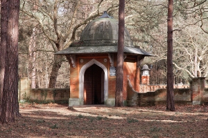
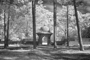
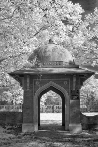
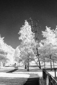
I commented in my previous post regarding the way in which infrared brought out the hard alien nature of the pylons against the softness of the leafy trees and bricks of the old burial ground. I thought that in some respects we’ve become so used to pylons that they’re just a part of the landscape as they march in regimented order.  But maybe not!

Pylons have always interested me. – their shapes (French ones are very different); birds perching on the wires; men who risk death to repair/paint them . Pylons are dangerous in and of themselves – does it do harm if you live near to one?  When I mentioned pylons to my daughter she said that there was a pylon on Chobham Common and when you walked past it you could hear it crackle!  There was a short walk where we used to live where a pylon was standing right in front of a house .

I decided to look for more information on pylons.  Concurrently I decided, again, to use both normal and infrared photography to explore how each of them might express my feelings regarding the way in which we become so used to having something in our midst that we almost forget it’s there.  I haven’t forgotten about the Muslim Burial Ground though and will be returning to it later.

Following the Pylons

On a visit to the National Grid website I found a question asking whether information could be given on the location of pylons ‘under The Freedom of Information Act’. The answer was that pylons aren’t covered by the Act, presumably this is in the interests of protection against attack etc.  I discovered that pylons are shown on ordnance survey maps but the distance between them is ‘representational’.  This wasn’t a problem because I already knew were there were some nearby pylons.

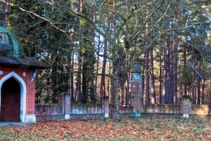
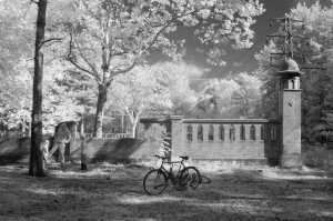
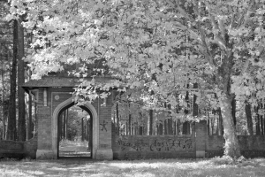
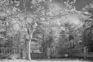
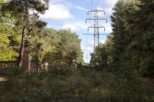
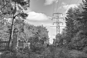
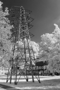
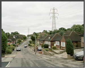
First I went back to the burial ground where, amongst others, I took a photograph using my normal camera to match the IR one

_MG_9531 lr

_MG_3403 lr

I also did two conversions on a colour photograph for further comparison

_MG_3404 b+w PS lr

(converted to b+w in Photoshop CS5 (linear contrast) plus Nik Silver Efex Pro 2 full contrast and structure filter at 50% opacity.}

_MG_3404 LR IR lr

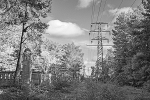
(converted to b+w  with  IR filter in Lightroom 4, plus linear contrast and sharpening in CS5.)

I think that here the IR filter in Lightroom 4 has the edge over the b+w and colour versions. If I’ve understand correctly then this is due to the fact that there is so much green foliage. In the colour version these greens merge together more whereas they become more distinct firstly in b+w and then with the Lightroom filter. In addition, the pylon also becomes more distinct.

Continuing along the pylon path

A recreation ground:-

_MG_3431 9x6 low res             _MG_9557 as 9x6 low res

_MG_3435 9x6 low res             _MG_3439 9x6 low res

_MG_3442 9x6 low res           _MG_9553 9x6 low res

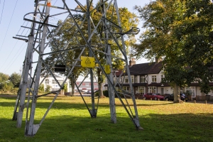
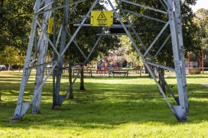
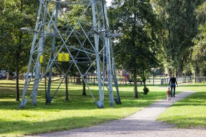
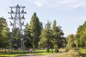
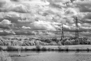
In the IR image the pylon looks more ethereal here whereas I think the colour images draw more attention to the dangerous aspect because of the yellow sign and the way I’ve composed to show the nearness to people passing by and the playground.

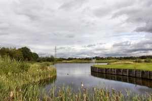
The line stretched further over the canal and then joined the burial ground. A few miles beyond and I found the overhead lines emerging at a golf course.

_MG_3452 9x6 low res

_MG_3455 9x6 low res                 _MG_9561 9x6 low res

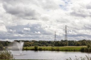
In this location I quickly became aware how I was being attracted towards the pylons; their architectural aspects and how they’d been designed into the landscaping. I’m guessing that they were there before the golf course was created. I was using them as a compositional aspect as opposed to a contrast in the theme.

Presenting them for discussion on the Brighton Study Weekend

I took some prints with me for the group review session and there was quite a discussion.  I won’t go into it in depth us, in summary, there were comments from one of the tutors in terms of the IR images looking like an etching and being  too pretty/chocolate boxey’. He seemed to prefer another idea of mine that was to follow the canal rather than the pylons.  Some of my fellow students quite liked the IR images stating that there was nothing wrong with beautiful images.  In comparing the two images of the lake, it was pointed out that, in the colour version the fountain caught the eye first, whereas, in the IR version, the pylons caught the eye first. There were suggestions that if I wanted to go the ironic/subversion route I could make the pylons look extremely pretty which could then make people start to interrogate them more closely. Another suggestion was to just carry on doing both and ‘follow the pylons’ to see where they led me in terms of appropriateness to what I wanted to convey. Paul Cabuts was a name given to me by the tutors as a photographer who had done a series on pylons (see below).

Some information I found regarding pylons

I have to admit that I did become somewhat obsessed with pylons and had to stop myself from talking too often about them. I’ll go into recovery when I’ve finished this post I think! There is a Pylon Appreciation Society and  also quite a few groups on Flickr.

I found some references to  the possible health risks of living near Pylons (and other structures which emit electrical fields) – dementia, leukemia and cancer have been referred to  during the past ten years. This latest one quotes an American study .  There’s a site here that gives latest news on planning proposals, dangers of overground pylons and how to make representations etc . I phoned our local planning department to ask what the regulations were concerning buildings and pylons and was directed to The National Grid which gives the advice.  From the National Grid site I learned that there are no specific regulations in force. Advice is given on how to enable better quality development near power lines and there is a link to a PDF that can be downloaded (link below).  I thought this made interesting reading particularly this quote:-

The current urban renaissance planning and design agenda promotes a compact urban form featuring a mix of uses and the efficient use of land through the use of higher density development. This leads to an intense built form with taller buildings, smaller gardens (front and back), and narrower streets employing more interlinked building forms than might have been considered in the recent past.

This dense urban form provides good opportunities to screen views of pylons and diminish their visual impact.

Reflections : Where do I stand at the moment with both pylons and infrared?

My original purpose was to construct a series of images that would show how pylons and people exist alongside each other to the extent that people accept them as part of the landscape. I think this does happen where pylons have been around for many years (our current pylon design dates back to the 1920s). Having read around this I’m reminded though that  genuine concerns about the health risks do arise, and are researched,  over the years and people do protest when new projects involving pylons (and other forms of overground transmission) are suggested.  I certainly wouldn’t want to live near one.

I’m not sure at this stage that infrared can portray these tensions although, to me, it certainly brings out the differences between the man-made world and nature.  If I knew that there was going to be a local protest and decided to photograph this would I use colour, b+w or infrared? Knowing me I’d probably prevaricate; decide to use a combination, and then decide afterwards what best portrayed the issue. Is this a cop-out? Well, it probably is so I’m going to have to do more thinking around this whole infrared topic.

In the meantime though I’ve looked at some other photographers and how they have photographed pylons.

Some photographers and some pylons

I looked at Paul Cabuts, Mark Power and Simon Roberts; contacted each of them to ask for permission to use their images and they all agreed.  Paul Cabuts and Simon Roberts additionally emailed me a higher res photograph with some good luck wishes.

Paul Cabuts

Paul Cabuts’s website explains that his practice is grounded in the valleys of  South Wales and that he was “initially motivated by the differences between his personal experiences of the living and working in the Valleys, and the way in which they had been represented in photography and other media”.  His series ‘Powerlines (2002-2004)‘  “respond to (and echo) the highly positive images taken for the South Wales Electrical Power Distribution Company (SWEPD) in the 1920s”.  When I first looked at them I thought of the Bechers and ‘typologies’. However, a closer look reveals the way in which he wanted to portray their individuality.

Paul Cabuts - Powerlines

Cefn Gelligaer                           © Paul Cabuts

In a sense this reminds me of the way in which I gradually became drawn to the architecture and structure of the pylons I visited. Also I doubt that either b+w or colour would have been able to show the distinctive properties of  the landscape that define the individuality of the poles.

Mark Power  

Mark Power’s Project “26 Different Endings” (2003-2006) visited places that fall just off the edge of the pages of the A-Z London Street Atlas. He writes,

The coverage of the map changes with each new edition. Someone somewhere decides, year by year, where it should end; which parts of the periphery of London should be included, and which should not. This project is about the unfortunate places that fall just off the edge.

The 26 images in the series provide a wonderful serendipity that is held together by their special (non) place in the A-Z Atlas. One of them includes two pylons

Mark Power T 128 South

T 128 South                           © Mark Power

Simon Roberts   

Simon Roberts travelled across England in a motorhome between 2007 and 2008.  He produced  a portfolio “We English”  http://simoncroberts.com/work/we-english/#PHOTO_0 –   large-format tableaux photographs of the English at leisure.  The description states:

Roberts aims to show a populace with a profound attachment to its local environment and homeland …. The resulting images are an intentionally lyrical rendering of a pastoral England, where  Roberts finds beauty in the mundane and in the exploration of the relationship between people and place, and of our  connections to the landscapes around us.

Again, there are a variety of images all held together by the theme. I hadn’t seen the following image before I began my own series but it shows exactly what I wanted to portray – it’s just that I haven’t quite got there yet, although at least I have a guide.

We English

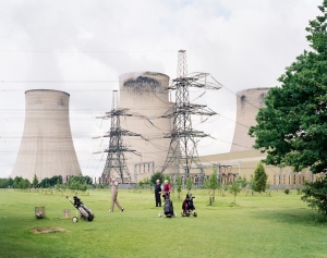
http://simoncroberts.com/work/we-english/#PHOTO_29  (c) Simon Roberts

Conclusion

I know I have to do yet more thinking around infrared and its uses to achieve the moods, reflections, and themes etc I hope to portray. It’s been very interesting to explore and compare infrared, b+w and colour along my journey so far. I’ve surprised myself about my relationship with pylons – the fascination they hold for me; the way I became just about obsessed with them, and how I moved from wanting to exclude them from compositions in the past (because they weren’t ‘attractive’) towards seeing their structure and architecture in compositional terms and accepting them as part of the landscape. I’ve spent several weeks thinking, reading and photographing them to the extent that I’m now late in producing my next assignment!

I looked at other photographs afterwards.  Yes – they could have informed my own work but, in a way, I’m pleased I just went ahead. I do have more in my photography armoury now though. Paul Cabuts’s work is an excellent example of using pylons or other structures  as subjects in themselves –  having their own individual characteristics as brought out by their locations. In the series by Mark Power and Simon Roberts the pylons play a part of the composition. In Mark Power’s image the pylons are intrinsic to both the scene and the composition. He chose to include them and, of course, he could have excluded them and produce a different image. In Simon Roberts’s photograph the cooling towers and pylons play an important backdrop to the whole scene and add to the wry look at how the English can be so absorbed in their leisure pursuit that they are (probably) oblivious to whatever else is around them.

12th December 2012

References

Photographers

http://www.markpower.co.uk/projects/26-DIFFERENT-ENDINGS

http://www.paulcabuts.com/gallery.html

http://www.paulcabuts.com/gallery_252144.html

http://simonroberts.com

http://simoncroberts.com/work/we-english/#PHOTO_0

Planning permission and pylons

http://www.emfs.info/Related+Issues/property/UK/design/

http://www.emfs.info/Related+Issues/SAGE/first/corridorwidth.htm

http://www.dailymail.co.uk/sciencetech/article-2049258/New-electricity-pylons-T-shaped.html

http://www.independent.co.uk/news/electricity-pylons-pose-health-risk-1167517.html

http://www.nationalgrid.com/uk/senseofplace

http://www.nationalgrid.com/NR/rdonlyres/98636F39-F2AF-4D9B-9D9E-A1366AB73B8A/1154/ASopCreatingDesignGuidelines.pdf

http://www.no-moor-pylons.co.uk/Latest%20News.html

http://www.telegraph.co.uk/earth/earthnews/3344158/Nuclear-plans-could-mean-miles-of-giant-pylons.html


Continuing with Infrared : The Muslim Burial Ground

Continuing with Infrared : The Muslim Burial Ground

_MG_4587 lr 

One area of Horsell Common contains a now abandoned Muslim burial ground, which is a Grade II listed building in the care of Horsell Common Preservation Society. Over a million troops from India fought for Britain in the 1st World War and those wounded were brought from France to special hospitals along the South Coast (for example the converted Brighton Royal Pavilion).  There was concern that those who died in hospital weren’t being buried according to their religious custom and, in 1915, the War Office created the burial ground near to the Shah Jehan Mosque in Woking at the request of the Muslim community.  Sadly, the graves were desecrated and the bodies were moved to Brookwood Cemetery, Woking, which has a Commonwealth burial site.   This article from an on-line journal gives  an interesting account of it’s history  in relation to a project  by the British artist Said Adrus  .

The site is in a different part of the Common from where I normally walk (the Common is bisected by three busy main roads)  and it wasn’t until late in 2010, when I first got a DSLR camera, that I decided to go and have a look at it. I was immediately taken by its tranquillity there amongst the trees, even though the main road was not too far away.

Muslim Burial Ground 2010

I was also dismayed by the nature of the graffiti  on some of the outside walls. I know the bodies and their graves were no longer there but it seemed like such a lack of respect.

In August this year there was an announcement that English Heritage were going to contribute 80% of the cost of renovating the site and it is intended that repairs will be completed in time for the 100th Anniversary of World War I.  There will be landscaping of the site with one suggestion so far that a meditation garden might be created between the walls.   I think that’s a wonderful idea which will suit the site well although I am concerned it will be even more vulnerable to vandalism.  I thought that the renovation could make a good longer term photographic project and decided to visit again before any clearing work started. It also seemed an ideal opportunity to take the converted IR camera as I thought that it could well suit the architecture.

Infrared

_MG_9550 lr

_MG_9503 lr                                                                                               _MG_9509 lr


_MG_9518 lr

_MG_9513 lr                                                                        _MG_9531 lr
Thoughts

I think the IR effect does work well here for different reasons:-

  • In the first three images the softness of the ‘white’ IR leaves contrasts well with the austerity of the walls. For me it adds to the contemplative tranquillity of this site that is, in effect, a ghost of its former self and waiting to be given attention.
  • I could hardly believe my eyes when I saw the graffiti on the walls on the fourth image.  I hadn’t noticed it at all when I was there.  Surely I hadn’t been concentrating so much on my camera that I missed it! Is this another effect of IR in that it brings out what’s been hidden?
  • On the fifth image the way I’ve composed it includes the intrusion of the power lines into the tranquillity but in a muted way.
  • In the sixth image the IR effect has brought out more of the hardness and alien nature of the pylon against the softness of the leaves. I gave it a more dominant position in the composition.

I decided I had to go back  and take my ordinary camera as well to check if I had just missed seeing the graffiti.  I wasn’t sure whether to put the image on Flickr even though I wanted feedback, because some of the graffiti looked Arabic and I had no idea what it might say. I decided to take the risk though and received some interesting feedback.

I remember noticing the pylon the very first time I visited the site, being annoyed that it was ‘in the way’ and composing photographs so that it didn’t appear.  This time I wanted to deliberately include it which shows how my attitude towards landscape photography is changing.  I started to think about people and places and how we treat them and also how we live alongside technology and get so used to it that we don’t notice it. I wondered which came first the creation of the burial site or the pylon and hoped that the pylon was only put there after the site was abandoned.  I then  began to muse on the idea of a project ‘Following the Pylons’.

The first step was to go back to the site with both the IR and normal camera for further investigation which will my next post. There have also been some very interesting comments on my previous post which are here  so I hope the debate will continue on this new post.

References

 http://www.darkmatter101.org/site/2007/07/11/sites-sights-of-memory-and-mourning-said-adrus-lost-pavilion-2006/

http://www.saidadrus.com/wp/about


Early Explorations into Infrared Photography

Infrared compared

I have been interested in the concept of infrared photography for quite a while now having been introduced to it by my good friend Norma Bellini,  http://www.flickr.com/photos/norjacks/sets/72157627957482610/ who studied it in depth during her final Degree year. I am interested in its capacities to produce dreamlike/surreal images as this is one aspect of photography that appeals to me. Through Norma’s good offices I was able to acquire a converted Canon 500D with accessories and also two technical books, and decided I would do some experiments to see what type of subjects suit it best. To begin with I looked at some of the technical aspects of the use of infrared and also some photographers.

What is infrared

I thought it best, first, to write something to show my understanding so far, so please correct me on anything I’ve got wrong.

Light travels in waves and its wavelength is measured in nanometers (nm) (billionths of a meter). The light we see ranges from around 400 nm  (violet) to around 700nm (red). This visible spectrum enables us to see primary and secondary colours and their combinations.  Light at shorter wavelengths is named ultraviolet (UV) most of which is invisible to the human eye. At the other end are wavelengths longer than 700nm  which is where the Infrared (IR) spectrum begins. It ranges from around 700nm to 1,000 and is referred to as near IR because it is near the visible spectrum.

Infrared photography captures invisible light – beyond the spectrum of light that we normally see.  Far-infrared photography is used in thermal imaging techniques (to detect heat from bodies etc that are emitting thermal infrared energy).  Near-infrared photography uses subjects that reflect near infrared light and it creates images with a dreamlike or even eerie effect due to the colour distortion (either in colour or the black and white tones).  For example, blue skies will often appear almost black, whilst green leaves will appear white because foliage reflects infrared in the same way that snow reflects visible light.

Digital cameras have a hot mirror inside them, between the lens and the CCD image sensor, which reflects most IR and UV light and serves as a blocking filter.  To take ‘infrared’ images you need to filter out the visible light and only allow the near infrared and infrared spectrum through to the film or sensor and, for this, you need a special filter and long exposures as these filters are very dense and block most or all of invisible light.

Another method is to have a DSLR camera converted by fitting an internal IR filter. .  This means that external filters are not required; you can see a normal view through the viewfinder and get a brighter view if you’re using an analogue camera. You can autofocus,  manually focus and set exposure normally; use reasonable ISO settings and no tripod is required except where you would have used one for conventional photography (Busch, D (2007) p. 83)

Some Infrared Photographers

Simon Marsden

Simon Marsden,  who died earlier this year, was probably the best known infrared photographer in the UK. He lived in two haunted houses as a child, was interested in ghosts and believed that there is a parallel spirit world which we can sometimes see under the right conditions, “the mystical quality of my photographs reflects this ancient order and they attempt to reveal what is eternal”.  Upon reading about him I have, of course, wondered whether he was, in fact, hoping that he might be able to reveal a ghost in his images – certainly many of them do have a ghostly feel about them.

I have contacted the Simon Marsden Archive to ask for permission to use one of the images but as I have not yet had a reply, here’s a link and I’ll insert an image later if I gain permission.

I haven’t done much research to date regarding IR photographers mainly because I’m not sure that that’s a direction I wish to take. At this stage I am just wanting to explore ways in which it can be used to bring out qualities I’m looking for. However, another photographer whose images do really appeal to me is the Turkish photographer Reha Akcakaya. It’s difficult at this stage for me to pinpoint exactly how they are created but his images have more of a dreamlike, fluid  atmosphere. Again I haven’t yet heard back regarding permission to download an image but will include one if/when I get a reply.  ** (see edit below 23.4.2013)

Richard Mosse

I have to say that, so far, I have much preferred black and white IR to colour IR. However, Richard Mosse has used infrared film in a different way. He used a large format camera with a type of colour infrared film called Kodak Aerochrome in his ‘Infra’ series. This film (used in a discontinued military surveillance technology) renders the green landscape into hues of crimson, lavender and hot pink. This section of his website contains extracts from articles about the Series  and also a videoed interview where he explains the concept underlying his use of this type of film.  Here also is another,  You Tube,  video where he talks about the film.

The more I look at these images the more I gain that sense of the Aerochrome film’s serious use as a visual metaphor for shifting one’s visual perspective to view conflict in a different way. In some respects it reminds me of the film ‘Avatar’ which also distorts visual perspective, but in a different manner, and brings the viewer into a surrealistic world where we feel the effects of  the plundering of natural resources on a large scale  without regard for the indigent population or environment.

I contacted Richard to ask his permission to use one of his images on my blog and he very kindly agreed.

 Vintage Violence, North Kivu, Eastern Congo, 2011

(c) Richard Mosse

Personal exploration

I’ve been told that IR is very good for unusual portraits and photographs of churches, cemeteries and statues. A perfect opportunity arose when my daughter said she’d like to go to Twickenham, where there are some unusual statues in the grounds of York House.  The link explains the history of the statues so I won’t relate it here.  I decided to take my usual digital camera, in addition to the IR converted one, so that I could get some comparisons. We took a short river walk to get to York House Garden.

This is what the image looked like straight out of the camera:-

As you can see it’s very different from the images created by Kodak Aerochrome film. Advice had been to convert in Photoshop to black and white; and then play with the red filter to obtain the tones I wanted. I’ve found that the red (and magenta) filter are the only ones which make a difference.

Here are some more with ‘normal’ images for  comparison:-


The statues are certainly unusual to begin with and I think that IR actually enhances this whilst also making the statues look more lifelike. The colour ‘normal’ digital  versions somehow seem more lurid but maybe that’s because of the subject matter.

Where to from here?

I’ve continued the search for interesting uses of IR and, in a subsequent post, will describe how I became obsessed with electricity pylons.


** Edit 23.4.2013 Reha Akcakaya  Reha has now contacted me with apologies for the delay and has kindly agreed that I can use one of his images


Kutahya 1 99

kütahya 1 99 b                 Copyright Reha Akcakaya

_____________________________________________________________________ 

References

Busch, D. (2007) Digital Infrared Pro Secrets, Thomson Course technology, Boston, MA

Sandidge. D. (2009). Digital Infrared Photography: Photo Workshop, Wiley Publishing Inc, Indianapolis, Indiana.

http://rehaakcakaya.com/

http://www.flickr.com/photos/norjacks/sets/72157627957482610/

http://www.marsdenarchive.com/

http://www.marsdenarchive.com/library/preview.php?id=00000686&cat=00000028

http://www.richardmosse.com

http://www.twickenham-museum.org.uk/detail.asp?ContentID=11


Personal Projects : 1. People and Landscape – Leaving Traces

 Personal Projects :

People and Landscape : 1. Leaving Traces

O where is it, the wilderness’

 O where is it, the wilderness

The wildness of the wilderness?

Where is it, the wilderness?

———————————-

And wander in the wilderness;

In the weedy wilderness,

Wander in the wilderness

(Gerard Manley Hopkins)

There are times I go on the Common when it seems as if it’s all mine and no other people are there.  I am surrounded by greenness and tall pines sky-reaching. All is still and quiet. It comes as a surprise to suddenly see someone else amongst the trees .

People leave signs and traces of themselves though even when they’re not there and I’ve noticed this more during the past few months. A small pile of pebbles suddenly appeared by the path one day that now keeps being added to as if it’s a shrine – yet it isn’t. My grandsons were very interested in them, firstly wanting to take one away as a souvenir and then wanting to add one instead. “Is someone dead under there?” they wanted to know. I doubt it though. I’m not talking of litter, but I wonder what it is within us that wants to leave some kind of mark on the landscape which somehow means we take possession of it. When I had this notion of ‘leaving traces” I noticed more. The Common is left in as much of a natural state as possible but there is some tidying going on.

Some trees (seeds blown in by the wind as years go by) have been chopped down to allow the natural heathland to spread. The wind whistling through the pines often blows down the more fragile branches (or even whole trees).  I’ve often seen children playing with the branches to make teepees – temporary installations. However, this year there has been a change.  The structures have become more elaborate and I’ve imagined adults joining in, even taking over maybe.  It got to the stage where I almost decided to start awarding prizes and leave rosettes!  One of the stronger trees has been used as a temporary swing for years  with a strong twig and old bits of rope. This summer a more sophisticated swing appeared – it’s now disappeared.

I decided to make a series of these temporary installations which continue to fascinate me and here are some of them.


I’m going to continue with this theme on how we interact with the landscape and nature.

28th October 2012

Reference

Phillips, C (Ed) (1986), Gerard Manley Hopkins : The Major Works , Oxford University Press (2002)